→ Great Design Advice by the Hour
Photograph by Chris Leaman.
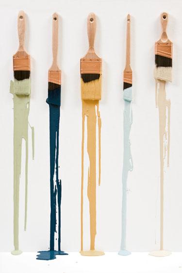
When it comes to getting the most bang for your decorating buck, nothing beats paint. It’s the most cost-effective way to change the look of a room.
But with thousands of color choices—you can even mix colors to create custom shades—paint may be one of the toughest design decisions you make.
Not surprisingly, designers have a lot to say about paint. We asked them to name some of the shades they like best.
Not Afraid of Color?
“One of my all-time favorites is Farrow & Ball’s Cooking Apple Green,” says DC designer Victoria Neale. It’s not quite as yellow as real apples, she says. She likes it in kitchens, sunrooms, bedrooms—almost anywhere except a living room, where it might be too strong.
Barbara Hawthorn, an interior designer in McLean, is a fan of Farrow & Ball Orangery, a bright shade that would warm up a living room or dining room—“if you are not afraid of color,” she says.
Gaithersburg designer Samantha Friedman used Farrow & Ball Hague Blue, “a rich, decadent” shade, to create a striking dining room in the Washington Design Center’s Spring Design House. “It’s such an intriguing color,” says Friedman, who thinks it would also look good in a powder room, on a ceiling, or in a living room below a chair rail.
Rockville designer Sandra Meyers likes Benjamin Moore Umbria Red, a bright red with purple undertones that would look especially good in a kitchen. “But you could put it almost anywhere,” she says. “It’s a happy red.”
Nestor Santa-Cruz, a design director with Gensler, an international design firm, suggests another cheery color, Farrow & Ball India Yellow, which he describes as “a mango color that makes me smile.” He especially likes it for dining rooms, either on all the walls or one accent wall.
Pale Glow
“This year, what’s interesting to me is yellow,” says Reston designer Susan Gulick. “I’ve never been a yellow person, but I’m liking it, especially with gray and white.” She suggests Benjamin Moore Sunshine on the Bay—a very sunny color—with River Reflections, a warm gray. The combo would work well in a bathroom, laundry room, study, or kid’s room.
Jennie Curtis, of the design firm Material Differences in Potomac Falls, likes Farrow & Ball Borrowed Light, a subtle duck-egg blue that she uses on ceilings or mixed with tans and whites.
For bedrooms and bathrooms, DC designer Liz Levin suggests two soft Benjamin Moore shades: Palladian Blue, a pretty spa blue, and Celery Salt, “a very pale color that gives off a hint of green and cream.”
As a backdrop for bookshelves, Santa-Cruz is fond of Farrow & Ball Terre d’Egypte. “It reminds me of an Hermès box but with a terra-cotta twist,” he says.
At the DC Design House this spring, Draza Stamenich of McLean won lots of praise for the laundry room, where he used Farrow & Ball Teresa’s Green. “I’m in love with it,” he says. “It’s a very refreshing minty green.” He says it would be just as nice in a family or living room.
Getting Cozy
In the Design House, DC designer Iantha Carley achieved a cozy sitting room off the master bedroom with Farrow & Ball Dauphin, a deep taupe. She designed the master bath too, using Mouse’s Back, a lighter Farrow & Ball taupe.
Chevy Chase designer Sue Burgess likes chocolate browns but says they’re tricky because many have red undertones; she prefers bronzey versions such as Benjamin Moore Middlebury Brown.
Goes With Anything
For living rooms, dining rooms, and spaces where you want to highlight art, Curtis favors Pastry and Sesame by Pratt & Lambert. “They’re bronze creams, so they go with many colors,” she says. Another favorite is Benjamin Moore Barely Beige, a true beige that’s easy to coordinate with other colors.
Hawthorn recommends Benjamin Moore Straw, a neutral with “a touch of yellow, but not so much that it takes over.” It’s a safe color you can use in any room.
Neale likes two by Farrow & Ball: Farrow’s Cream, “a beautiful warm beige,” and Dorset Cream, which has a terra-cotta undertone.
Burgess is happy with Benjamin Moore Putnam Ivory, a not-too-yellow beige she recently used in a living room, library, and sunroom. “It’s warm and easy and pretty with whites,” she says.
Levin is a fan of Benjamin Moore Wickham Gray, a pretty gray with lots of blue in it that looks great in Craftsman houses and other homes with lots of trim.
Meyers recommends another Benjamin Moore neutral, Bleeker Beige, which she says goes with anything: “It’s like an amoeba. It adjusts and can be more gray or more peach. It really blends.”
This article first appeared in the August 2009 issue of Washingtonian. For more articles from that issue, click here.