Who better to take color-pairing advice from than someone who named her design company Bossy Color? Interior designer Annie Elliott recently mentioned on her blog that one of her 2014 design goals was to get a little edgy with her pairings—so we asked her to share some of her favorite unexpectedly awesome hue duos. Read on to see what she’s loving together right now, along with her paint picks, then give these color teams a try in your own home—whether you go bold by pairing paints or start small with a contrasting decor accent is up to you.

Blush + Mustard
Elliott loves the combination of blush pink with the warmth of golden yellow. “The mustard takes the sweetness out of the pink, so you can just appreciate its glow,” she says.
Try it: Combine Farrow & Ball’s Pink Ground with India Yellow.
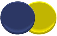
Navy + Chartreuse
Love navy but want to update it? Chartreuse is a fresh contrast. “The edgy greenish yellow is such a great counterpoint to navy’s conservative vibe,” says Elliott.
Try it: Put Benjamin Moore’s Admiral Blue next to Chartreuse.

Blue + Black
We’re already showed you this eye-catching Elliott-designed interior from a Chevy Chase home, which pairs a vibrant cobalt blue with rich black accents. Not ready to go quite so bright? Elliot likes a darker blue with black, too.
Try it: Pair Farrow & Ball’s Drawing Room Blue with Pitch Black for this chic, über-sophisticated look.
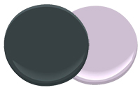
Light Orchid + Deep Green
Here’s how Elliott recommends working in the year’s biggest hue: “If you MUST adapt the color of the year into your decor—Pantone, what did we do to deserve the curse of Radiant Orchid?—I suggest graying it down and pairing it with a green so dark it’s almost black.”
Try it: Use Benjamin Moore’s Violet Petal with Regent Green.