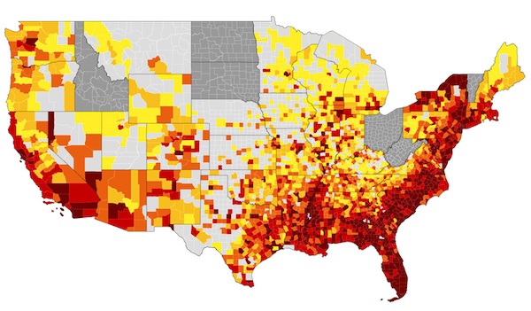
Broken down by county, this map illustrates the rate of adults and adolescents living with an HIV diagnosis in the US. The darkest shades signify the most affected areas. Image courtesy AIDSVu and the Rollins School of Public Health at Emory University
Atlanta’s Emory University launched an interactive HIV-tracking map today called AIDSVu, showing how prevalent the disease is in communities across the country. The launch coincides with the 30th anniversary of the first AIDS cases reported to the Centers for Disease Control and Prevention in June 1981. The map draws most of its information from data obtained by the CDC.
In addition to the countrywide view, users can zoom in to view state- and county-level details. The darkest areas are the most affected. The DC data is broken down by Zip code, with neighborhoods in 20009, 20001, 20036, and 20005—all in the center of the District—recording the highest rates of infection.
You can also filter the map to view particular demographics, such gender, race, or age group. The map shows that more men than women are impacted by HIV and that black and Hispanic Americans are affected more than other groups. The Northeast and South are the most heavily impacted regions in the country.
Check out AIDSVu for yourself here.
Subscribe to Washingtonian
Follow Well+Being on Twitter
More >> Health | Top Doctors | Well+Being Blog


