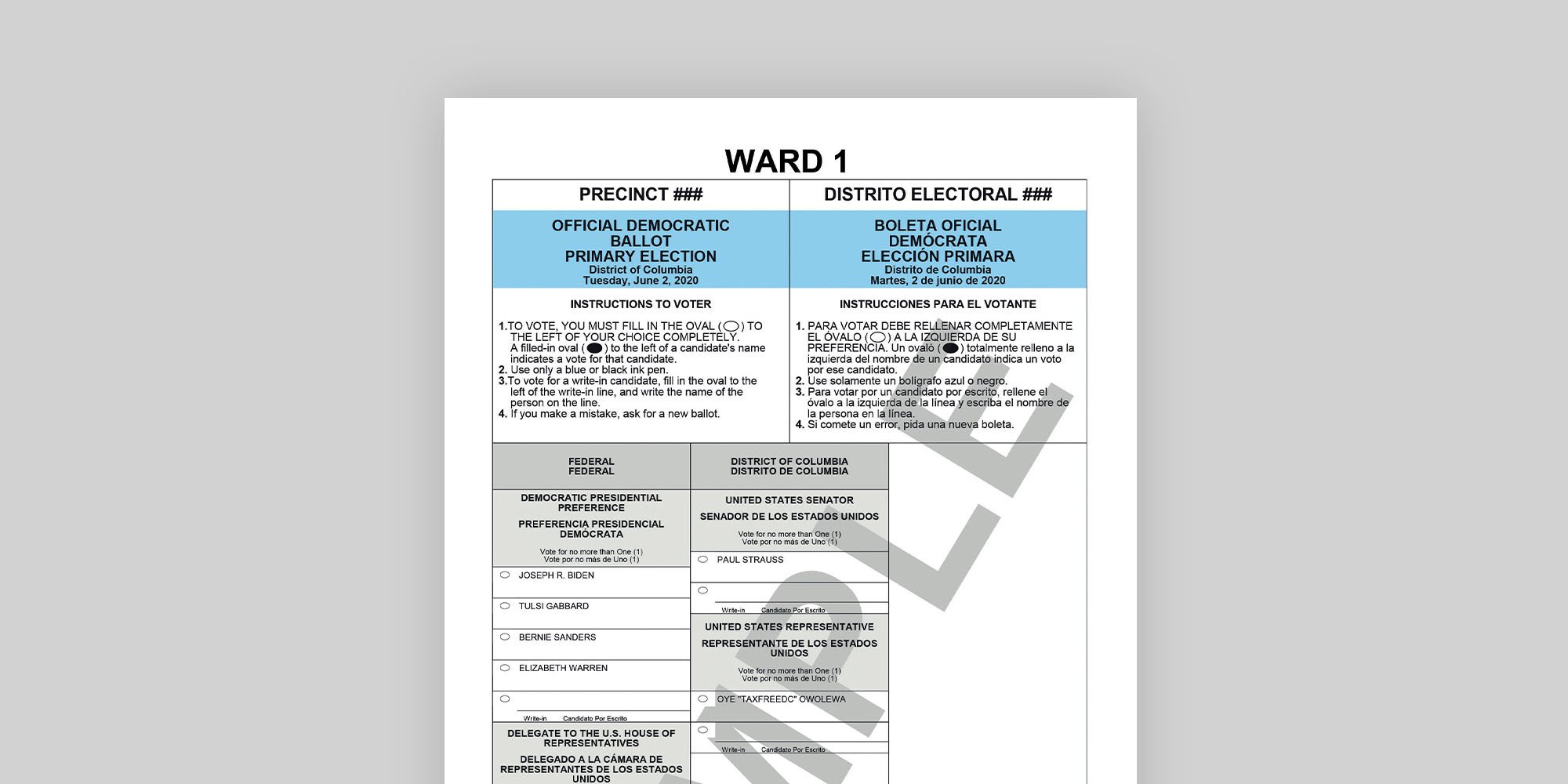
When it comes to voting, much of the discussion of late has been about where and how people will make their picks. But there’s another crucial aspect: what the ballot looks like. We asked Whitney Quesenbery—whose organization, the Center for Civic Design, publishes guidelines for effective ballots—to share her thoughts on DC’s previous effort, for this year’s primary. “It’s not a bad ballot,” she says. “It’s clean. It’s readable.” Here’s a closer look.
1. Works well: Thoughtful use of shading and color helps voters navigate the ballot.
Quesenbery likes the colored headers. (The Republican version has red across the top.) And the gray shading is a clever solution that makes it obvious where to mark your selections (in the white areas).
2. Could be improved: All-caps makes it hard to read.
The brain is better able to process a mix of upper- and lowercase. “If we were ancient Romans and everything was capitalized, reading capital letters would be easier,” says Quesenbery. “We’re not.”
3. Could be improved: Having the English and Spanish look the same is confusing.
“We usually just do one of two things. One of them is to make the English a half point bigger than the Spanish, and the other is to keep them the same size but make the Spanish italic.”
4. Works well: Entries don’t spill over from one column to the next.
A list of candidates that jumps from one column to the next is a notorious cause of “overvotes”—in which people make more than one selection for a single race. This ballot avoids that pitfall.
5. Could be improved: Centered type is less user-friendly than left-justified.
It’s a subtle point, but voters need to process info quickly, so it matters. “When you read, your eye has to keep finding the beginning of the line. It’s easier when that’s in a consistent place.”

