Let There Be Light
Raw brick walls darkened and aged a historic condo, but now they’re among its best assets
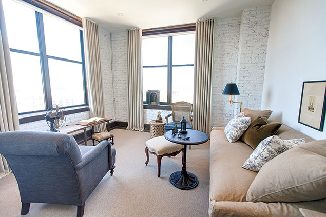
Near Dupont Circle on Q Street, the Cairo—which opened in 1894—is the tallest residential building in DC, and among the most historically significant. The two-bedroom condominium shown above sits on its highest floor, the 12th.
Designer Paul Corrie set out to make over the space for a single woman who had moved to town for a job at the World Bank. He used its lofty elevation as inspiration: “I almost wanted to make her feel like she was in the clouds.”
The 705-square-foot unit felt cramped, in part because of an overabundance of exposed red brick walls. Corrie loved their texture but not how they darkened the rooms. He painted them white, instantly refreshing and lightening the condo. The contrast with the window casings and baseboards allows the original wood to pop.
Though the owner didn’t bring any furnishings with her, Corrie wanted the decor to look as though it had been collected over time. He blended vintage pieces with new items from stores such as Crate & Barrel, achieving Old World glamour on a budget.
Aging Gracefully
A Georgetown gem showing wear and tear just needed some polish
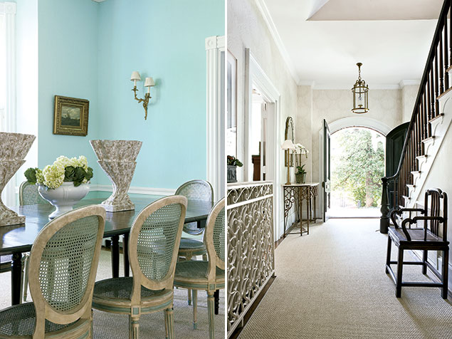
When designer Marika Meyer entered this Georgetown home, built in the late 1800s, she says, “it was really showing its age.” The plaster walls were water-damaged, and the wood floors were in rough condition. But her transformation demonstrates that old houses don’t always require a top-to-bottom gutting.
Meyer updated the lighting and resurfaced the walls, but the original floor plan remains intact. Though “open concept” prevails in most new homes, Meyer says there are advantages to maintaining traditional rooms: “It gives you an opportunity to try out different things. You can get away with spaces that are unified but more distinct.”
She employed some simple solutions, such as commissioning a limestone top for the large radiator in the entryway and painting both it and its cover the same shade so they no longer clashed.
The most personal detail waits in the dining room: walls covered in heirloom robin’s-egg blue wallpaper that belonged to the homeowner’s grandmother. There was just enough of the 50-plus-year-old paper to finish the area. Clearly, it was meant to be.
Devotion to Detail
In Old Town, proof that the little things often bring big character
It was love at first sight when a young family found this 1901 Federal-style rowhouse (right). For three years, they’d searched for an old house with high ceilings—a rarity. They bought this one the day it hit the market.
“It had all the bones they were looking for,” says designer Stuart Nordin, who revamped the place. Walls that separated a vestibule, living room, and dining room were knocked down to open up the floor plan, but the historic details were preserved. The trim, moldings, fireplace, wood floors, built-in shelving—even the doors and mismatched doorknobs—are original.
“All those architectural details—new construction can technically reproduce them, but it doesn’t have the same feel,” says Nordin.
A mix of furnishings, such as graphic, chevron-upholstered chairs parked atop an Oriental rug, continue the theme of weaving together old and new.
Sticking to Tradition
Sometimes keeping it classic is the best approach
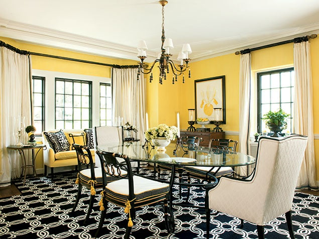
This 1934 Tudor-like house in Bethesda (left) is special to designer Kelley Proxmire—it’s hers. She and her family have lived there 17 years, but she redesigned the living and dining rooms only this spring. Though—given her profession—she changes the home’s spaces frequently, she sticks to a guiding principle: “You have to keep a nod to the house. If it’s traditional, you shouldn’t do all modern.”
Even in spots where Proxmire had to add new elements, she did her best to keep them classic. She recently replaced the windows, selecting ones that looked as close to the originals as possible. “We painted the mullions black inside, which is a technique to keep them more traditional,” she says.
But don’t confuse traditional with precious—the bold wool rug in the dining room is both a stylistic and practical choice: “Dogs rule in this house,” the designer says. “That rug stands up to them.”
Maximized Potential
A 90-year-old rowhouse’s tight spaces call for clever thinking
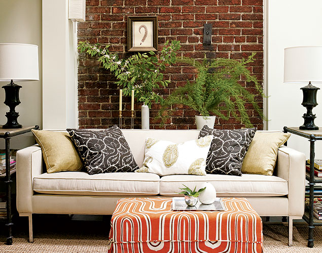
The family that hired Lauren Liess to overhaul their 1924 Capitol Hill rowhouse entertains often. That meant the home needed to accommodate 75 guests just as easily as its three residents. As is frequently the case in older places, Liess confronted small rooms in need of imagination.
She relied on visual tricks, such as hanging window treatments from floor to ceiling to elongate rooms. She set up the dining room as a transitional space. It can be configured for traditional meals or turned into a lounge during parties. The table gets pushed against the window, its leaves dropped. Moveable pieces—such as the boldly patterned orange ottoman usually in the living room—are brought in.
Liess’s clients wanted midcentury-modern elements infused throughout the home—a request the designer was happy to accommodate. “I love that juxtaposition,” she says. “Anytime you have a historical home with great architecture like this one, with bricks and old woodwork, I love mixing in modern pieces.”
Steering Clear of Stuffy
A grand 1920s home shows off its history without bringing down the mood
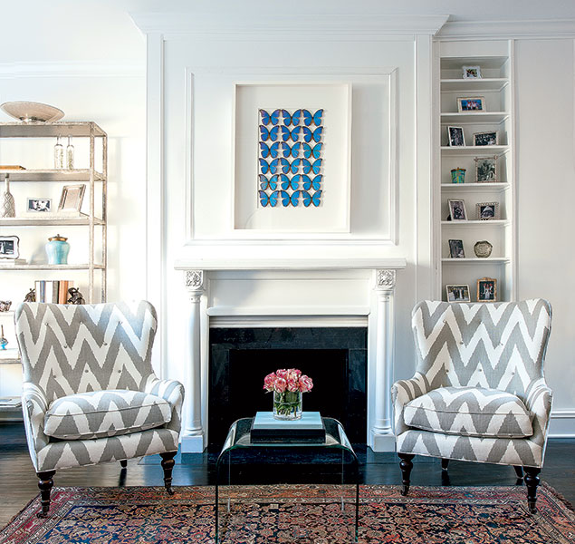
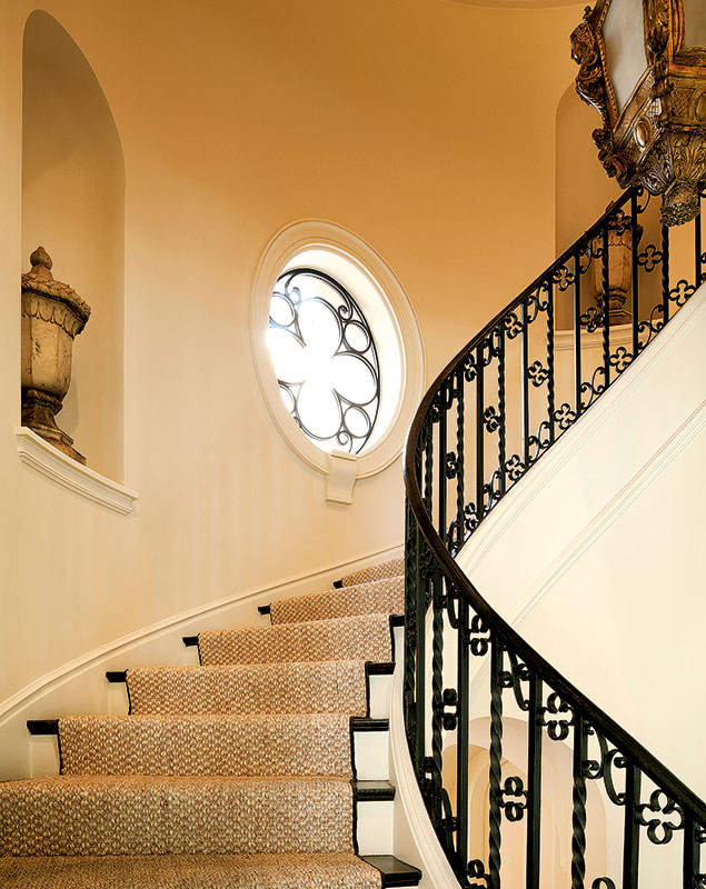
From its intricate plaster moldings to its stately front door and curving stairs, the original features in this Normandy-style, 1920s Chevy Chase DC home epitomize grandeur. In the wrong hands, the house could lean stuffy or imposing, but designer Thomas Pheasant kept the interior soft and gracious without diminishing its elegance.
The family who lives here loves contemporary art. A large-scale Helen Frankenthaler painting from their collection brings fresh energy to the entry hall. “I’m a classicist, and we live in a fairly traditional city,” says Pheasant. “But in terms of furnishings and artwork, these are the things that should reflect the personality and interests of the clients.”
Pheasant commissioned oval windows with ironwork to mirror the pattern in the stair railing. And he laid custom-cut sisal rugs, whose natural texture helped “relax the home.”

Marisa M. Kashino joined Washingtonian in 2009 and was a senior editor until 2022.


