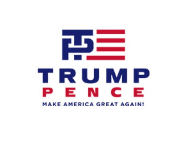
No sooner than Donald Trump‘s presidential campaign rolled out its logo featuring the name of his running mate, Indiana Governor Mike Pence, did the internet thrust into hours of snickering over its design, that features the T in “Trump” aggressively inserting itself into a distended P in “Pence.”
Top-to-bottom critiques of Trump’s new logo can be found elsewhere—in particular, check out the review by Slate’s J. Bryan Lowder—but for the sake of the lowly Trump Tower flunky who was dragooned onto the campaign’s design team, consider that logos that blend two letters can be difficult to create. Not every combination has the simple elegance of, say, Roger Federer‘s regal “RF” or the understated swagger of Kyrie Irving‘s interlocking “KI.”
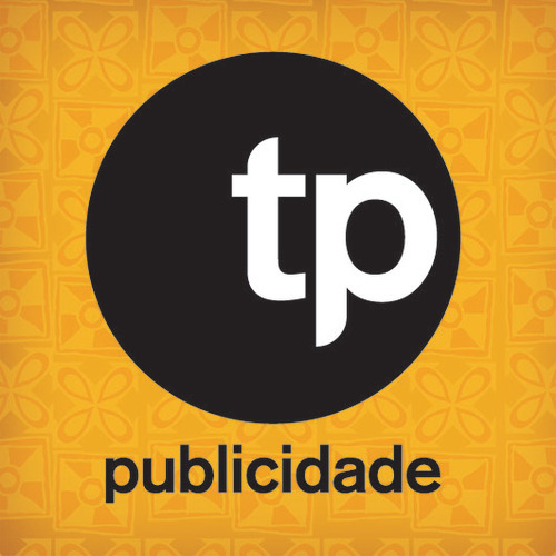
The combination of T and P can be especially vexing, as evidenced by a quick search of logos that combine those letters. Here are a few that stood out in their ugliness:
TP Publicidade, a publicity agency in Brazil:
Twin Perfect, a video-game blog:

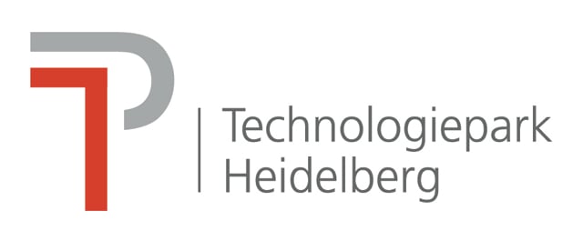
An office park in Heidelberg, Germany:
Tijuana Productions, a recording studio in Melbourne, Australia:

ThinkProgress, a liberal news and opinion website:

Training Point, an Irish technology-training company:

By comparison, the logo for Trump and Pence isn’t so—nah, it looks exactly like what you think it does.

