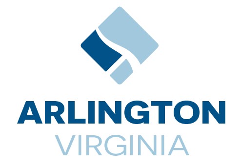
Arlington County has released its new logo: It maps out Arlington, DC, and Alexandria with the Potomac River running between them.
The design is the result of a frustrating, months-long process involving a public contest and more than 400 community submissions. The first group, which were put to a vote in April, received a lot of negative feedback from Arlington residents who complained that the logos, all simultaneously colorful and plain, looked too corporate, would become outdated very quickly, and didn’t represent the county. A second group of finalists was named, and the winner was chosen from that group.
Washingtonian asked area design experts about the design. Their answers have been lightly edited and condensed for clarity.
Jandos Rothstein
Graphic design professor at George Mason University
I think there’s a couple of ways to look at it. I think if you think of it as a logo, it has some pretty obvious shortcomings in that it doesn’t say much about Arlington except as part of the larger region. It’s more of a reasonable mark for the DMV than it is for Arlington itself. It would be nice if they could’ve had something about Arlington to feature there. On the other hand, Arlington being part of the DMV might be what’s most interesting about it.
When a county does something like this, they want it to not be too expensive, they especially want it to not look too expensive, so they tend to do what Arlington did, which was a contest. If you have a contest, you’re getting submissions from people who are not necessarily branding experts; maybe they do some graphic design, maybe they don’t. If you look at it from that perspective, [of] asking a bunch of randos to do a logo for you, it’s a pretty good mark. I think they got out of that process about as good a result as you’re going to get out of that process.
David Carlson
Artist and Arlington resident
I like the logo itself: the abstraction, the little square that has Arlington and DC and Alexandria with the Potomac flowing through it. I like that part of it. I’m kind of lost on the text. I think the text takes away from the visual image.
It’s a square turned up on its point. I like the flow and the shapes and the flow of the Potomac through there and how it’s broken up. It’s clearly the original map of the District of Columbia and its inclusion. I like what they’re doing there.
The text is bold. The Arlington part is very bold. When I teach drawing and we’ll be doing a still life, I’ll have the students draw an object, and it’s always interesting to me those who draw the apple, for example, and then those who draw the apple, and underneath of it, they write the word “apple.” You don’t know that’s an apple? It’s kind of interesting, isn’t it? It shows you that people don’t necessarily think visually, but they really have words in their ideas. I think it’s better without it. At least leave something to the imagination. We know who we are. We know what that place is. Why do we need to be reaffirmed by this big, bold “Arlington?”
Lauren Thorson
Partner at design firm Studio-Set
I don’t live in that specific region, so I don’t fully understand that place and that community. From an outsider’s perspective, I feel like it is a little nondescript for the place. While it is pretty abstract, I feel maybe the essence behind the place could be represented more by the spirit of the community rather than the lines and the districting around the community. That being said, that’s an outsider’s perspective. It’s a complicated thing because it feels like it is overcomplicated, and the idea of a logo for a region seems silly to me. I think it’s legible. It’s straightforward. The typography is doing its job, and it’s legible.
Jaqui Falkenhe
Artist and Arlington resident
As an abstract artist, I really like the minimal shapes, and I’m very attracted to maps. I actually like how the new logo puts Arlington into context with the city and Alexandria, and I like the use of the negative space for the Potomac River. All in all, I like the selection. I am a person who’s drawn to simple shapes and things that are visually — not a lot of saturated colors. I personally like it. I think it was a long process, I understand. I like how they included the participation of the community. All in all, I’m happy.
It’s very personal, in the end. New logos get established over time as recognition. People will see it and will recognize it. Right now, it’s very new, but eventually when people see it all over in letters and in people’s uniforms, it’ll get more recognition and people will get familiar with it. Personally, there’s nothing I don’t like.

