If restaurants are doing their job–in other words, sweeping you up into an illusion–then you’re really not supposed to think about something as inconsequential as, for instance, the napkin on your table.
But even if you eat out only occasionally I’m guessing that at some point the following thought has crossed your mind: is it me or does every place nowadays have the same napkin?
Short answer: it’s not you.
Wait a second, do you mean to tell me that this is going to be an entire column about a napkin?
I hear you, believe me. But more awaits you than talk about thread count, I promise.
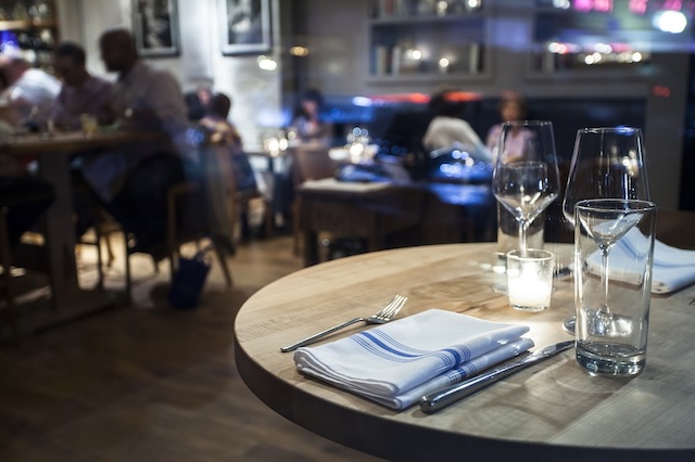
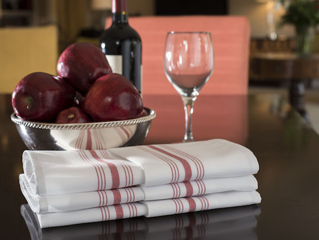
Known variously in the industry as either the “signature stripe”–for the band of blue, red, green, or other colors that run down the center when folded–or “the bistro napkin,” the thing looks, at a glance, more pedestrian than either of those names suggest. It looks like a tea towel or a dish towel, the kind of cloth a chef might use to snatch a scalding pan from the stove.
You would hardly guess that since its introduction into the market two years ago, it has become as trendily ubiquitous as ramen.
The surprise, nowadays, is not that so many new restaurants have adopted it–locally, the list includes Ambar, The Pig, The Partisan, Cafe Berlin, Beuchert’s Saloon, Urban Butcher, Compass Rose, Chez Billy Sud, Bar Pilar, The Heights, and many dozens of others. The surprise is that some still haven’t.
Wanting to understand how a napkin could come to dominate the scene the way the bistro napkin has, I contacted several restaurant general managers. Why this particular napkin? I asked. What makes it so special?
They all began, more or less, by reminding me that a napkin might seem like an insignificant detail in the broader picture, but to a restaurateur determined to create a distinctive, memorable place, there really is no such thing. The cutlery, the plates, the chairs, the music on the sound system, the tiles on the walls and on the floors–all must contribute to the textured web of the place. In that sense, a napkin is one of those innumerable small things that add up, hopefully, to something big.
Most said that when they began thinking about what sort of napkin they wanted, they began with an image of something nice and high quality, but that the nicest napkin out there, the thick white cloth we have long tended to associate with fine dining–and which luxury hotels like the Four Seasons still use–is “too elegant” or even “too stuffy” and would therefore sent the wrong message for the kind of small, intimate, personal places they operated.
With sumptuous white linens thus ruled out, they began casting about for cheaper (but not cheap!) alternatives.
The idea of going with something quirky and unusual–something no other restaurant was using–was enormously appealing, but they quickly abandoned their need to stand out from the herd when they began to calculate the high costs of going rogue.
“The last thing you want to do after you close up, and it’s 1 or 2 in the morning,” said Elizabeth Parker, of Crane & Turtle, which stands out among the crop of trendy, ambitious restaurants for not using the signature stripe–it uses a blue cloth napkin I haven’t seen anywhere else–“is wash linens and then iron them.”
In some cases, it was not simply a matter of stamina. They lacked the space and resources to keep the napkins looking crisp night after night.
For this reason, they turned to a laundry service. They rationalized the loss of distinctiveness on the table as a gain of efficiency and convenience. Not only does the laundry service rent napkins to the restaurants and replace them when they fray or become ripped; it also collects the used cloths, washes, dries, presses, and folds them, and returns them the next day to begin all over again.
The popularity of the bistro napkin, then, could be explained, in part, by this standardization. But only in part.
When I spoke to Kristin Dempsey, the vice president of Dempsey Uniform & Linen Supply, a 56-year-old company with outlets in Maryland, Pennsylvania, and New Jersey, among others, and one of the premier services in the region, I was stunned to learn that there are 50 options in her napery line.
“Fifty?” I asked, thinking that maybe I’d misheard her.
“You’d never guess, huh,” Dempsey said.
“I mean, no–you’d think there’d be this broad range of styles out there. But more and more, I’m seeing just the one.”
She confessed to a kind of astonishment that this glorified tea towel had separated itself from the pack to become the clear preference of so many GMs.
In a dining age in which restaurants must not be thought to be trying too hard, of course, it makes sense that a napkin that can be at home either in an opera or a honkytonk–or, perhaps more accurately, that can make an opera seem like a honkytonk–would be so popular.
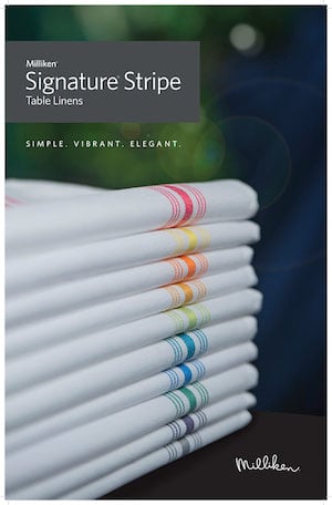
This was precisely the thinking of the Spartanburg, South Carolina-based Milliken, when it introduced the product in late 2013, according to Brenda Burris-Drake, the VP of marketing.
The company’s designers consciously set about creating a napkin that would reckon with the paradigm shift that has altered, perhaps irrevocably, the restaurant world. With locavorism and “farm-to-table” restaurants ascendant, with the lines between fancy and casual continuing to blur, Milliken saw an opportunity to win over the dining mainstream by blending high and low into one cloth.
At a glance, it’s a homey-looking rag. But pick it up and hold it in your hands, and you can feel its heft. No rag has this weight, which bespeaks a certain elegance and refinement. Dempsey told me that its surprising solidity is the result of spun polyester, a recent breakthrough in the industry, in which polyester is spun in the manner of cotton to achieve a rich, dense weave.
For high-end restaurants that wish to be thought of as not being up to anything too serious and self-conscious, the napkin enables them to say: We’re approachable; we’re rustic.
For more casual restaurants, like retro diners, the napkin is a different sort of signifier. It tells the diner: We might look simple, but we’re sophisticated; just feel the texture.
The napkin has been a huge early success, Burris-Drake told me; sales are up 64 percent in the past year, and the napkin is “trending on the East Coast and in California [and] working its way into the Midwest.”
A trending napkin.
Amazing.
But hey, if a cupcake could be turned into a luxury fetish and catch a wave, and a cheapie caloric snack for budget-crunching college students could rise up the ladder to become a fine-dining fixture, why not a cloth that looks humble but feels haute?
OtherWise is Todd Kliman’s weekly column.