If some interior designers had their way, the color beige would be banned from walls throughout Washington.
“We’ve had a solid 20 years of beige–it’s really time to move on,” says interior designer Robert Shields.
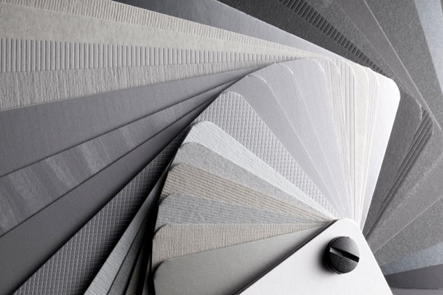
What’s the new neutral that designers are hot for? Gray.
“For a long time, people were afraid of gray–it was sort of sad and depressing,” says interior designer Celia Welch. “Now there are some wonderful grays.”
Designer Dana Tydings recommends using lighter tones of gray to impart a sense of lightness and relaxation. Deeper shades give richness to the room without being too dark.
“Gray is edgier, moodier, and maybe just a little more chic,” says designer Sally Steponkus.
There are hundreds of shades of gray available through paint companies. Here are some specific hues recommended by local interior designers as well as accent colors they like to pair with each.
- Mouse’s Back by Farrow & Ball
- Dayroom Yellow by Farrow & Ball
Sally Steponkus used this color pairing in her room at the 2009 DC Design House. Mouse’s Back is one of her favorite grays, and a yellow accent provides a fresh feeling to a room.
- Pearl White by Pratt & Lambert
- Middleton Pink by Farrow & Ball
“The gray paired with the soft pink strikes the perfect masculine/feminine balance for a bedroom,” says Dana Tydings.
- Down Pipe by Farrow & Ball
- Blue Ground by Farrow & Ball
“I use Farrow & Ball’s Down Pipe often. It’s a deep gray with a lot of green in it,” says designer Zoe Feldman. Pairing it with Blue Ground makes a room pop with color.
- Revere Pewter by Benjamin Moore
- Venezuelan Sea by Benjamin Moore
“I just painted my powder room this peacock blue–not for the weak of heart!” says designer Liz Levin. She suggests that if you want to use a bold color, use it sparingly–and make gray the foundation of a room, to soften a strong accent color. “Soft grays are fantastic background colors.”
- Weimeraner Gray by Benjamin Moore
- Baked Terra Cotta by Benjamin Moore
“Add a bit of excitement to gray with a color from the opposite side of the spectrum,” says designer Andy Staszak. “A rust or terra-cotta accent will give a subtle and sophisticated effect.”
- Cinder by Benjamin Moore
- Pebble Creek by Benjamin Moore
Cinder is a true gray, which is hard to find, says Staszak. “So many of them skew blue, green, or brown.” This pairing brings out the best of both colors, he says. The Pebble Creek lavender “looks very muddy on the chart, but paired with gray it will read as a very soft, heathery lavender. Beautiful.”

