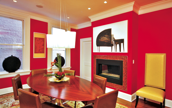
The walls in this Capitol Hill dining room by designer Barbara Hawthorn are painted Benjamin Moore Tricycle Red. Photograph by Kenneth M. Wyner Photography
For years, neutrals reigned. But interior designers say more clients are now asking for help introducing vibrant colors into their homes.
“A lot of people seem to be taking more risks with color,” says Herndon designer Lauren Liess. “They’re looking for an energetic, fresh feel.”
Ray Gomez, director of color marketing at Benjamin Moore, says deep, rich paint colors have experienced a spike in popularity. Among the company’s recent bestsellers are Caliente, a vivid red with hints of orange; Passion Plum, a bold purple; and Poolside Blue, a luminous blue-turquoise.
In late 2009, Benjamin Moore introduced Color Capture, a phone app that allows users to match any color in a photograph to one of the company’s more than 3,300 paint colors. It also shows a range of darker and lighter shades on either side and picks five “harmony colors” that would go well with any color you choose. More than 300,000 people have downloaded the app.
Gomez says tools such as Color Capture make consumers feel more comfortable experimenting with color: “People are saying, ‘I never thought of using that purple with that particular shade of gold before.’ The app gives them the affirmation that Benjamin Moore says, ‘It’s okay to use these colors together.’ ”
DC interior designer Zoe Feldman sees a connection between the use of color and the economy: “We’re not able to get rid of things as quickly as we used to.” Feldman has worked with clients who have repainted outdated kitchen cabinets rather than buying new ones. Painting floors, furniture, and walls is another way to give a space fresh life without buying new pieces. “We paint everything—dressers, desks, headboards,” Feldman says. “If it’s wood, we’ll paint it.”
Fabric companies have picked up on the trend and have begun to make a wider variety of colors. “It used to be that chenilles, velvets, and woven linens were only available in neutral colors,” says designer Barbara Hawthorn of McLean. “Now you can get them in a broader spectrum—you can find mango instead of just orange.”
For many homeowners, picking a color scheme is the hardest part of redecorating.
“The most common mistake I see is people not going far enough,” says Feldman. “They stay so safe that they end up with a boring space that they’re not happy with.”
But before you buy gallons of bright paint, here are five questions to ask yourself when choosing and using color.
—–
How Do I Pick the Perfect Paint Color?
Most people are drawn to certain colors. “Look at how you dress yourself,” says David Herchik of JDS Designs on Capitol Hill.
Hawthorn suggests playing with different combinations of fabric swatches or paint chips on a white tablecloth. “People’s eyes get big when they see something they like,” she says. “There really is a physical effect—you’ll know viscerally what makes you feel good.”
According to designers, a typical mistake is picking the paint color first and then decorating around it. “Paint is the easiest thing to switch out,” says Liess. DC designer Victoria Neale suggests beginning with what she calls a “catalyst” piece. It could be a swatch of fabric, a rug, or artwork that you love. “Something has to drive,” she says. “Otherwise you’ll be paralyzed.”
DC designer Nestor Santa-Cruz encourages clients to borrow combinations from their favorite works of art, even if those pieces will never hang in their home. If you like Vermeer’s “Girl With a Pearl Earring,” for example, you can introduce a similar palette with tan, white, and blue.
—–
What Feeling Do I Want the Color to Evoke?
In general, the higher the contrast between colors in a room, the more lively and busy the space will seem.
“Everybody wants something different when they come home,” says Neale. “Some people want a happy, cheery feel—they want to walk in the room and smile. Other people want serenity because their lives are chaotic.”
If you want the space to be calming, look for soothing tones such as light blue-grays, soft lavenders, and cool neutrals. A monochromatic scheme featuring mostly neutrals will create the calmest setting. When you’re working with low-contrast colors, designers warn against choosing shades that are too similar—there needs to be enough contrast so that the colors play off one another. Feldman says not to choose colors that are side by side on a paint fan: “It will just look like there’s weird shadowing.”
High-contrast colors, or shades that are opposite each other on a color wheel, can be used to create a more energetic space. Blue and orange. Yellow and purple. Red and green. “It’s amazing how all color is an interaction with another color,” says Bethesda designer Skip Sroka.
For a high-contrast palette to work well, the colors need to be able to hold their own. Designers suggest choosing colors that have the same value, or intensity. Graded paint swatches typically move from light to dark—one easy way to pick well-matched colors is to choose two that are in the same position on the swatch. Says Sroka: “What you’re really seeking is balance.”
—–
How Is the Room Used?
Designers say picking colors that occur naturally in food—such as tomato red, lettuce green, or mandarin orange—create an appealing environment for a dining room. Hawthorn advises staying away from yellows and greens in bathrooms where you plan to put on makeup, because your skin can take on a green or yellow tint in the mirror. In bedrooms, most people gravitate toward soothing palettes.
It’s also important to think about public versus private spaces. In many homes, public spaces are flowing and open—you can see the kitchen from the living room or the dining room from the entryway. Although you don’t want the same color scheme for all of your public spaces, you should create a palette that flows from room to room. “It’s not Pee-wee’s Playhouse,” says Feldman. “You want everything to make sense together.”
For example, you may come up with a color scheme that involves navy, white, and light blue. In the living room, the walls may be navy, the trim white, and the accents light blue; in the kitchen, you could have white walls with navy and light-blue accents. You can introduce pops of different colors in each room—a bright-orange throw pillow or a kelly-green upholstered chair—to add variety and personality.
You have more flexibility in private spaces that have a door. For those drawn to color, private spaces are a chance to go bold. Dee Thornton of Houseworks Interiors in Old Town Alexandria paired silver wallpaper with a rich lavender ceiling in a powder room last year; McLean designer Jill Sorensen painted a boy’s bedroom Benjamin Moore Seaport Blue, a pure deep blue.
—–
Is There Natural Light?
It may sound counterintuitive, but dark, rich colors work well in rooms that don’t get a lot of light.
“A lot of people say, ‘This room is dark—I don’t want to make it darker,’ ” says Thornton. “But it is hard to see a light color in a dark room. Dark colors take in the corners, wipe out the shadows, and unify the space.”
Thornton says Cumin—made by Pantone and available through Fine Paints of Europe—is a fantastic color for a library with a lot of wood and bookshelves.
Keep in mind that paints look deeper and more intense on a wall than in the paint store. Yellow in particular reflects against and magnifies itself. Many designers recommend choosing a color two to three shades lighter than your instinct. One common mistake is seeing a color in a friend’s home or a magazine and thinking it will look the same on your walls.
“Light really can change a color,” says Thornton. “What looks good in one room might not look good in another.”
Before you paint, test the color on a wall or a piece of poster board and make sure you like it in natural and artificial light. Many brands offer sample pots or large sheets coated in paint, like a large paint chip, that you can tape to the wall.
—–
What’s the Best Way to Use Bold Hues?
A little can go a long way if a paint color is very strong.
Small spaces, such as entry halls and powder rooms, can take on a jewel-box feel when painted in a rich, vibrant tone. “It’s this amazing saturation of color for a moment,” says Feldman. “But you don’t have to live in it all the time.” Barbara Hawthorn likes Benjamin Moore’s Hot Lips, a deep pink, for a powder room.
In larger spaces, a good way to introduce vibrant color is to paint a piece of furniture, such as a buffet or a dresser. If you want it to really stand out, use a glossy finish. Pillows, lamps, and draperies can be another chance to go bold. The trick is to use strong colors in moderation; otherwise the room could feel too busy.
Even in a colorful room, don’t forget about neutrals—they enrich the colors and provide balance. Says Sorensen: “You have to give the eye a place to rest.”
 This article appears in the August 2011 issue of The Washingtonian.
Subscribe to Washingtonian
Follow Washingtonian on Twitter

Andrew Beaujon joined Washingtonian in late 2014. He was previously with the Poynter Institute, TBD.com, and Washington City Paper. He lives in Del Ray.