1. Minimalist Multipurpose
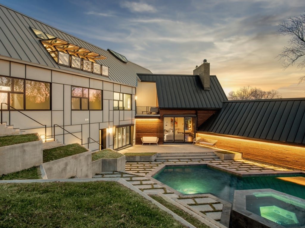
Years before it was trendy for restaurants and coffee shops to open in the alleys of Shaw, architect Mark Lawrence made his home in one. He and his wife, Cary, bought an old stable on Naylor Court in early 2011. They transformed it into a minimalist first-floor office for Lawrence’s firm, EL Studio, with a modern apartment for them to live in above. The setup was perfect for a young couple—not so much for a family of four, which they’ve since become.
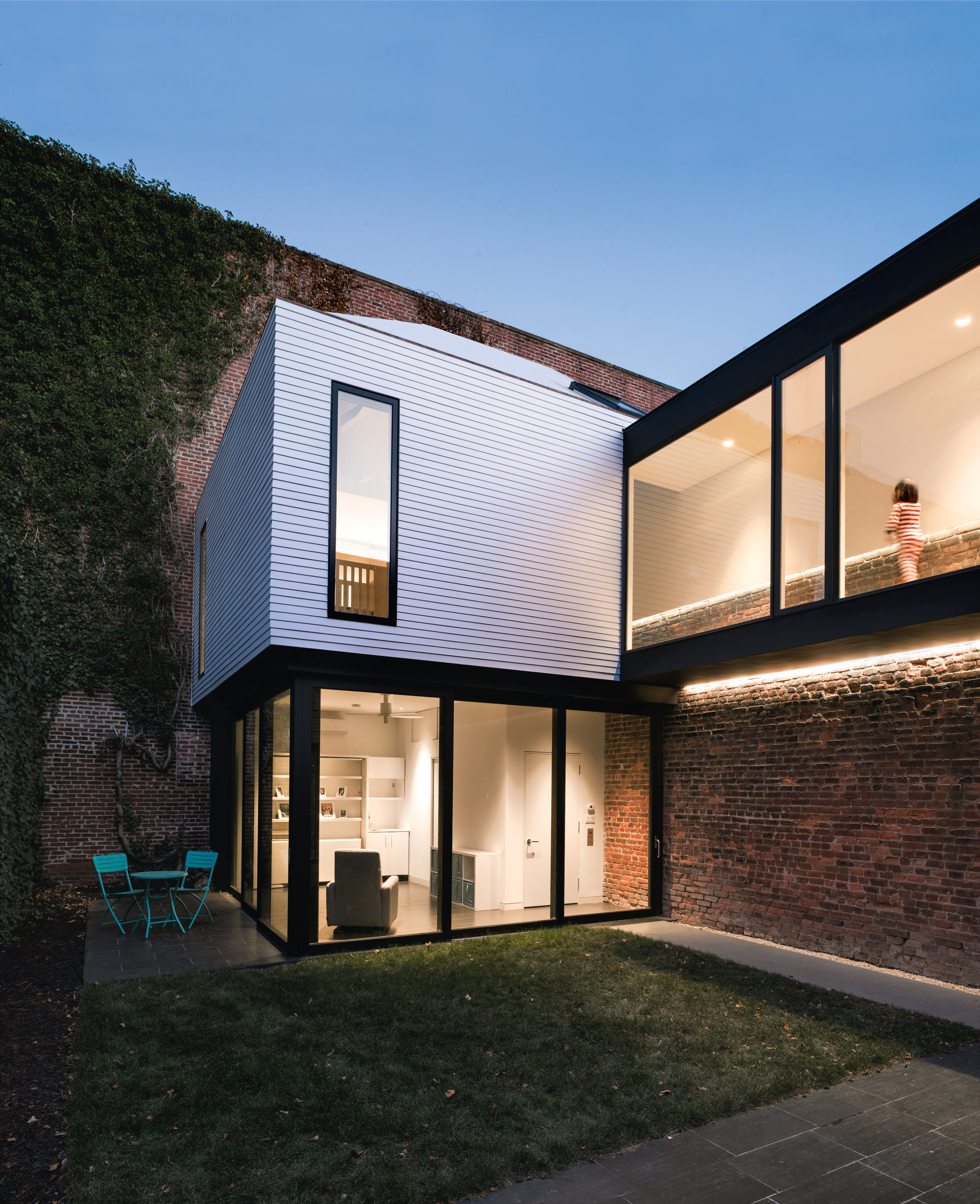
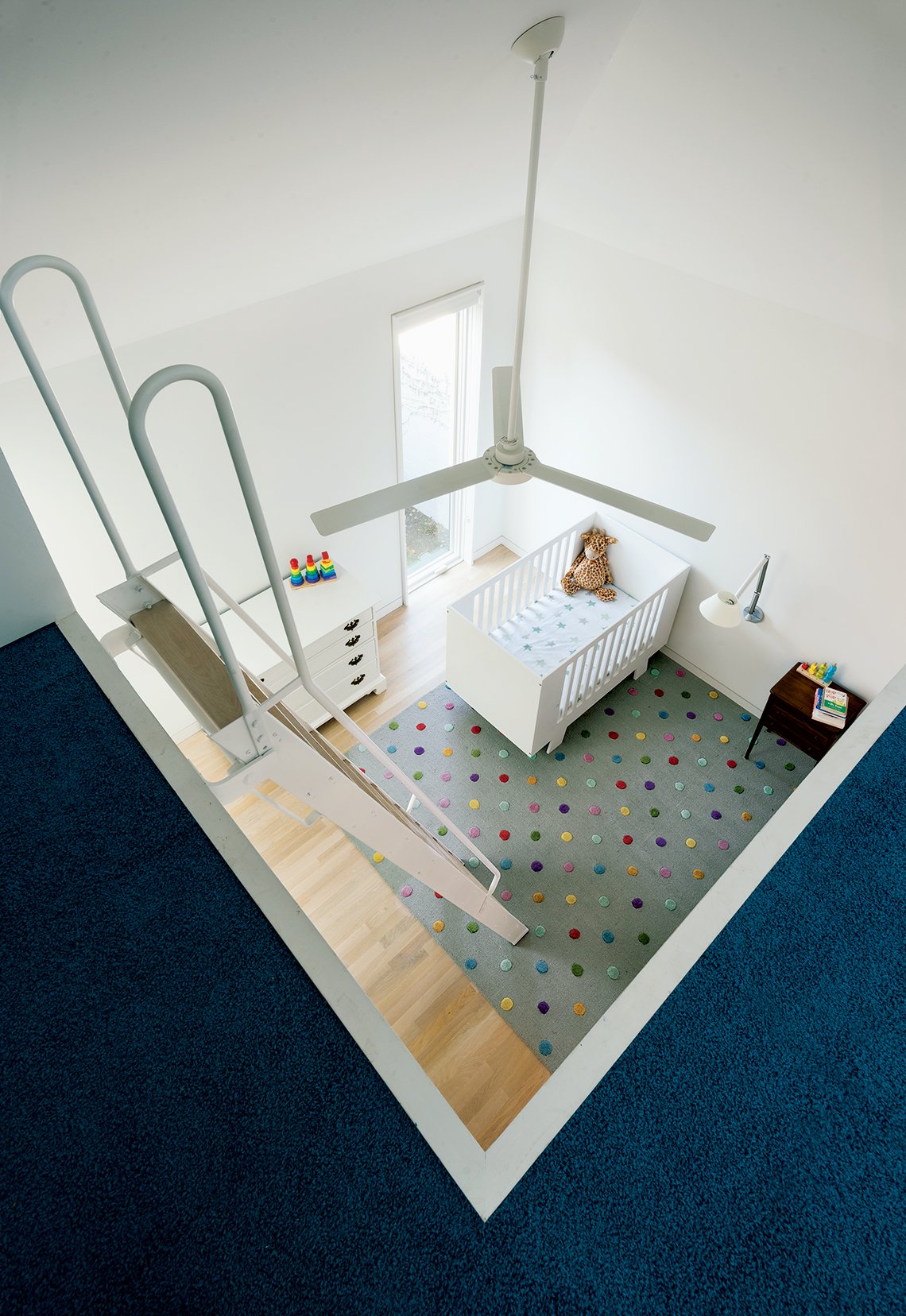
So Lawrence and his partner, Elizabeth Emerson, designed a back-yard addition. The two-story space is extremely efficient. On 800 square feet—with a footprint of just 350 square feet—it packs in a playroom/guest room, a kid’s bedroom, two full baths, and a loft area that will be converted into a bedroom for the Lawrences’ five-month-old son when he’s older. One trick to fitting so much in was installing an elevator instead of a staircase. “It’s much more compact, like a little closet,” says Lawrence. (They can also use the stairs in the main house and access the addition through a glass sky bridge that connects the two buildings.)
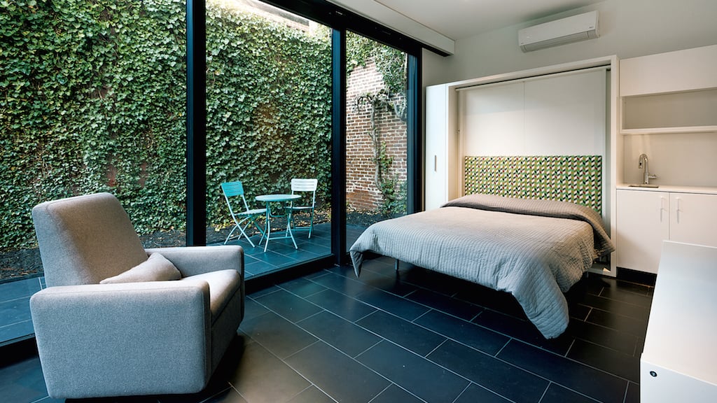
The first-floor playroom was designed around a wall unit that converts from shelving and a desk into a queen-size bed for guests. Though the room is snug, walls of sliding glass keep it from feeling claustrophobic. On nice days, the family leaves them open. Says Lawrence: “You feel like it’s really part of the whole back yard.”
2. Making Room to Grow
Like a lot of DC rowhouses, this one—on T Street in Logan Circle—was tight. And at just over 1,000 square feet, it needed to accommodate a growing family.
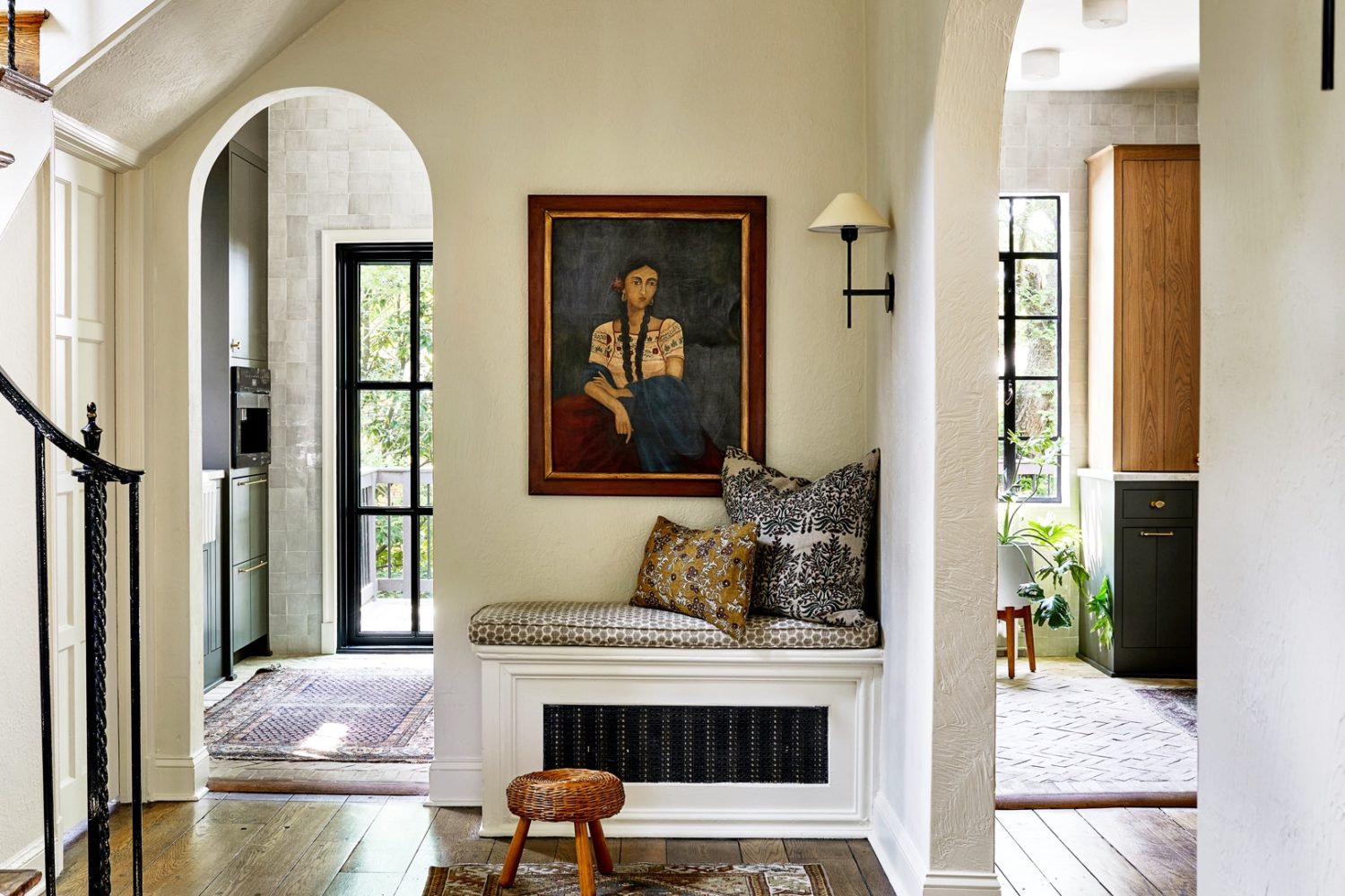
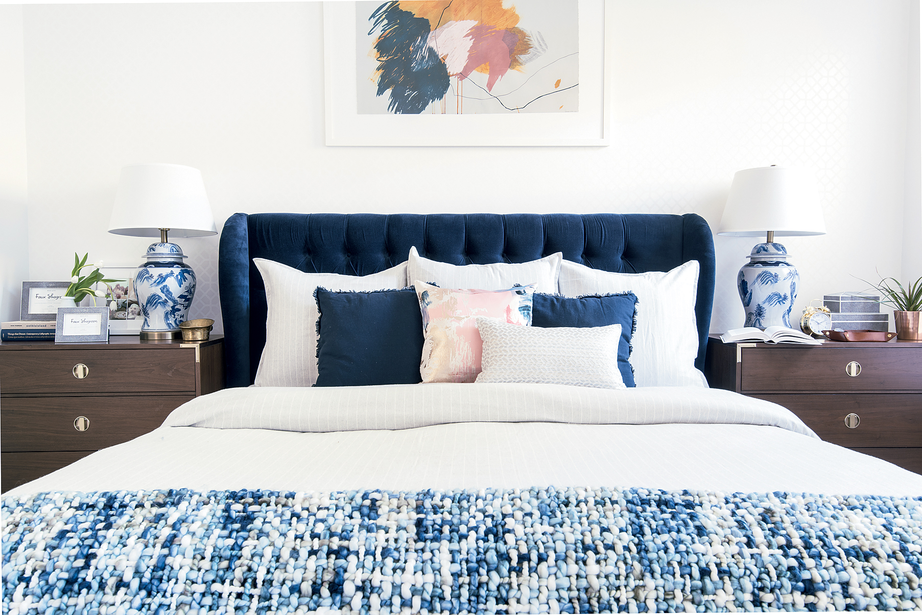
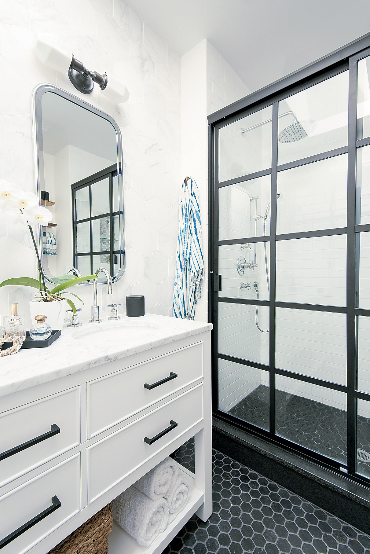
Interior designer Kerra Michele Huerta knew right away she’d take down a wall dividing the living and dining rooms to open up the choppy layout. But to buy herself more room, she looked downward, converting a crawl space into a finished basement. Doing so allowed her to relocate the laundry from upstairs and to free up square-footage for a larger master bathroom. She also moved both of the house’s stairwells to create space for a main-floor powder room.
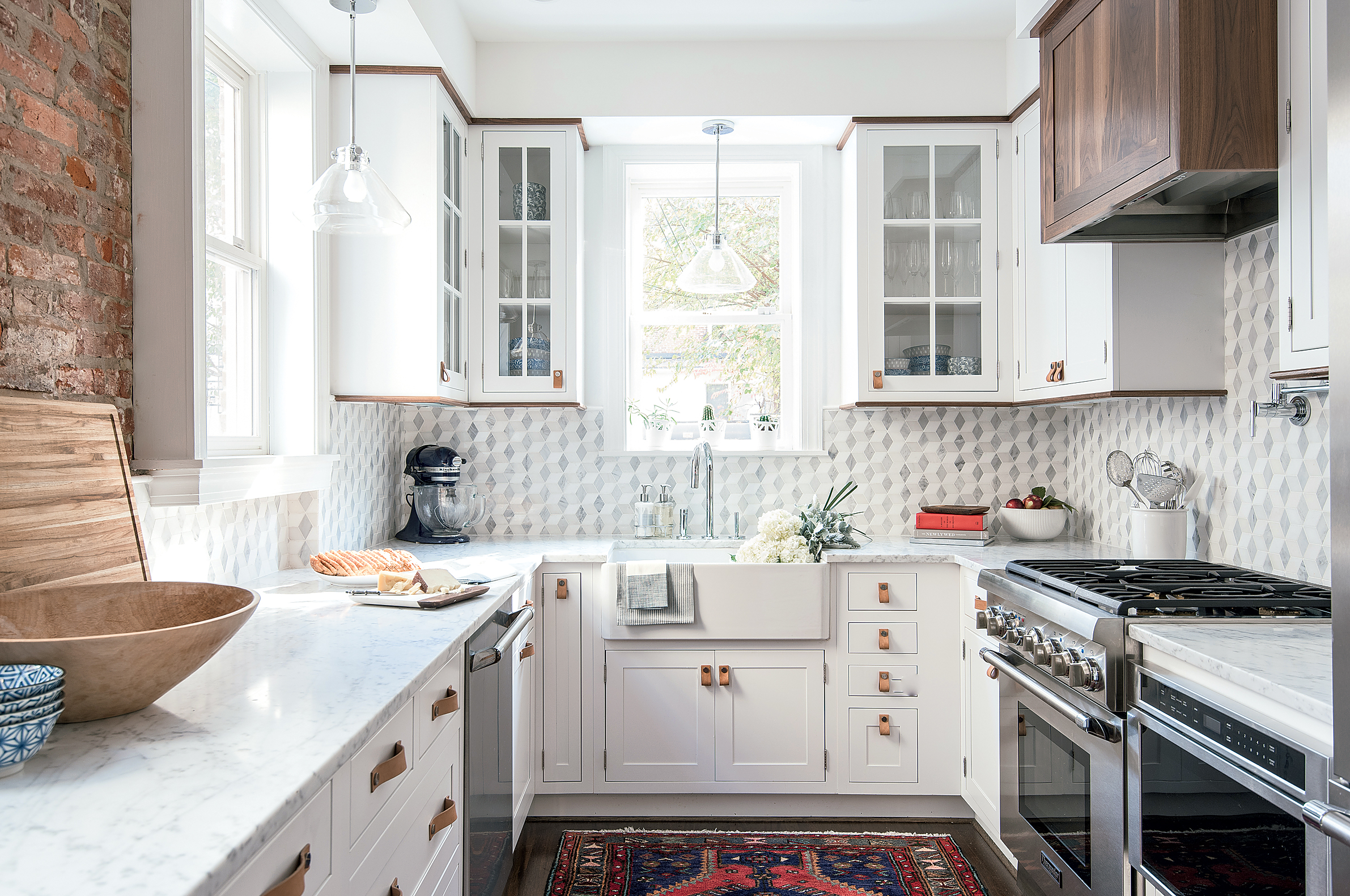
The footprint of the outdated L-shaped kitchen was dictated by a door to the back yard, so Huerta replaced it with a window and added a new exterior door in the dining area. Now U-shaped, the kitchen fits nearly double the storage.
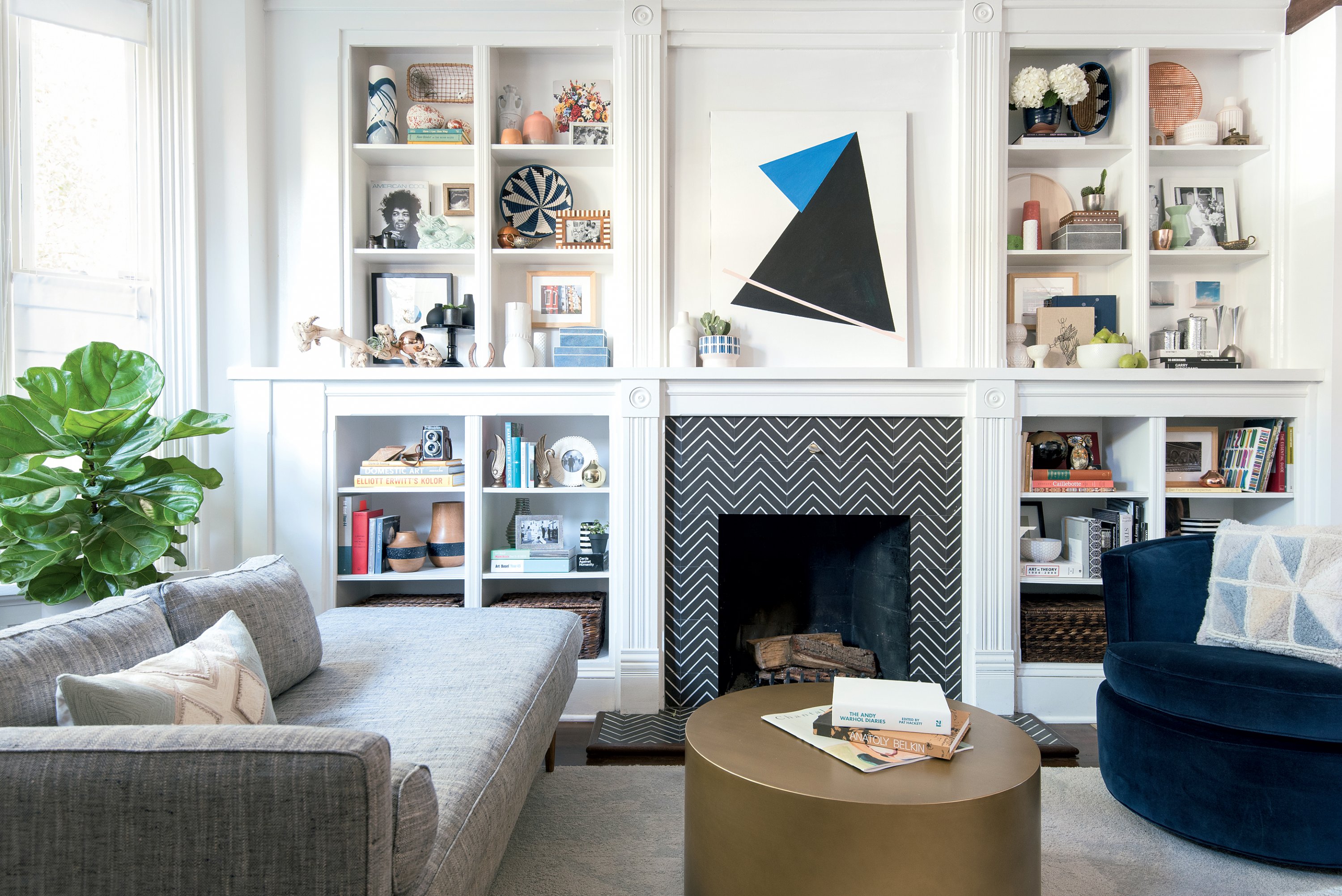
Huerta stuck with a neutral color palette of black, white, and navy. She chose leggy furniture, a designer trick that leaves negative space and makes a room feel less cluttered. Transparent light fixtures reinforce the illusion of openness. Rowhouses, says Huerta, are “a fun puzzle to solve.”
3. Less Space, More Glam
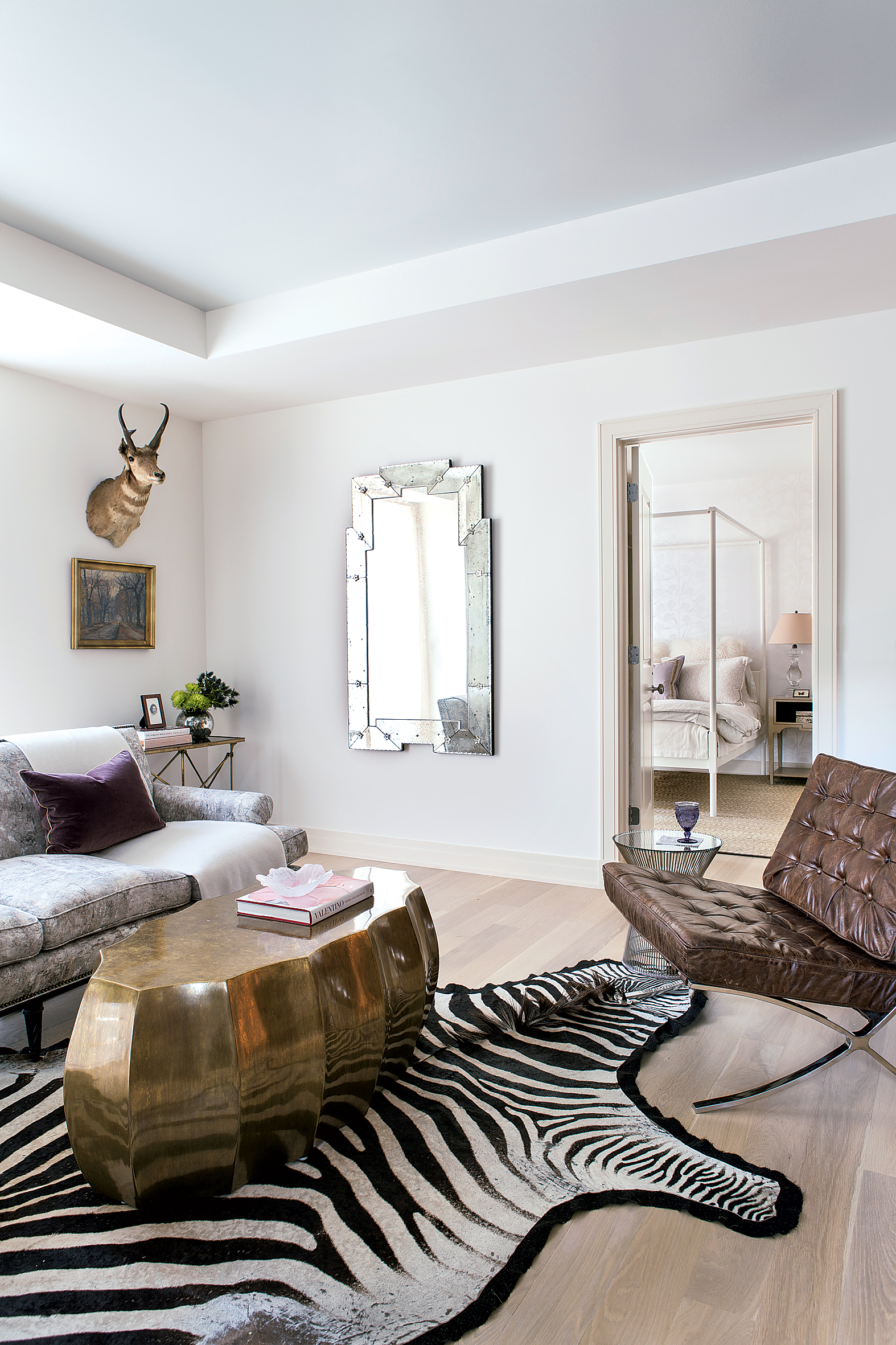
When Tricia Huntley’s political-consultant client was ready to make the leap from renting to owning in Georgetown, both agreed that a rowhouse would require too much upkeep for someone constantly traveling. They finally found a sunny condo with a large garden terrace, though it was smaller—with a much different layout—than the penthouse Huntley had previously decorated for the client.
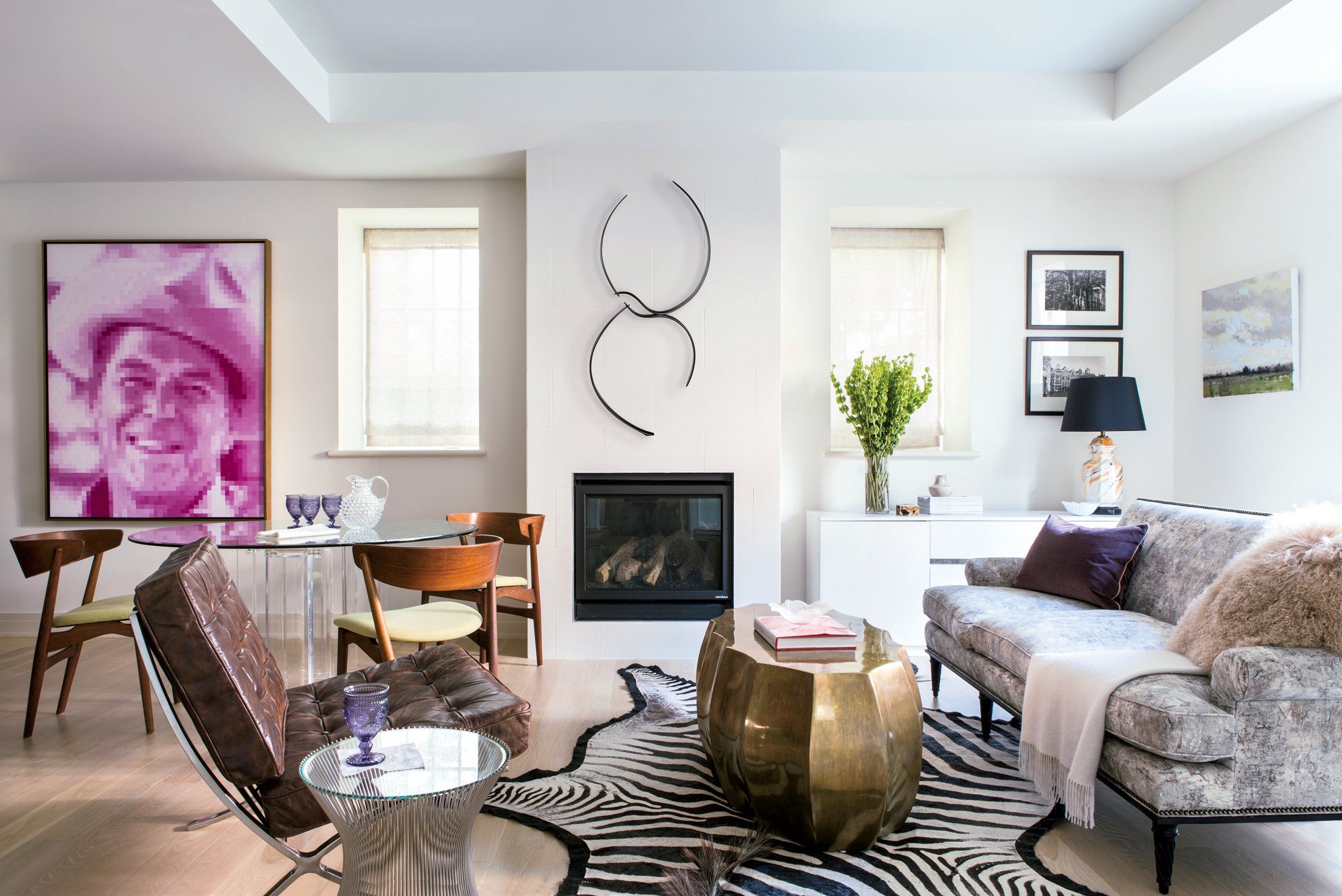
Huntley first lightened all the surfaces, from the floorboards to the kitchen cabinets. “That’s a big thing for small spaces—creating a more consistent envelope so everything’s not so choppy,” she says. When the floors, walls, and ceilings are all the same tone, “the angles disappear and it starts feeling like a bigger space.”
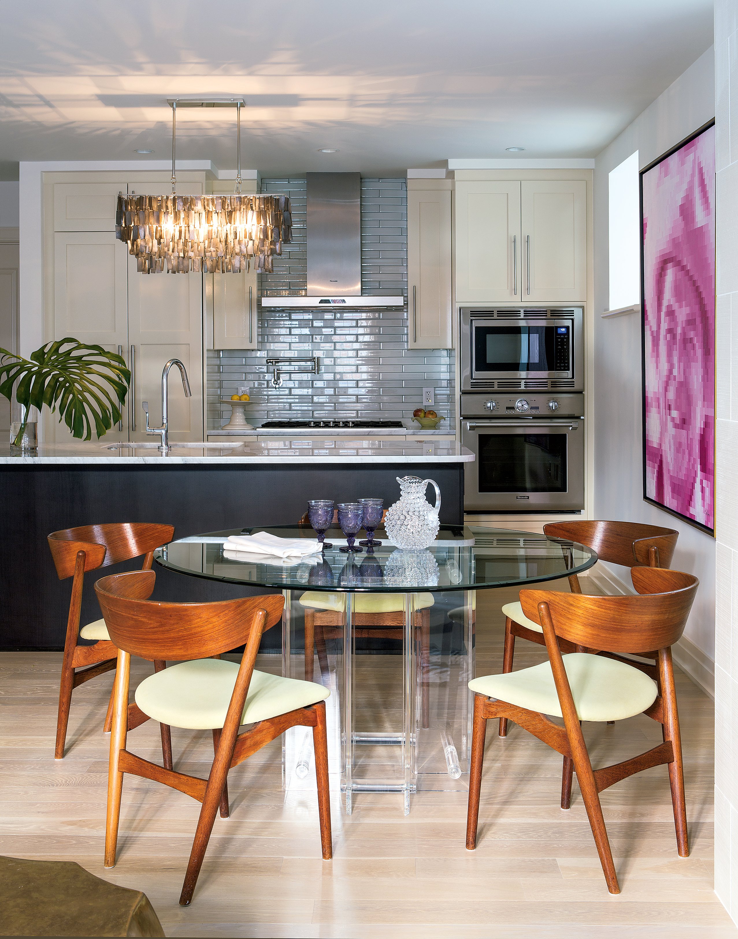
Huntley sacrificed some seating in the living room to accommodate the owner’s beloved dining table and Danish teak chairs. The designer was strategic in mixing weighty and slim furnishings. “Mass versus transparency is important—you want something big with something leggy.”
The theory also applies to lighting, which is why she chose a huge chandelier over the kitchen island: “I didn’t want a lot of little pendants. We have enough little things going on.”
This article appears in the March 2017 issue of Washingtonian.

