I’ve always sternly resisted viewing my bookshelves in the same light as, say, my coffee table or my vanity, two places where useful objects are meant to be cast aside in favor of the aesthetically delightful. While hand-thrown ceramics and an artful collection of glass perfume bottles are scattered with purpose across those surfaces, my bookshelves are kept in strict alphabetical order. Overhang is pushed in above the rows, and an unwieldy stack of unread galleys totters off to the side. This system allows all the Murakami to congregate, and the vast stretch of Virginia Woolf to form my own particular version of her oeuvre.
Bookshelves like mine may now be the last physical domain of the visually unconcerned inhabitant, the final sector in which design aficionados are now pushing to style every aspect of our lives—yet some folks are holding out. Our coffee tables now hold art books and funky matchbooks, not TV Guides and remote controls. Our medicine cabinets aren’t worth peeping into, since they’ve been stripped of their pharmaceutical goodies in favor of elegantly labelled cosmetics acquired specifically for the purpose of “shelfies.” Hell, there are even people who decant every last dry good they buy at Safeway into glass jars just so their pantries are photo-worthy. But while visions of styled bookshelves roll up through my Pinterest feed and unfold across my decor magazines, time and again I enter offices and studies where the bookshelf remains just that: a shelf full of books, packed in there in some personally satisfactory order, with maybe a few silver-framed family photos along the edge.
As a former books editor who perhaps thinks too highly of herself as an intellectual (my first job in journalism was working on the now-defunct books site for The New Republic), even the thought of turning my books from vehicles for thought into decorative objets feels crummy. These books are a representation of my intellectual wanderings: do they need to visually communicate anything to other people?
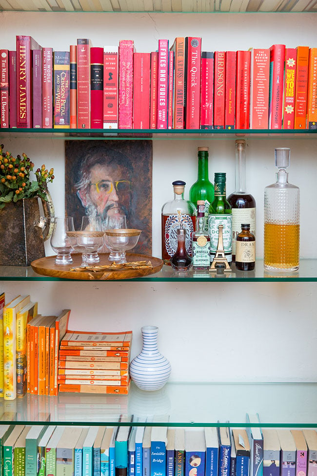
But as an interiors editor, the decision to style a bookshelf makes complete sense: color-coding your books is a clear path to visual serenity. It looks lovely on the page, and it telegraphs the sense of a clean, inviting, well-kept space, as a wordier Hemingway might have put it. Is there anything really wrong with that? The debate has raged for years, though, with design sites like Apartment Therapy defending the sheer joy the rainbow shelf provides and Slate reassuring us that styled shelves are not “a moral failure.” But while I thought that debate has passed. it turns out there’s still a quiet war being waged about the fates of our bookshelves—though most people don’t even know they’re fighting in it.
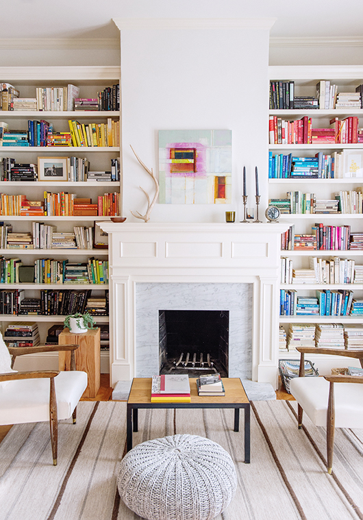
The week before Thanksgiving, while pulling together a photo shoot on organizing that was set to take place in my house, Washingtonian’s photo editors took one look at my bookshelf and informed me that the chaotic, multichromatic vibe I had going on (a.k.a. my books were divided by subject matter and then alphabetized by author’s last name) just wasn’t going to jibe. In person, the system worked beautifully and looked like … a bookshelf. On film it would read as a visual cesspool of tonal clashing and typographical warfare. I needed, the wise photo department declared, to organize my books by color.
I relented to the wisdom of the photo editors (they almost always know best) and dutifully ripped my shelves apart, reassembling them into a rainbow-rific kaleidoscope of pure visual pleasure. The resulting photos were dynamic, if I do say so myself, and accomplished what we sought. I did feel a low hum of guilt every time I received a compliment on the shelves—it felt like I’d been photographed wearing gads of makeup and people were exclaiming how pretty I looked—but shrugged it off.
Then late last week a Twitter commenter (I know, I know: Never read the comments) fired off what I’m certain he thought was a clever one-two punch about the space: “People who organize books by spine color b/c it helps to organize them? Clearly not actual readers.…” People, it seems, won’t hesitate to denigrate your intellect based on the arrangement of your bookshelves.
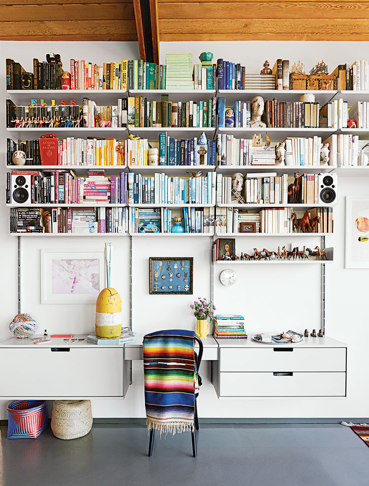
Styling our spaces has become, thanks to humanity’s incessant need to seek image-based approval from our peers via Instagram and similar platforms, a matter of great import to folks in the design world and folks who look to the design world for cues on how to make their lives pretty. Blogger Joy Cho of Oh Joy! wrote just a few days ago about her 4-year-old daughter, Ruby, who “recently starting paying a lot of attention to this one little corner of her room and set it up with a little chair, some pillows, and some of her favorite toys. I heard her saying that she was ‘styling’ it and asked Coco [her sister] to please not mess it up. I had no idea that she even knew the word ‘styling’ but must have heard me say it from work.” The word is now bandied about with such frequency among the design set that 4-year-olds are “styling” their toys.
Really, styling just means “arranging to provide visual oomph,” but with the word’s prevalence comes a whole host of questions about just how “curated” (there’s another one of those words) our spaces, and by default our lives, should be. Is it inauthentic to completely redesign your nightstand for optimal photo-taking or is that just smart thinking about optics? Is our need to “style” every last bit of our spaces—our medicine cabinets, our mug racks, our makeup drawers—preventing us from using the space and interacting with the objects themselves?
When it comes to bookshelves, the questions take on a less functional and more intellectual sheen. The conflict between the aesthete and the critic is an old one (too old for this short bit of reflection to fully analyze). But new, social-media-driven fears about the slow trickle of the artificial into our homes are broadcast entirely onto the our shelves. The bookshelf, critics seem to imply, should be a place where intellectuals can catalog their cognitive accomplishments, where objects are placed to telegraph the interior lives of their owners, and not the superficial trappings of a well-designed home.
But really, that’s its own sort of costume—that of the harried intellectual, too busy madly scribbling in some marginalia to worry about the physical state of his surroundings, or too concerned with wowing visitors with the breadth of the titles on the shelf to consider the color of their spines. The libraries of yore, paneled in walnut and filled with leather-bound first editions expressed the riches of its owner. Editors’ shelves, heaped high with galleys, are unofficial communiques of power and importance. There is nothing new about the bookshelf representing the reader, and yet in the instance of the color-coded library, the world insists that the representation is one of silliness.
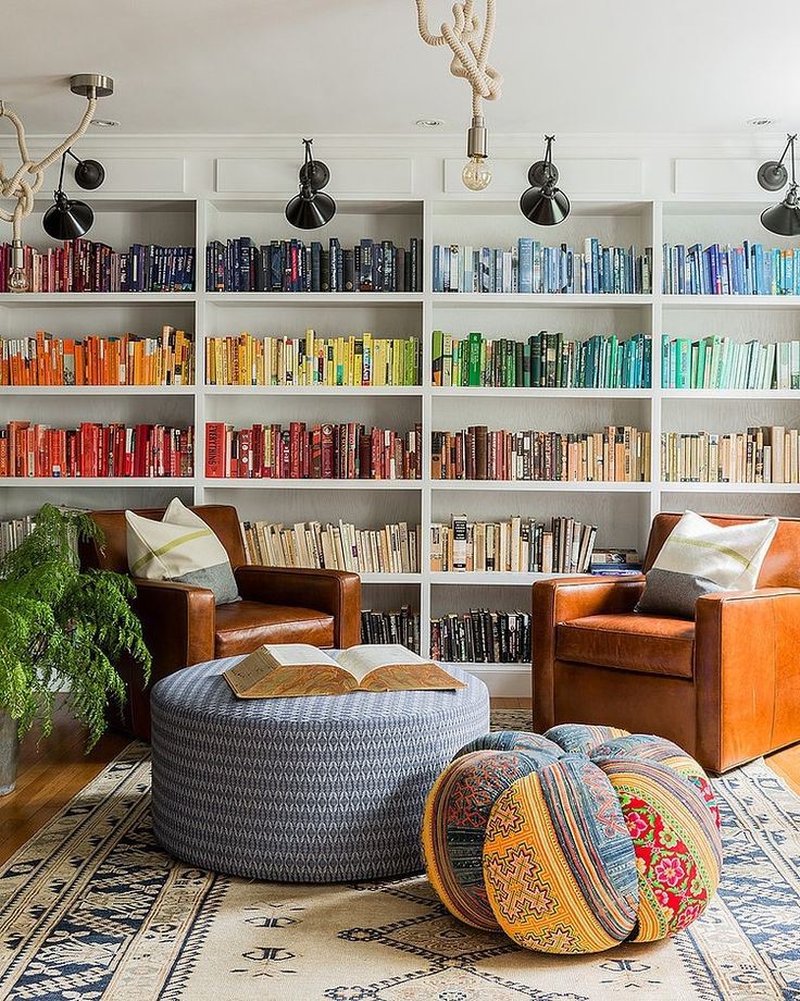
The real crux of the issue can’t be handled by insisting on one’s bona fides (or by pointing out that Michael Chabon prefers his books organized by color, and he’s got a little thing called the Pulitzer Prize for Fiction). That would, after all, only reinforce the point that some people are “actual” readers, and some people are, according to this lovely man and many many others, faking it in some capacity, or simply not taking reading seriously enough to count. Jennifer Weiner and Jodi Picoult and other (often female) fiction writers have fought a long, tough battle for the media to abolish such delineations, between “literary” and “genre,” in writing. Insisting on their right to gain membership to the club was never an effective argument for them, but calling out for inspection of the entire idea that a club should exist—well, that one has gained traction.
So while there certainly are trends in bookshelf decor that might make us a bit queasy due to their sky-high levels of detectable pretension (buying books by the yard, for instance), it’s time to reckon with the fact that there always has been—and always will be—artifice in how we display what we read. That’s not a bad thing. And the visually focused artifice doesn’t tower over the intellectually focused artifice as some sort of greater crime. We’ve been fanning our New Yorker subscriptions for decades and hiding the self-help books in the closet for years. We control and corral and arrange what we own into little collages of ourselves. Color-coding is just another method for that beautiful madness.
Post-shoot I returned many of my books to their natural order, but left a vibrant red stripe of spines in place. I’m particular enough—or nerdy enough, however you see it–to know which books are the red ones: Sebastian Faulk’s Birdsong, for instance, along with my copy of A Tale of Two Cities and Umberto Eco’s The Name of the Rose. I wouldn’t have trouble finding titles I needed, and meanwhile the books could pull double duty, livening up my living room.

