Campaign logos do more than serve as visual identities—they should convey a sense of change that will power a candidate over the finish line. A crowded field of people hopes to challenge President Trump next year, and a simple logo won’t help anyone stand out.
“Not even Obama could run as Obama now. It would have to be a completely different approach” a Washington-based branding expert tells Washingtonian. (The person spoke on the condition of anonymity in order to be candid.)
We asked this person to critique some of the current contenders’ logos. One note: It’s typical for designs to change slightly as candidates and their campaigns grow, the source says.
Julián Castro:
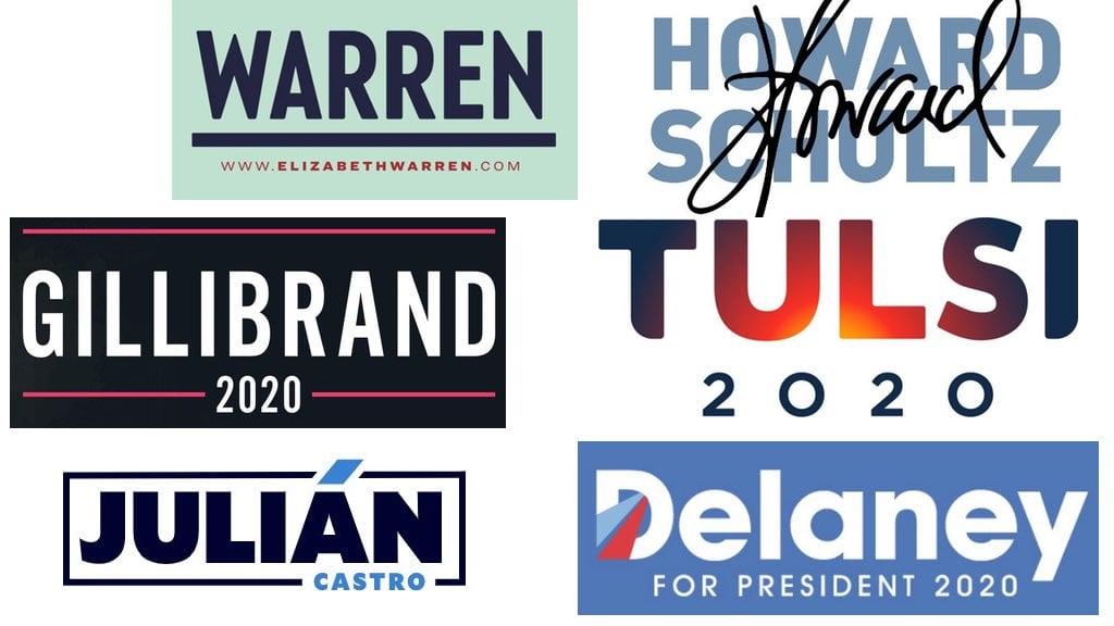
 “I think there’s been a debate over a number of years now whether to use first names, or first names and last names, or just last names for candidates. In general, [using first names has] been a trend that’s more associated with women; make of that what you will. I think the decision to use [Castro’s] first name is obvious in that it’s distinguishing himself from his brother. I also think the name Castro, especially in South Florida, based on history, would be a challenge. There’s obviously the accent, which emphasizes his Hispanic background in a pretty strong way. Otherwise, I think the colors themselves are fairly conventional and boring. Blue is very, very obvious for a Democrat. Almost excessively at this point. And that color blue in particular is just a bit too sort of delicate and it doesn’t inspire a lot of confidence and weight. The actual type of his name is very strong, and while it’s not wildly impressive, I think it gets the job done.”
John Delaney:
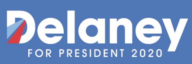
“I think it’s pretty weak. One thing that folks have been trying to do since 2008 is replicate that feeling of Obama’s logo. I will say that it’s a pretty simple shape, but it doesn’t tell me anything about him as a candidate. It just seems like an effort to make a logo mark instead of being something that evokes feeling. Using an initial from a candidate—whether it’s the “O” of the Obama logo, or the “H” for Hillary—is at this point, especially given that our politics has changed so dramatically over the past few years, so painfully cliché. This is too conventional an approach for the moment that we’re in.”
Tulsi Gabbard:
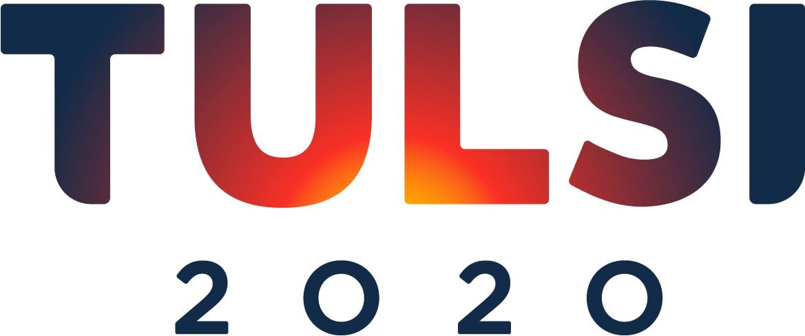
“As a logo object—a set of shapes—this is pretty successful, as it creates an interesting shape while being pretty simple. I’ve heard people jokingly refer to this as the ‘apocalypse logo.’ It’s obviously trying to evoke a Hawaiian sunset or sunrise. But it also inadvertently feels a little bit apocalyptic. For that reason it depends on how something it coming to [the logo.] If someone doesn’t otherwise know her, I think it is very doomsday-ish. If you have that [Hawaiian] context, I don’t think it’s as bad.”
Howard Schultz:
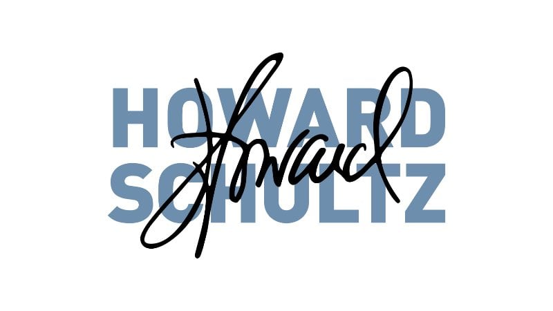
“There’s this joke on Silicon Valley about this billionaire Google-type exec who puts his signature on a product and it creates the shape of something that’s very…embarrassing. It’s eye-rolling to think that this billionaire would think his signature is important enough to actually speak for him. Yes, it’s indicative of putting a name on a coffee cup. That’s kind of funny. Graphically, it doesn’t work at all because it looks like a scramble. Even worse, it’s too similar to Elizabeth Warren’s Senate logo. I don’t think it’s quite as bad as some, but it’s an awkward approach, whereas given the fact that he’s a new politician, he would have been smart to wrap himself in a more conventional approach.”
Kirsten Gillibrand
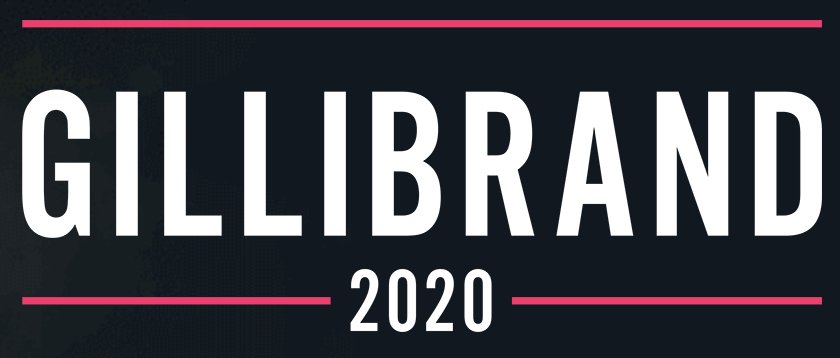
“This is the kind of approach you put together if you’re worried about taking a risk and you’re worried about folks being critical. I think leading with her last name, especially in light of female candidates using their first name, is a confident choice. There’s obviously this trend of sans serif, really vertical, tall lettering. That expresses a certain kind of confidence. Then you saw, even two years ago, you saw folks using lowercase lettering to signal how user-friendly and accessible they are. An example is Marco Rubio’s, where he put his entire name in lowercase lettering, which was sort of diminishing of him in a way I don’t think it intended to be. The typography is very conventional; it strikes me as something that would be perfectly fine for a congressional race. It wouldn’t shock me if this ended up changing in some way.”
Elizabeth Warren
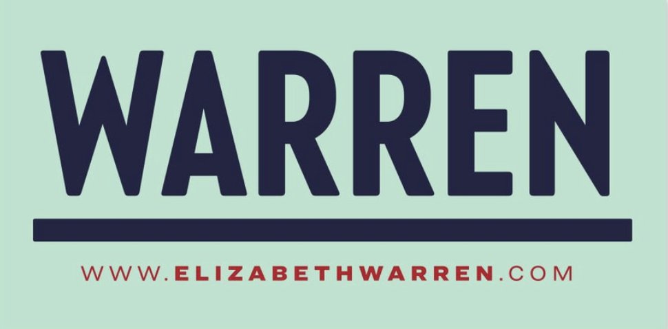 “The typography indicates a more vintage quality, a throwback to the mid-20th century or so, back in a time where the middle class was thriving and actually getting ahead. So it’s evocative of that almost ’40s-era vibe. While everyone uses red, white, and blue, the mint color that was pretty indicative of the Statue of Liberty is also a color in the palette of America. The pairing of those two things are interesting to me. They’re really simple choices, but they’re smart. I don’t think this knocks anyone’s socks off, but it doesn’t rock the boat in either a good way or a bad way.”

