Next month, six Blue and Yellow Line station platforms that have been closed all summer for renovations will open with slip-resistant tiles, USB charging stations, and better information displays. But perhaps their most significant change, as Jordan Pascale reported for WAMU Friday, is a different typeface on the gussied-up platforms pylons.
Who cares about a font change? Only people who know how important type is to Metro’s very identity!
https://twitter.com/eamonwashere/status/1159561411678203904
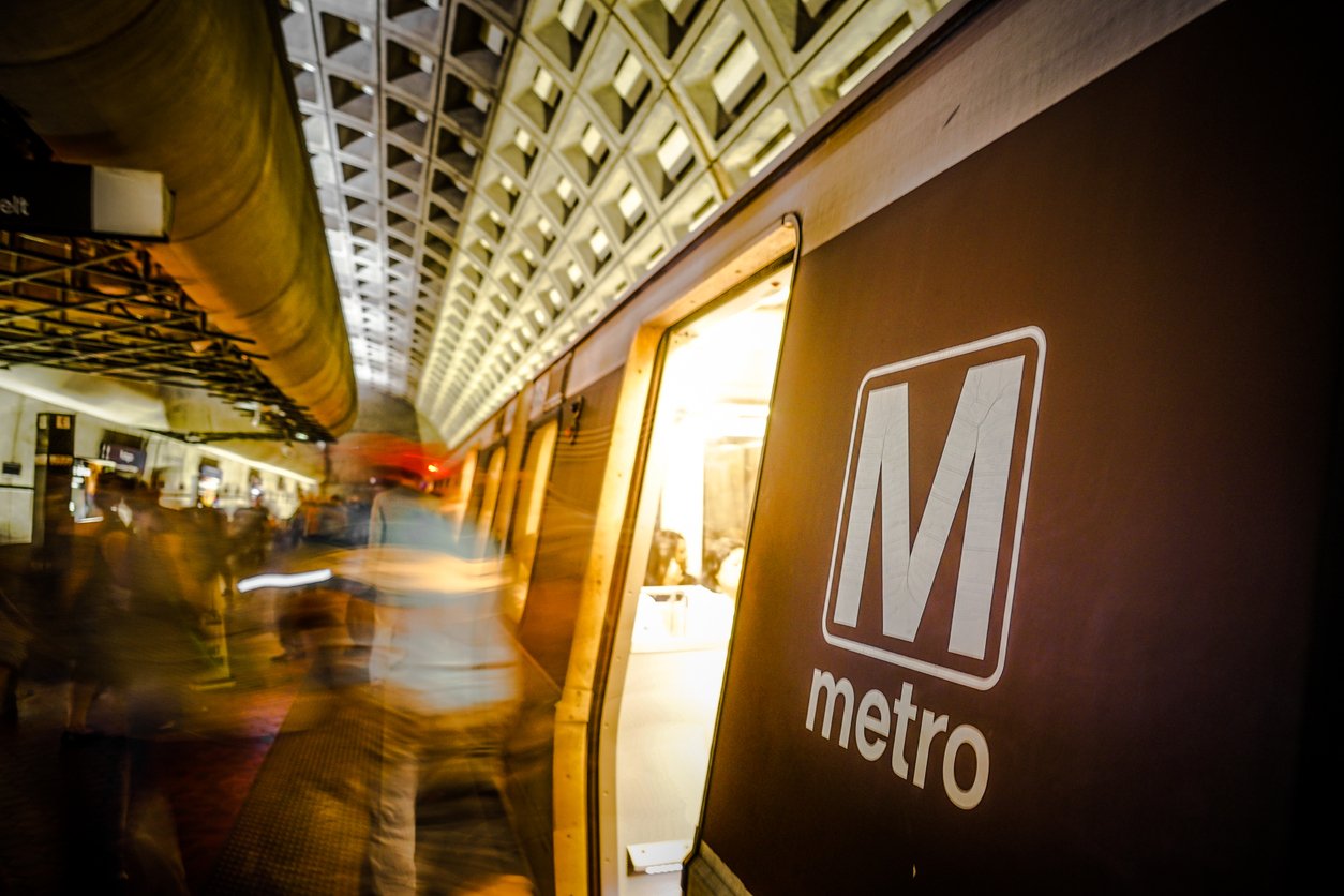
In his indispensable history of Metro, The Great Society Subway, Zachary M. Schrag writes that the Italian graphic designer Massimo Vignelli actually named Metro. (One name under apparently joking consideration was “Federal Area Rapid Transit,” which was “easily abbreviated as FART,” Schrag writes.) Vignelli suggested Metro because it scanned internationally and because “subway” wasn’t quite right for a system that had half of its systems underground. “Along with the name,” Schrag writes, “Vignelli gave Metro a symbol: a capital M in the Helvetica typeface, to be printed, embossed, and emblazoned on trains, stations, uniforms, and pylons throughout the region. Metro had raised its banner.”
“Consistent typeface is a powerful part of our brand language,” Metro’s style guidelines read. the Helvetica Neue font family, the guide says, is a “clean, highly legible font that satisfies a wide spectrum of needs. Besides that, it has been the font used in station signage since the beginning of Metro.” That clean look pervades Metro. It’s on the maps, the wayfinding signs, the towels. (Online, Metro often uses Arial, which is a whole nother can of worms.)
Helvetica Neue’s clean look perfectly reflects the minimalist sensibilities of Vignelli, and system architects Harry Weese and Stanley Allan. Were Metro to include public art, Schrag reports Weese said, “the art is going to be bad art. I can guarantee it.”
Vignelli died in 2014, but R. Roger Remington, who heads the Vignelli Center for Design Studies at Rochester Institute of Technology and was a friend of Vignelli’s for decades, says the new typeface might be Neue Haas Grotesk, a version of Helvetica that received a complete digital restoration between 2004 and 2010. “Massimo knew of the Haas and was using it late in career,” Remington tells Washingtonian in an email, sending along a mockup of the words “Van Dorn Street” in the Haas.
So why change a typeface so deeply woven into Metro’s history and visual look? Apparently it was a mistake. Thursday’s media tour “preceded Metro inspections that would have flagged and corrected this issue,” WMATA spokesperson Ian Jannetta tells Washingtonian. Jannetta confirms that “due to a vendor error, the platform contractor installed signs that use “Helvetica Black” typeface, rather than “Helvetica Bold,” as required by Metro’s signage standards. It will be corrected at no cost to Metro.”

