
This charming bungalow in Arlington was already spacious and inviting. But when the homeowners decided that they wanted a larger kitchen, more storage, and an elegant entryway, they really brought things to a Marie Kondo-approved level. From the moment you pass through their (lime-green!) front door this house just oozes roominess and easy elegance, in large part thanks to the substabtial overhaul from the McLean and Middleburg-based builders BOWA. With lots of white paint, shipboard siding, and a master cabinet-maker, they entirely opened up their first floor and transformed the way the space is used.
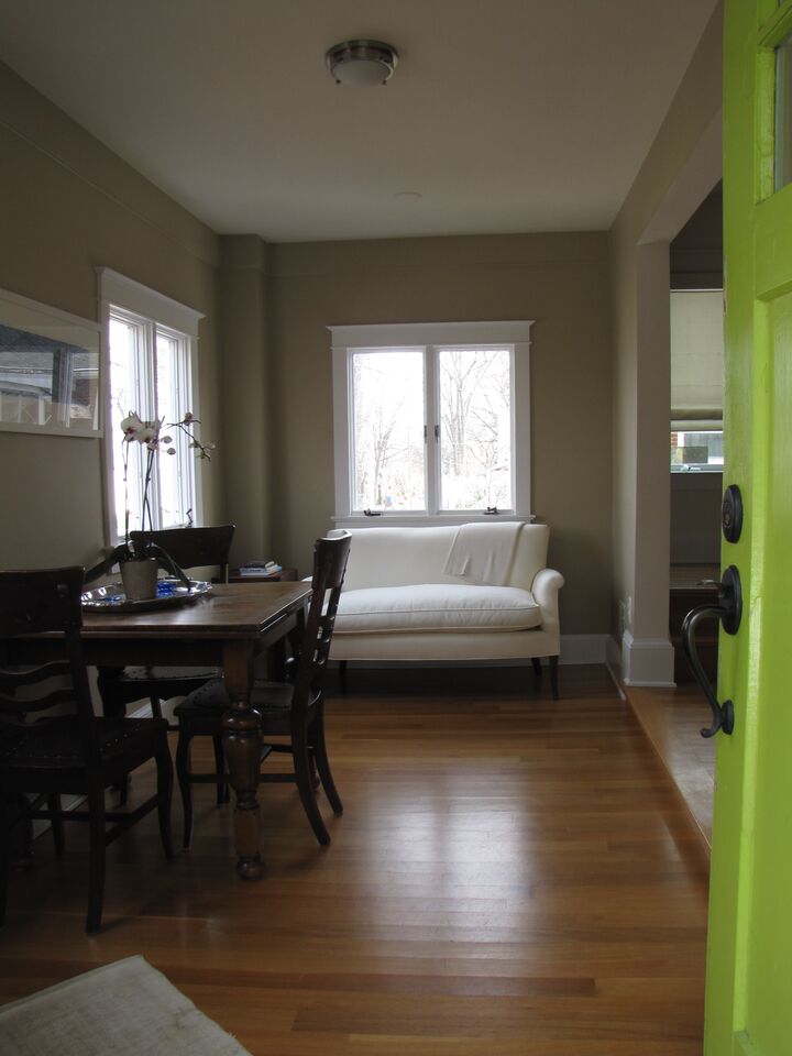
The Entryway: Before
The Entryway: After

In this case, subtracting the dining table made a massive difference in the feel of the room. Now, with the added texture of the shipboard siding and art that references the lime-green door, the walls feel friendly and personal. The chaise makes for a comfortable spot to sort through the mail, pull on shoes, or even have a cup of tea. And the practical insertion of a stone-tile floor just beyond the threshold means no more tracking wet shoes onto the hardwood. I’m not in love with the pendant light, but it adds some much-needed weight to the setup.
The Kitchen: Before
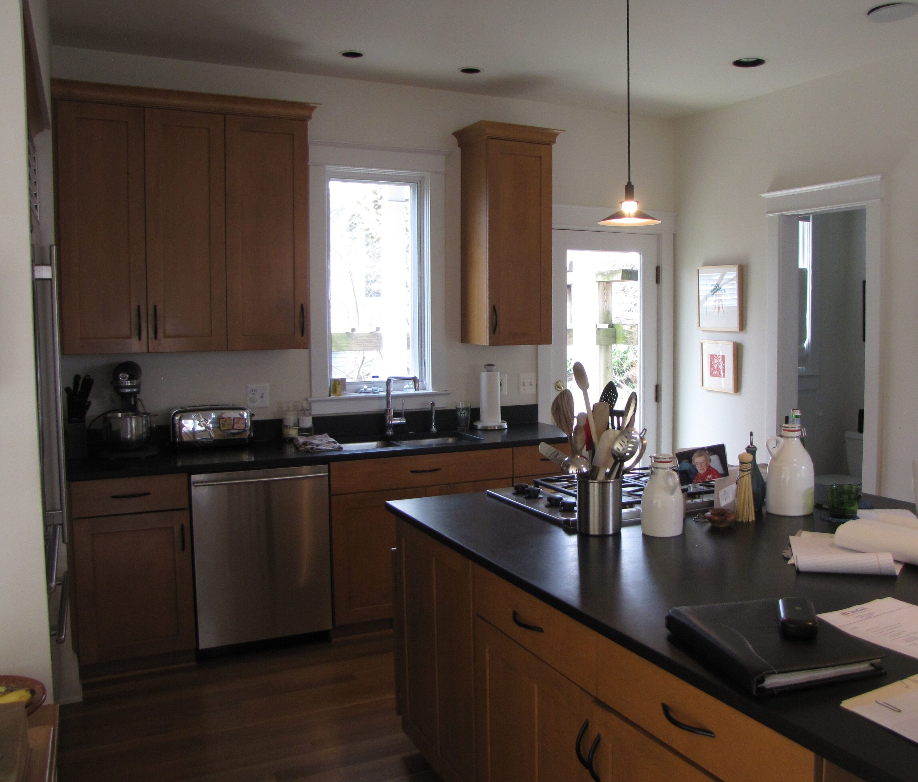
Though only moderately out of date, the kitchen felt much smaller and darker than it needed to. And check out that sad little light hanging above the stove–hardly enough to cook by, and awkwardly alone. The island boasts quite a bit of room, but lack of storage means it’s covered with bottles and tools. Worst of all, there’s no real design to the room. It just is.
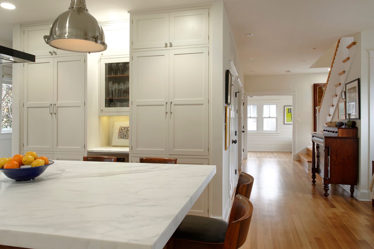
The Kitchen: After
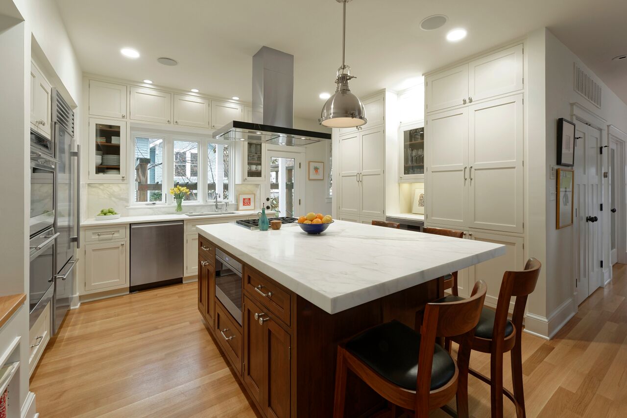
Three huge changes had the biggest impact: swapping out the black countertops for white marble completely lightens the mood of the room, the addition of two more windows above the sink opens the kitchen to the outdoors, and the relocation of the powder room allows for a long wall of cabinetry and tons more storage. The change from overly warm-toned cabinets to a Shaker-esque design with pale gray paint and slick chrome handles lends a modern architectural feel. A hood and shiny chrome pendant hang above the mahogany island, which anchors the space. And while the bar stools read a little too pub-y, they provide a nice spot for a friend to chat while the homeowners chop and cook.
The Built-in Desk: Before

Crowded, dangling off the edge of the kitchen, and shoved underneath a glassware cabinet, this built-in looked too uncomfortable to get much done. Plus that sad office chair just had to go.
The Built-in Desk: After

Relocated to another part of the first floor, the desk finally has some room to breathe. And while the space still needs some finishing touches–a rug and some greenery, perhaps–it’s easy to see how far it’s come. The addition of plenty of drawers means files and papers are tucked out of sight, and the custom shelving has room for books, art, and family photos. And they ditched the sad office chair!
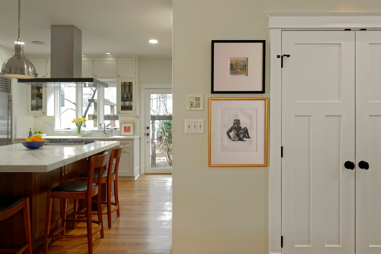
More Angles:


Hillary writes about interiors, real estate, arts, and culture. She is the former digital media editor of The New Republic, and her work has also been published in Glamour, The New York Times Book Review, and The Washington Post, among others. You can follow her on Instagram @hillarylouisekelly or on Pinterest @hlkelly.


