For the average Microsoft Word user, there are two rules for choosing fonts: write everything in Times New Roman, and avoid Comic Sans.
Some can tinker with this first guideline—Helvetica and Lucinda both look similarly sleek and professional—but the second one is unwavering. Comic Sans is the Nickelback, the Ishtar, the eating-pizza-with-a-fork-and-knife of typefaces. If you dare use it, your credibility is gone—just ask Cleveland Cavaliers owner Dan Gilbert, whose bitter, unprofessional open letter to LeBron James after James signed with the Miami Heat in 2010 is only remembered for the fact that Gilbert wrote it using Comic Sans. Forget the part where he exclaims “THE CLEVELAND CAVALIERS WILL WIN AN NBA CHAMPIONSHIP BEFORE THE SELF-TITLED FORMER ‘KING’ WINS ONE” or the $100,000 fine he received after posting the letter to his team’s official website. Gilbert’s rant lives in infamy for his selection of a font most associated with lost pet signs and homemade “Get Well Soon” cards.
But Comic Sans’s status as a universal signifier of bad taste is undeserved. Consider its origins: Comic Sans was created in 1994 by British typeface designer and then Microsoft employee Vincent Connare to be “the font of the common man.” Connare, who also invented Trebuchet MS, wanted to eschew the rigidity and symmetry of most fonts in favor of something that resembled handwriting and all its imperfections, serving as an easy, approachable entry into the world of computers for people who had yet to take the digital plunge. “It was designed for the home market,” Connare says. “It was geared for moms, dads, and kids.”
The coming-out party for Comic Sans was supposed to occur in early 1995 with “Microsoft Bob”—software that gave new computer users a simple, accessible interface to try, featuring a “family room” setting with clickable pieces of furniture to represent the different Microsoft icons—but Connare didn’t finish it in time. Instead, Comic Sans debuted in Microsoft 3D Movie Maker as the font for speech-bubbles.
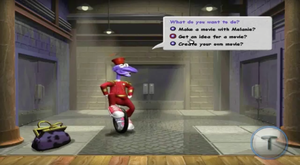
Then, its presence began expanding. It became the standard font for the OEM version of Windows 95 and then a default choice for Internet Explorer 3.0. Connare also started noticing his less-technologically-adept Microsoft colleagues—specifically administrative assistants, he says—using Comic Sans in their emails, which really opened his eyes to the appeal of his creation.
“That’s when I first realized that people liked this,” he says. “Regular people, people that are not typographically aware, really like this because it’s not the school-book typeface they’re used to. It’s something different. It’s like their handwriting. It’s not what they read in a textbook.”
While there’s no singular spark for the cultural aversion to Comic Sans, it probably has something to do with early internet elitism. According to Pew Research Center, only 14 percent of American adults were online in 1995. Yet five years earlier, Pew found that 42 percent of American adults said they used a personal computer. Still, only a small slice knew how to search on a browser, send an email, or connect with someone in a chat room.
That’s important if you consider the main audience for Connare’s font: computer novices. If you relied on a “Microsoft Bob”-type interface to learn how to navigate digital programs and software, then you probably had no part in helping shape the future of the internet. You probably were just beginning to send emails, maybe using Bob’s $5-a-month service, which included 15 sent emails per month.
By contrast, the people driving the dialogue and the scope of the internet at that time were using relatively complex technology that fairly repelled new users–bulletin boards, Usenet groups, TCP/IP setting panels. For those people, an email from Grandma in Comic Sans would only exacerbate the feeling that she hadn’t worked as hard as they had to be online.
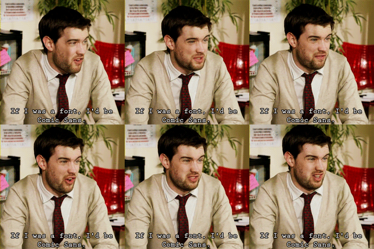
Really, at the heart of Comic Sans hatred is a crisis of authenticity. The font’s visual imperfections are well-documented; writer and neuroscientist David Kadavy writes that “…by virtue of its handwriting-based style, [Comic Sans] has a tilted— incidentally “Venetian”—eye to its “e” giving it both a small eye, and a large aperture. Since there is no stroke modulation to Comic Sans, it can’t compensate for this lack of balance and thus utterly fails.”
But our ire cuts deeper. Comic Sans has the word “casual” built in into its technical nomenclature—”sans-serif casual script”—which speaks to its informal yet straightforward nature. There’s nothing sexy about a fourth grade chemistry assignment or a flyer tacked to a public library bulletin board, but there doesn’t need to be. These documents transcend self-awareness. They convey simple messages in which the only goal of the writer is to reach the reader—no sarcasm or aloofness, or what would eventually be known as subtweeting.
This sort of sincerity is an affront to the way many look at the internet. Take the campaign “Ban Comic Sans“—started by graphic designers Dave Combs and Holly Combs—whose manifesto says “Comic Sans as a voice conveys silliness, childish naivete, irreverence, and is far too casual for such a purpose. It is analogous to showing up for a black tie event in a clown costume.” They “call on the common man to rise up in revolt against this evil of typographical ignorance.”
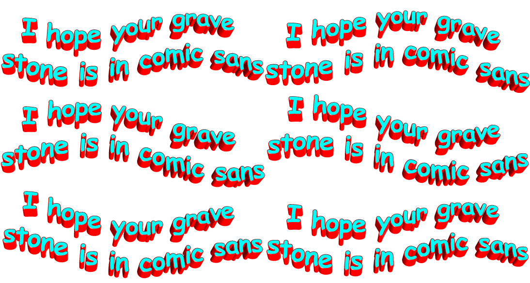
Though their proposed “ban” is more in reference to taste and aesthetic choices in the graphic design world, Dave Combs and Holly Combs’ campaign forgets something important: the “common man” isn’t interested in “irreverence” or the downsides of sporting a “clown costume.” He just wants to spread the word about his missing golden retriever.
And so I propose a way of changing this conversation. Let’s disrupt the culture surrounding Comic Sans. Find it garish and ugly? Fine. But don’t hate it because it speaks a different language than Times New Roman, Arial, or Helvetica. Those fonts court perfection, while Comic Sans is a sweet simulacrum of handwriting, an ever-less common part of life. Comic Sans is friendly and approachable because it echoes a form of communication that can’t help but show the sentient being behind it.
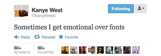
The hardest place to convey the emotions and intentions of such beings, though, is also the place where we spend most of our time: the internet. Think about Twitter, for instance, which is pure emotional incarceration. You can’t pick your typeface or your type size. You can’t bold, italicize, or underline. You can only write in 140-character chunks. If you’re using it as a platform to tell people about the death of a loved one, you’d be sharing textual formatting with someone ranting about Game of Thrones.
What does that leave us with? Smaller forms of rebellion—like sentence structuring, spelling, and slang. But these rebellions are nonetheless revealing. One way to look like a human on Twitter is to use all lowercase letters and no punctuation, a run-on sentence style that linguist Gretchen McCulloch calls the “the opposite of shouting” in a Huffington Post article by writer Mallika Rao. It’s informal and stream-of-conscious, like taking notes. Most important it conveys pathos, even though on the surface it may feel “calm and relaxed” or “maybe even non-emotional,” as McCulloch says.
To explain this, Rao invokes the symbol of Doge: a slightly-outdated internet meme depicting the face of a Shiba Inu surrounded by bits of all-lowercase text that read like half-finished thoughts. But Doge’s near-inscrutable phrases—such as “why this happen” and “so scare,” written, of course, in Comic Sans—come from its “quiet despair.” Rao writes “the effect of the mellow formatting on what are often hyper thoughts creates the sense of an animal frozen with emotion, as if on pain killers.” In other words, Doge is bursting at the seams with feelings. Yet, it’s confined to that static, expressionless look.
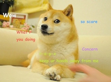
This meme is more than just a viral fad; it’s a brilliant metaphor for the internet. Doge’s face is the unalterable style through which we use Twitter—that steadfast selection of font, color, size, formatting, and character limit. How can we begin to express our true selves if we’re boxed in so mightily?
This is why we need Comic Sans, or rather I need Comic Sans. I need a way of telling people I’m bursting with emotion. As a millennial, I’ve accepted irony as a template for communication, but truthfully, it sucks to be self-aware. It sucks to be aloof. It sucks to cultivate an online persona that doesn’t represent who you really are. But I’m done with being phony. Comic Sans may always be a grotesque joke to the world, however, for me, it exemplifies the only thing I strive to be at the end of the day: human.

