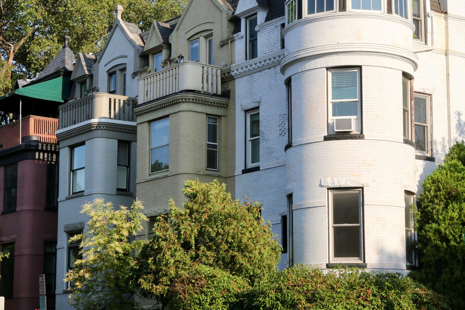
Century-old rowhouses are full of cramped rooms and seemingly useless nooks and niches. Here’s how two difficult spaces—both in historic Capitol Hill homes—became bright, modern, and multi-use.
Finding Purpose
The ambiguous, 112-square-foot space just inside this Eastern Market rowhouse’s front door presented a classic design challenge: It had so many different uses, it had lost any clear sense of purpose.
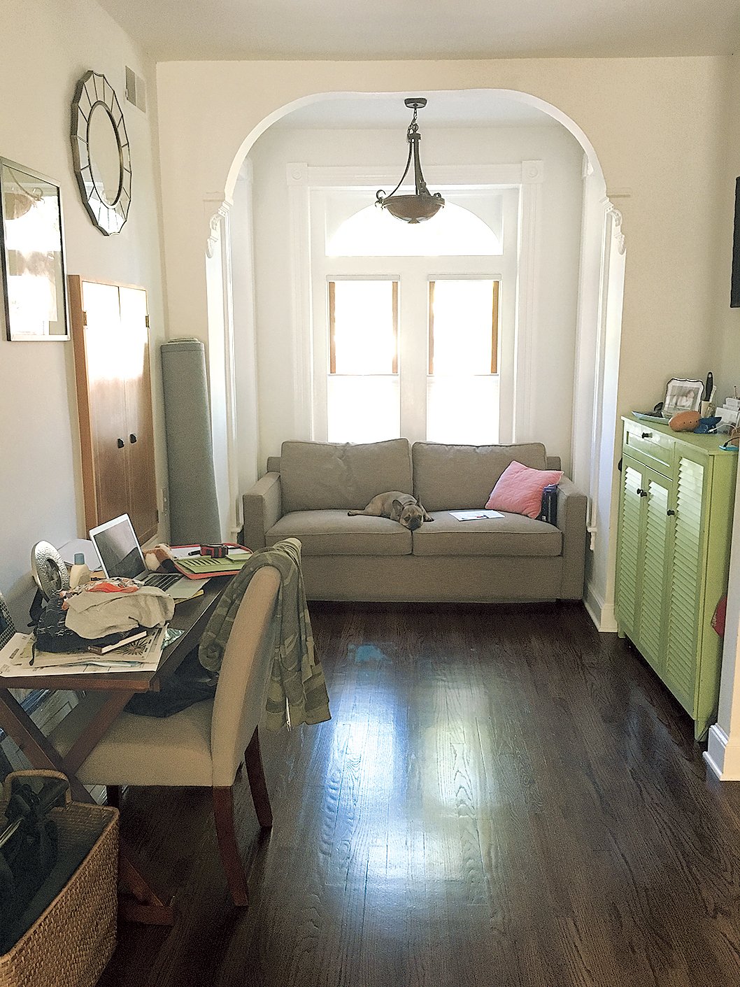
Joelle Ballew and her husband—who have two young sons—used it as a drop zone for bags, coats, and mail on the way to the living room. But they also had added a pullout couch so the area could double as a guest room. Complicating things even more, a built-in bar cabinet on the far wall suggested that the odd nook was actually for entertaining. The Ballews were at a loss. “It was such an awkward space” says Joelle.
Hoping a designer could find a solution, they hired Mary Jo Major. The goal: for the space to have more definition and cohesiveness while still retaining its functionality.
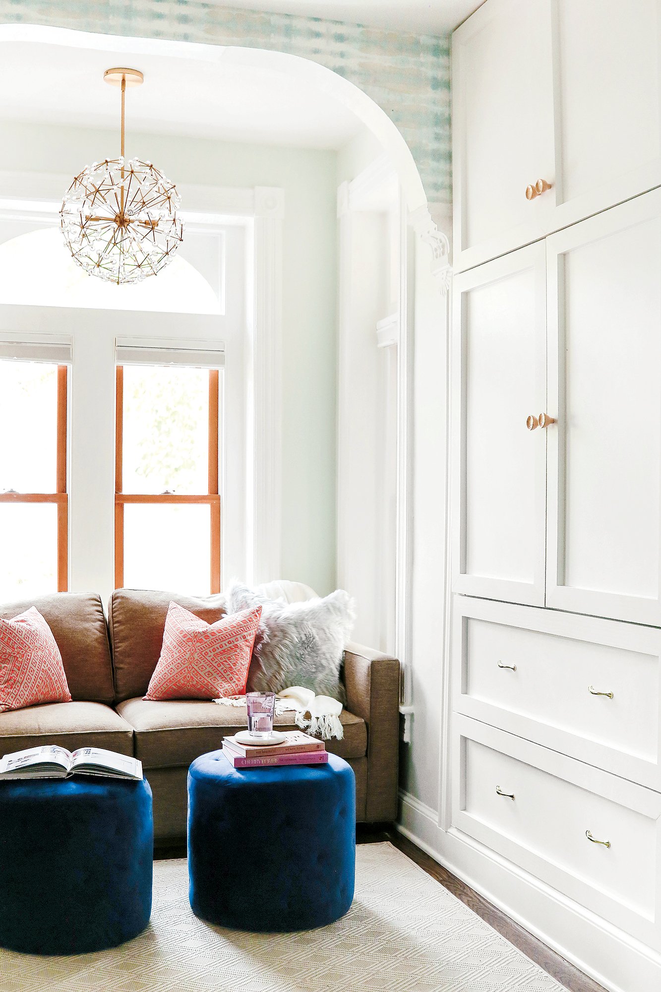
Major’s first task was to custom-design a closet, turning a tricky alcove into hidden storage for coats and shoes. After a debate about the bar—Joelle wanted to get rid of it, her husband wanted to keep it—they came to a compromise: covering it with patterned wallpaper to make it less obtrusive, then adding a mirrored console nearby where guests could mix their drinks. A large abstract print from One Kings Lane gave the room a focal point.
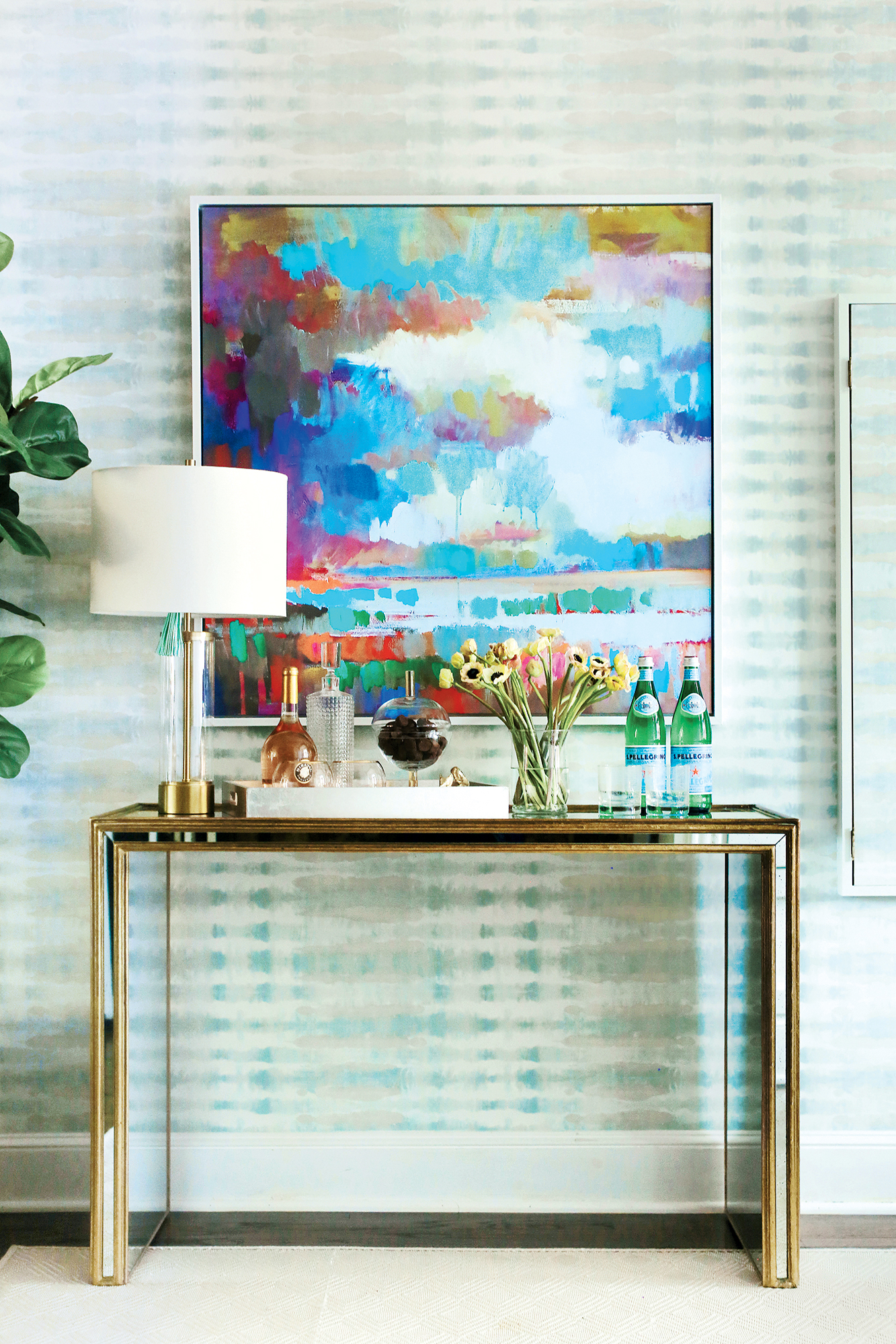
Keeping the pullout sofa, Major added a pair of ottoman poufs, which can serve as seating or be topped with trays and used as tables. When not needed, the poufs tuck away beneath the console.
A large indoor/outdoor rug stands up to heavy traffic and distinguishes the area from the living room. Accent pillows and a stunning brass light fixture from West Elm were final touches, helping create an airy space that’s barely recognizable from its former setup.
Into the Light
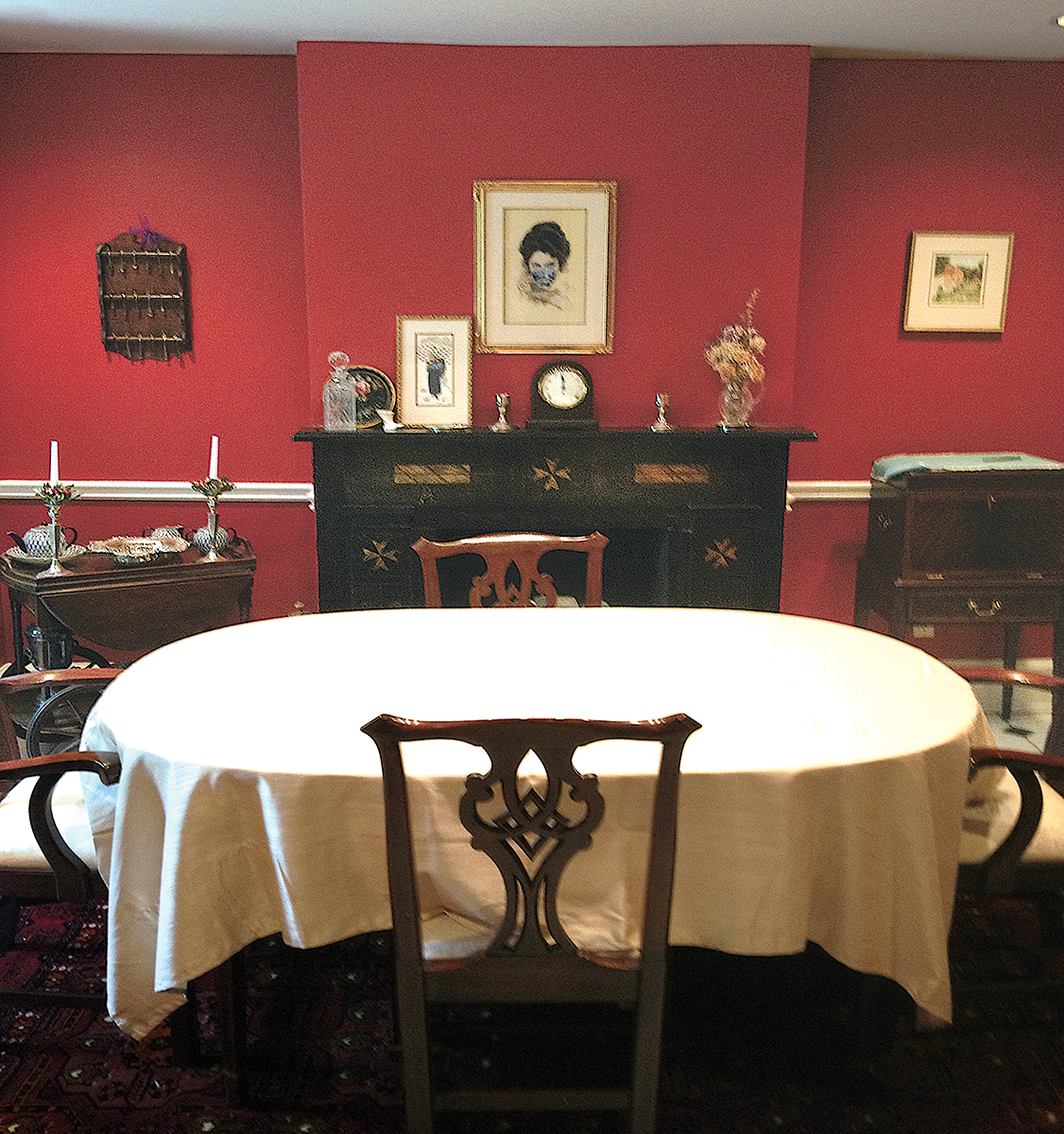
Victorian rowhouses conjure ornate woodwork and dark, formal rooms. Designer Annie Elliott, however, was intent on a new vision for her clients’ lower-level dining area on Capitol Hill.
The space played to the stuffy stereotype, with deep-red walls and heavy furniture. A beautiful fireplace, original to the 19th-century rowhouse, got lost in visual clutter that included white chair rails and dated black-and-white floor tile. “It felt closed, which it shouldn’t have, given the amount of light coming in,” Elliott says.
The designer had already decorated several of the house’s other rooms, and her clients—a retired couple—gave her carte blanche to transform this one. “It had to be a comfortable, multi-use space,” Elliott says. “That was our direction.”
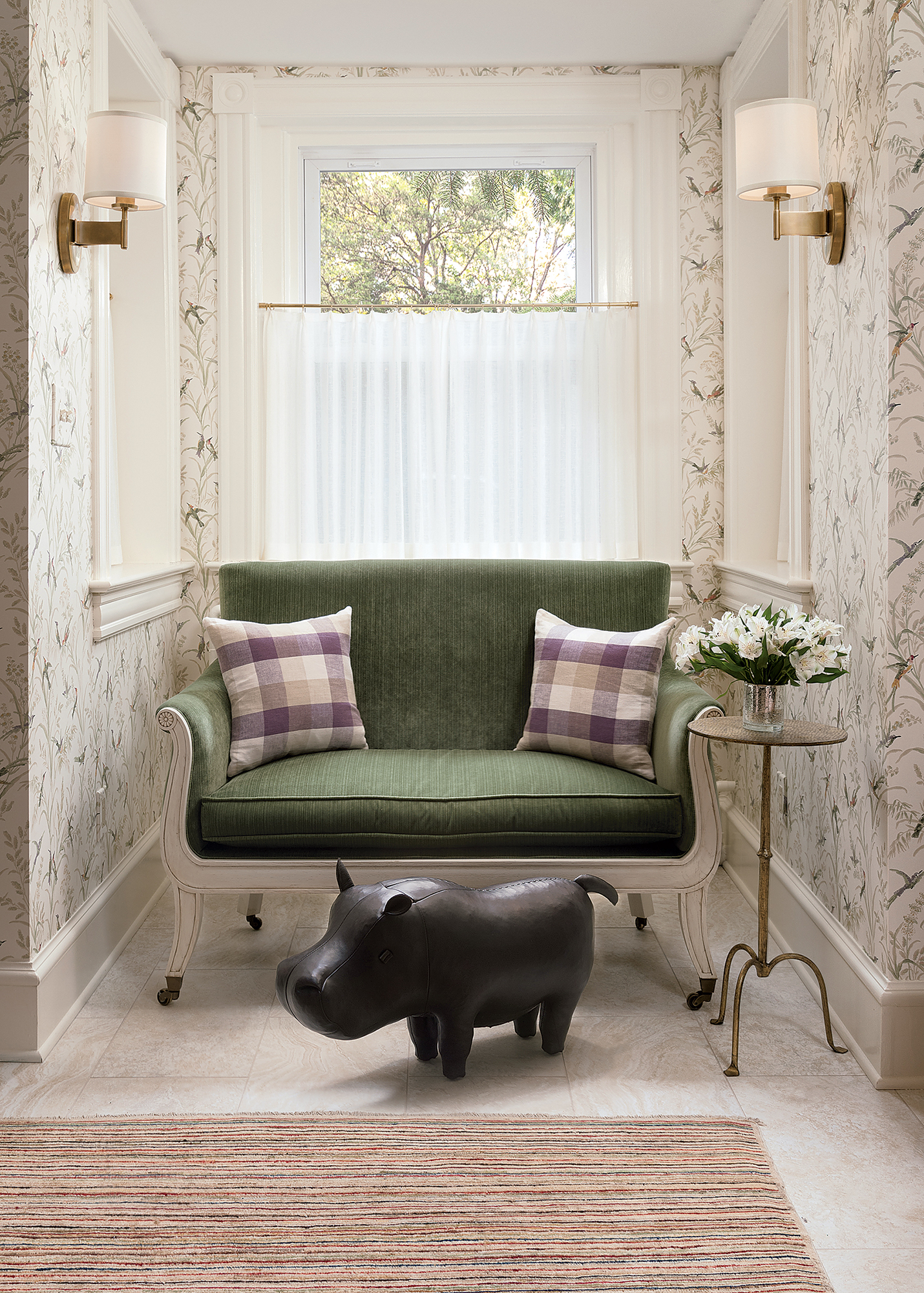
She papered the walls with a fanciful pattern of birds and greenery, pulling inspiration from the English-style garden just outside the windows. New porcelain floor tile, resembling pale, creamy-gold limestone, further brightened the room. Elliot got rid of a bulky radiator cover and eight-inch-deep windowsills in the niche, making room for a plush settee and side table.
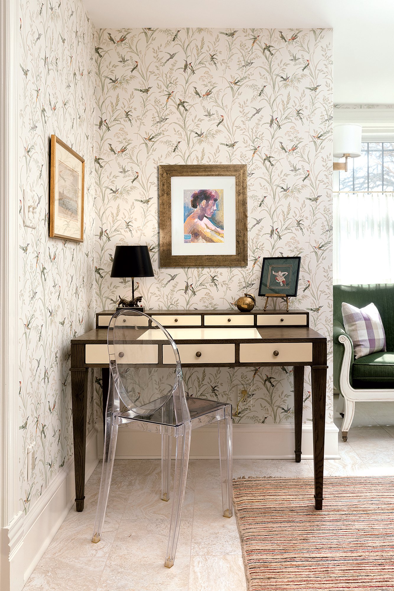
Because her clients wanted the space to fill a variety of roles, she paired a whimsical round table with skirted upholstered chairs that “are not overtly dining chairs.” She also managed to fit in a desk, giving the couple a dedicated spot to work or pay bills, because their upstairs living room and library didn’t have one.
One of the owners’ must-keep items was the large, dark china cabinet. To make it less dominant, Elliott moved it to a wider wall and lined the backs of the shelves with grass cloth. “Without that, the piece was very heavy,” she says. Now the items on display pop from their lighter background.
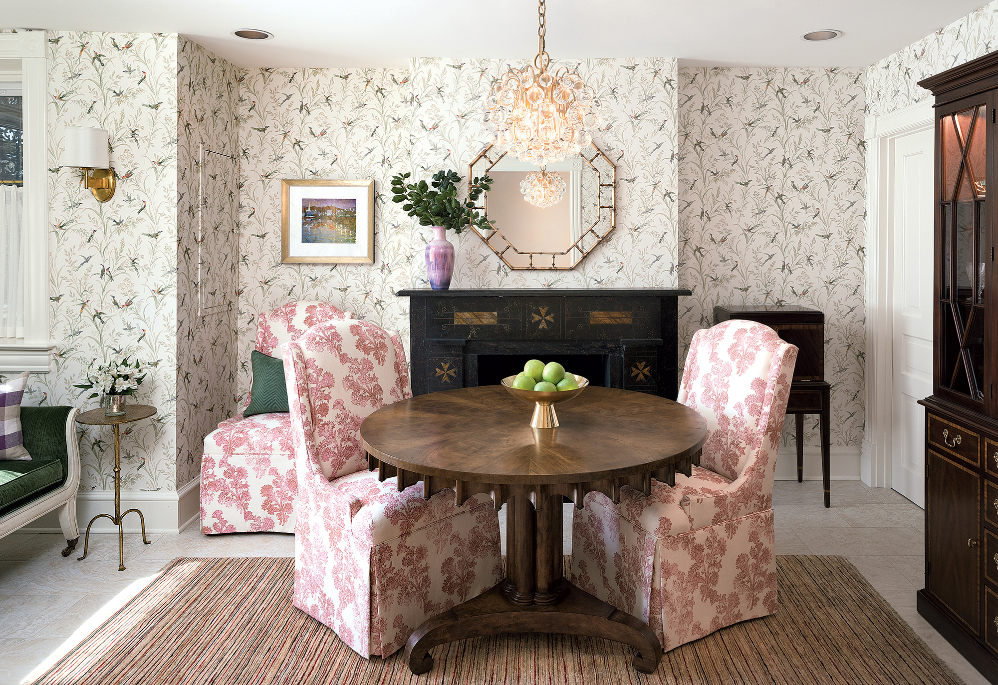
And that original fireplace? The room’s only distinctly Victorian feature is finally the focal point it always should have been.
This article appeared in the July 2018 issue of Washingtonian.

