Mission Control
Two spaces that prove that themed rooms can actually be really awesome.
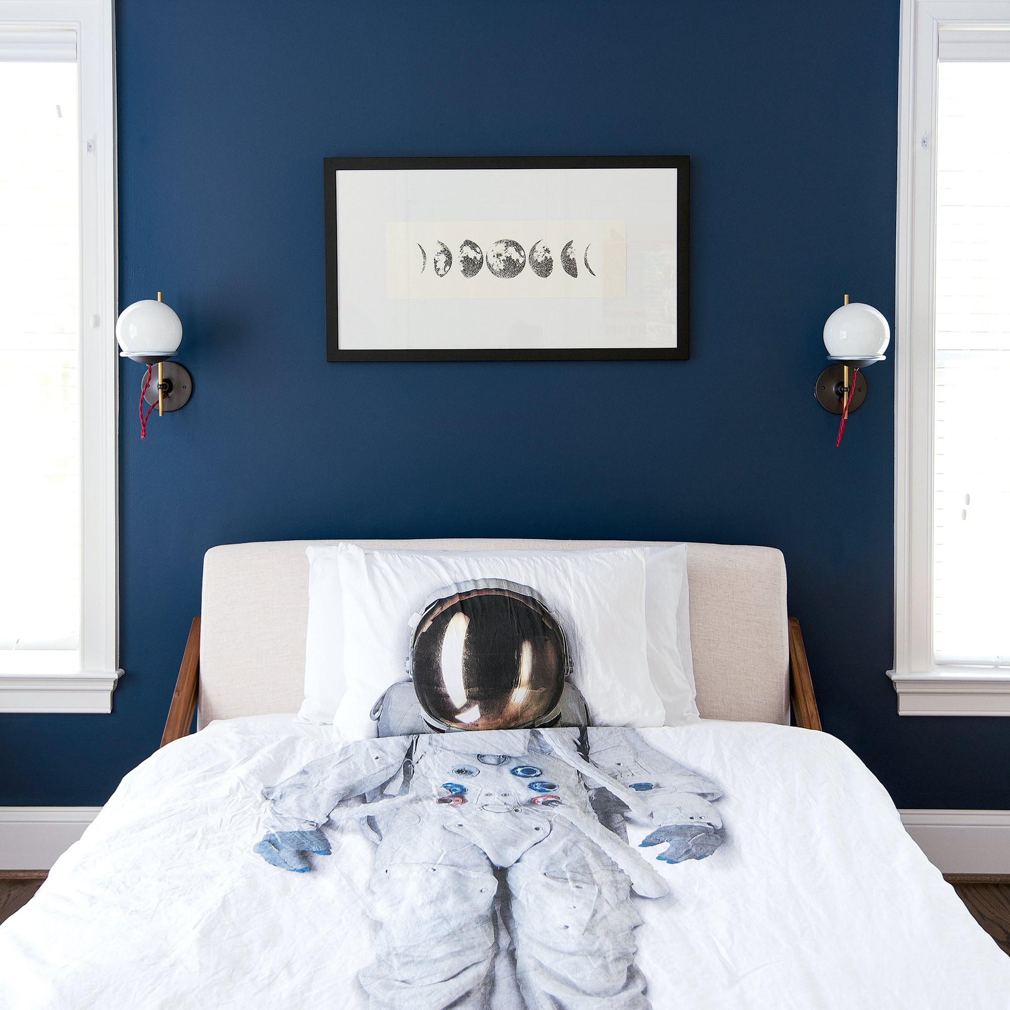
When Lexi and Nirav Patel upgraded to a larger house in McLean, their then three-year-old Jacob also got to trade up to his first big-boy room. Designer Kerra Michele was charged with creating his vibrant, outer-space-inspired haven.
She started by giving the new-construction bedroom some character where there had been none before. “It’s almost like I turned the room on its side and dipped it in that space blue,” she says. “It’s a way to give it a little bit of architectural interest.”
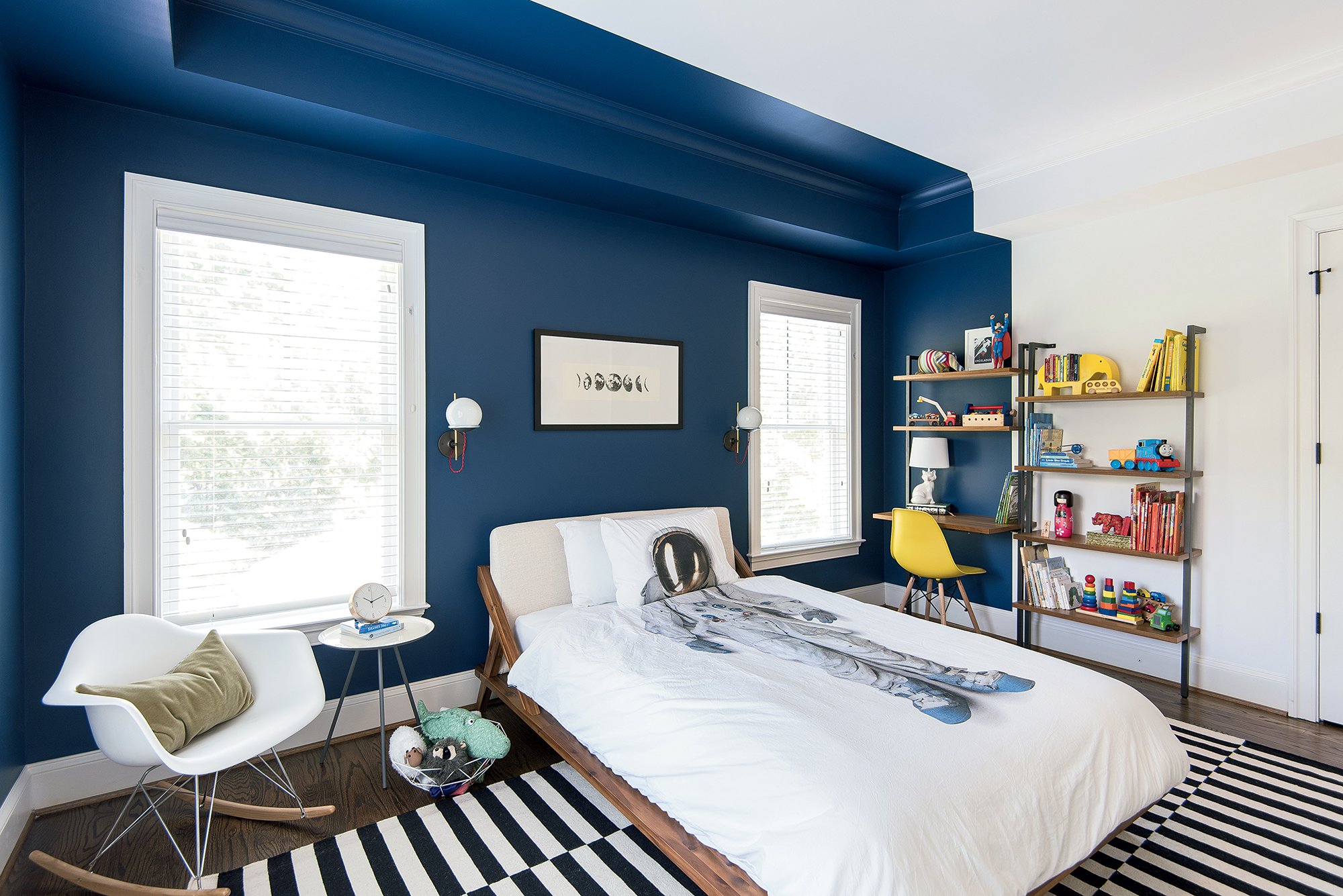
A thornier task was finding good bedding —“nothing was cool enough,” she says. Michele spent days on the internet before landing on Snurk, a Dutch online retailer whose fanciful pillowcases and duvets include the astronaut set that now defines Jacob’s room. Michele also downloaded free images of vintage space-exploration posters from the NASA website, scored lunar-phase block prints from Etsy, and found “spaceshippy” globe sconces from Schoolhouse Electric.
The lights, though, aren’t so otherworldly that they won’t survive beyond the space phase. The same goes for the CB2 bed and the chair, desk, and dresser. “I try to buy furniture from adult stores that could be appropriate for kids to use,” says Michele. “I don’t want the parents to be sentenced to redoing the room in three to five years.” Sure enough, now that Jacob is five, his interests are veering toward cars and superheroes. When the time comes, the bedding and art can be switched out, Lexi says, but the larger pieces “will grow with him.”
Into the Woods
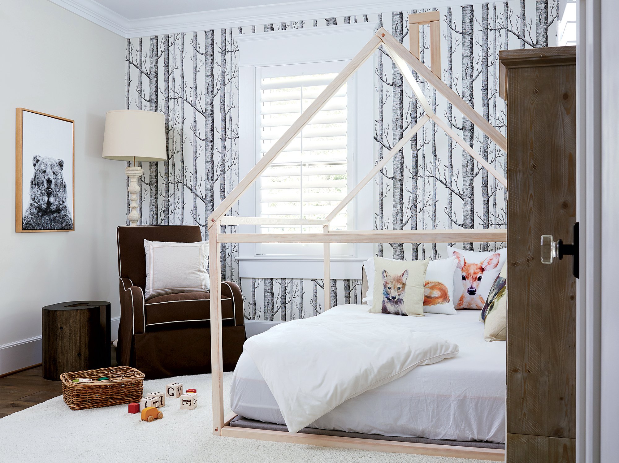
A McLean mom had an unusual request for designer Kristin Peake: Her older three kids had never liked being in a crib, so for her fourth child’s room, she simply wanted a mattress on the floor.
Peake couldn’t accept such a bare-bones solution. “Obviously, you don’t just want a mattress on the floor,” she says. “I was trying to think of something clever.”
The designer took cues from Mom, whom she describes as “very earth/nature/organic.” The client had already identified Cole & Son “Woods” wallpaper as something she liked, so Peake used it to create a feature wall. She then turned a queen-size mattress into a destination, enclosing it with a house-shaped frame of her own design and installing a large custom bolster along the walls.
The project gave her a chance to use throw pillows she’d found at North Carolina’s High Point Market that were hand-painted with woodland animals. She completed the look with a rustic accent table in the shape of a C for the little boy’s name and a dramatic framed photograph of a bear.
All four children love the two-year-old’s unique bed. “They hang out there during bath time and when we’re reading books,” says the homeowner. Noting the room’s neutral palette, the mom adds, “It’s calming and soft—maybe that’s why the kids take to it.” Either that or because they can escape to their own plush cabin in the woods.
Neutral Territory
Inside a Mount Pleasant rowhouse, a lesson in creating a sophisticated nursery for a baby girl—no frilly powder pink needed.
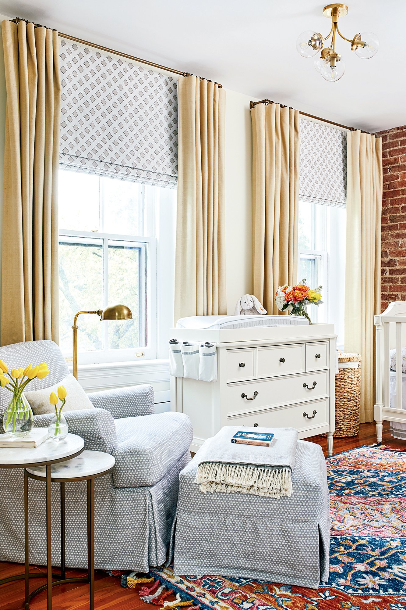
Christopher Boutlier had already been decorating Katie Johnson-Rawlings and Nate Rawlings’s century-old Mount Pleasant rowhouse when the couple found out they were expecting—news that added a tricky task to the designer’s to-do list. They wanted their baby’s room on the same floor as the master suite, which already occupied the entire third level. Also, it couldn’t be too girly. And one more thing: The room had to be able to transition one day into a home office.
Boutlier found a solution by moving the master bath into a huge, windowless closet and turning the sunny, old bathroom into the baby’s room. Sure, it would have been simpler to keep the bathroom as is and make the baby’s room out of the former closet, “but who wants a nursery with no natural light?” he says.
The gut renovation—by Charm City Construction—delivered a pleasant surprise: original brick in the new nursery that Boutlier left exposed. As for the decor, Katie—an attorney whose daughter, Georgia, was born in June—says that although she didn’t want frilly, she did want colorful.
Another priority was ample space for books, says Nate, a speechwriter whose mother was a librarian. Boutlier started with a richly hued rug from Zola. “That, in my mind, was where this color she requested was going to come from,” he says. Then came ledges to display dozens of children’s books and a custom closet with removable doors that can transform into a built-in bookshelf in the future office. Boutlier used tan and gray tones, which run through the rest of the house, for the walls, armchair, and window treatments that will stay once the space becomes a study. “The background is so neutral,” he says, “you almost couldn’t go wrong.”
Transition Zone
Their daughters are close to leaving the nest, so an Arlington couple created an area that works just as well for two as it does for four.
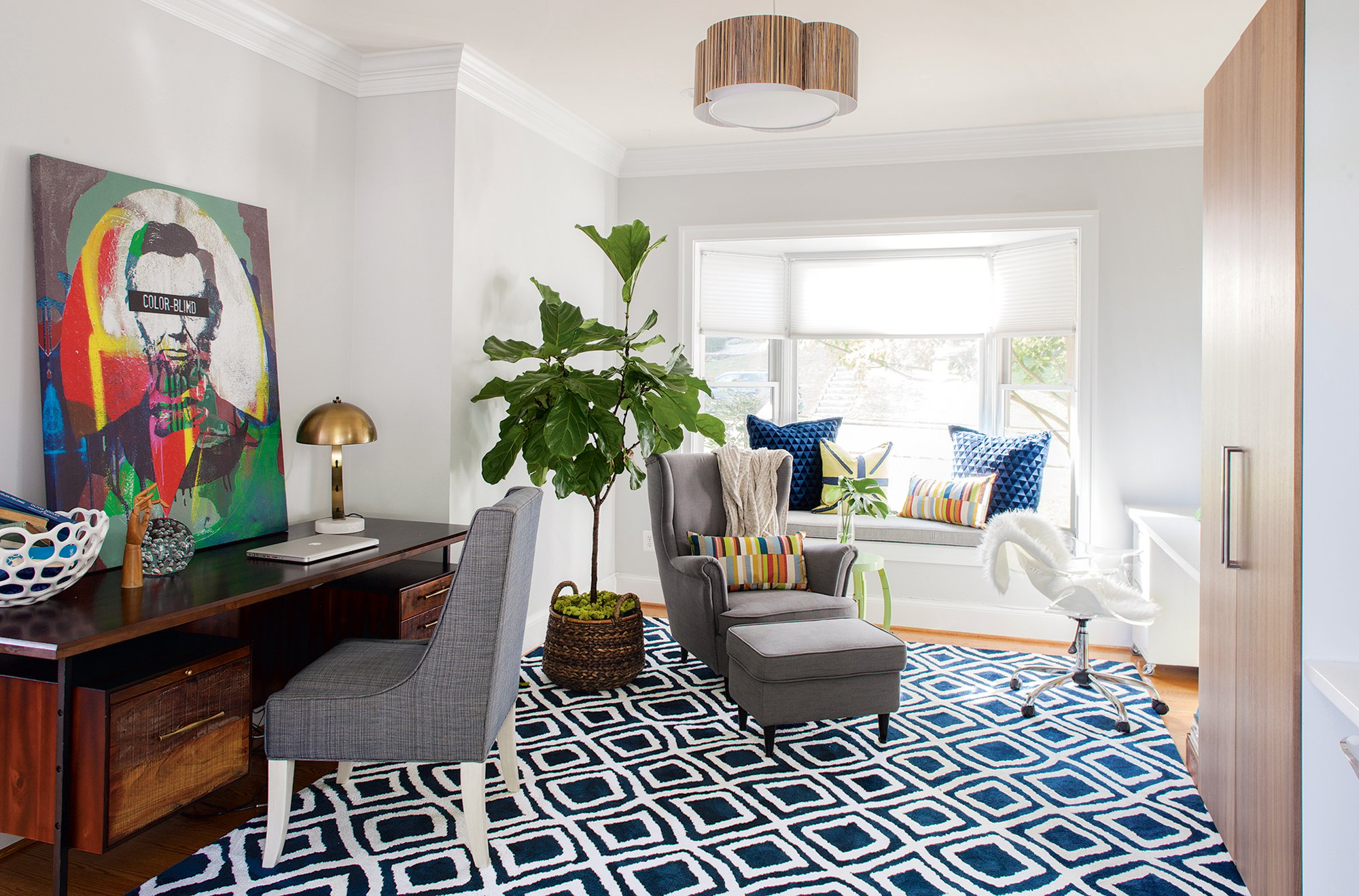
With daughters Julia and Jordan well into their teenage years, Jeff Joseph and Lisa Merman decided it was time to convert their Arlington house’s bonus room from a toy zone into a work-and-play area for the whole family. “Our goal was to create a more sophisticated space that would have a desk for Jeff and still some room for the kids to do homework, with storage for games,” says Merman, who handles communications for the interior-design firm Whittington Design Studio.
Merman selected a tall storage cabinet and two countertops from Ikea, installed to look like a built-in unit but for a fraction of the price. She asked her boss, Melanie Whittington, for help finding a desk for Joseph, who recently started his own public-affairs shop. The desk had to look good on all sides so that when the girls move out, he can float it in the middle of the room, taking over more of the space for his office, Merman explains. Says Whittington: “We went through—no joke—about 50 options” before finding the vintage-inspired model by Four Hands.
The rest of the aesthetic was all about color. A vibrant portrait of Abraham Lincoln that reads color-blind sits on Joseph’s desk. “It has meaning for our family,” says Merman, who is white while Joseph is African-American. Merman chose brightly striped fabric for throw pillows. (“They pull the room together.”) And she and Whittington shopped Crate & Kids for the lime-green floor lamps that rest on the girls’ worktops. “I thought it would be fun to do something really dramatic on the surfaces,” Whittington says.
Teen Dream
A designer and her 16-year-old daughter strike a compromise.
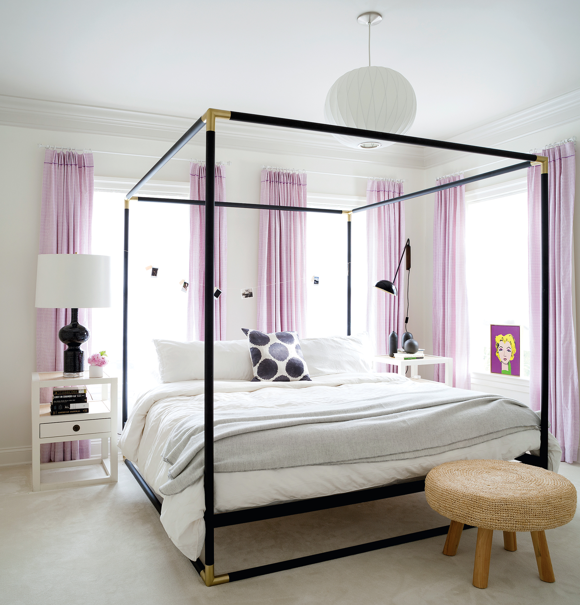
Designer Sandra Meyer takes a benevolent overlord’s approach when it comes to her daughters’ bedrooms: She lets them express themselves—to a point. “I do a lot of convincing my kids that it’s going to be super-cool,” says Meyer, who owns Ella Scott Design. Such was the case when the family moved to a new house in Bethesda’s Edgemoor neighborhood five years ago and she started planning 16-year-old Zoe’s room.
Zoe wanted to incorporate purple, so the violet-patterned drapes were a logical start. Meyer had remade bed sheets by John Robshaw into fabric panels for her daughter’s old room, then gave them new life as the drapes that inspired the rest of the room’s look: “It really all started with those drapes.”
The four-poster bed by CB2 is the other dominant feature. “I love, love, love four-poster beds, but nobody lets me do them,” Meyer says of her clients. “I was definitely doing a four-poster in here.” The designer played off the bed’s black frame with a funky vintage lamp that Meyer has had forever. She added a modern black sconce from CB2 on the opposite side.
Other than the color scheme, Zoe’s contributions include a piece of twine strung between bedposts on which she clips a rotating collection of pictures taken with her Polaroid camera. She also painted the portrait of Marilyn Monroe on a purple background. When they first moved in, Meyer let Zoe have an entire wall painted that color. But six months later, Mom took over and the walls are white once again: “I think we all agree that it’s better now.”
These articles appear in the August 2018 issue of Washingtonian.

