Maryland’s biggest water utility, the Washington Suburban Sanitary Commission (WSSC), recently faced criticism over an expensive rebranding effort. Was the money worth it? Here’s our take on how the logo compares with those of other local utilities.
From Boring to Bold
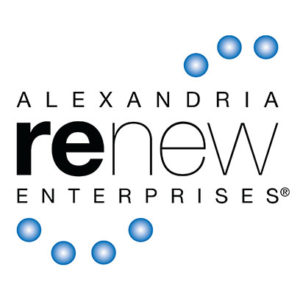
Alexandria Renew Enterprises. The circles are oddly configured, don’t convey much, and make us hungry for blueberry bagels.
WSSC Water. According to the company’s website, the W represents WSSC, water, and “world class.” Whatever.
Pepco. Those familiar rounded letters may not represent cutting-edge design, but they do have a certain retro charm.

Washington Gas. The blue circle and black lettering are pleasingly reminiscent of Saul Bass’s classic Bell System branding.
DC Water. While “water is life” is what your man-bun yoga teacher says at the hydration break, this one looks the least dated.
Logos courtesy of Companies.
This article appears in the October 2019 issue of Washingtonian.

