It Doesn’t Go Out of Style
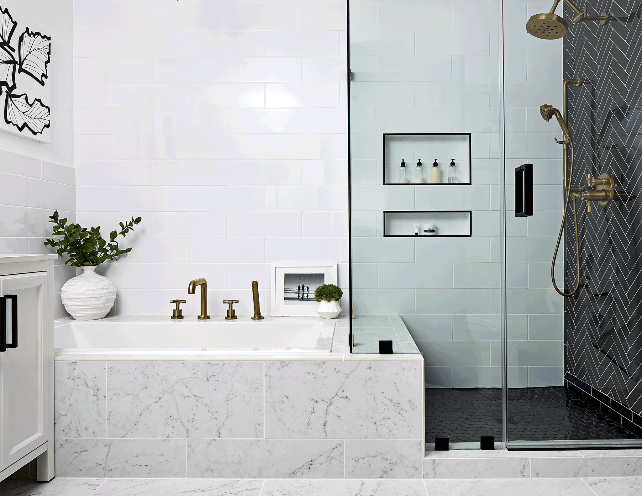
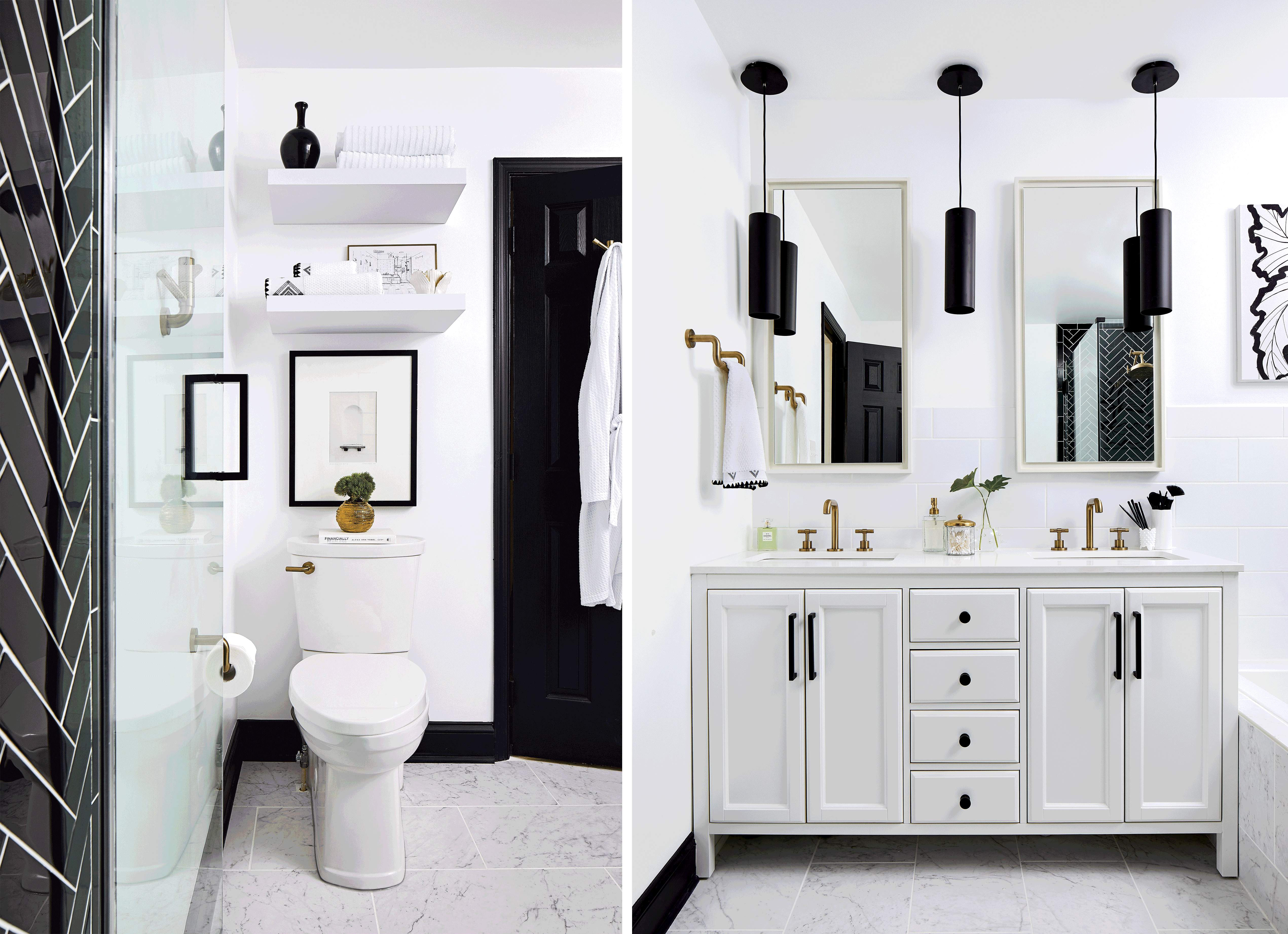
Designer Sallie Finney Kjos sees things in black and white. It’s the foundation for every space in the Chantilly townhouse that she shares with her two sons and that also serves as her office/design lab. “I get bored with colors, but I never get bored with black and white,” she says, especially with pricey investments like kitchens and baths. “You never want to do anything too trendy there. You want to be classic, and you want something you love.”
Kjos’s master-bath renovation is her case in point. White walls, cabinetry, and subway tile set a clean stage for dramatic tile in the shower, plus contrasting black and brass fixtures and accessories. “I’m a huge fan of mixed metals,” she says. “The matte-black hardware and pendants are juxtaposed against the Brizo ‘Litze’ fixtures and the gold light. It adds a lot of interest.” For a final touch, Kjos, her sons, and her boyfriend each painted a black leaf on a white canvas that hangs over the tub, further personalizing the luxe retreat. “I love my bathroom,” she says. “I love it every day.”
It’s High-Impact
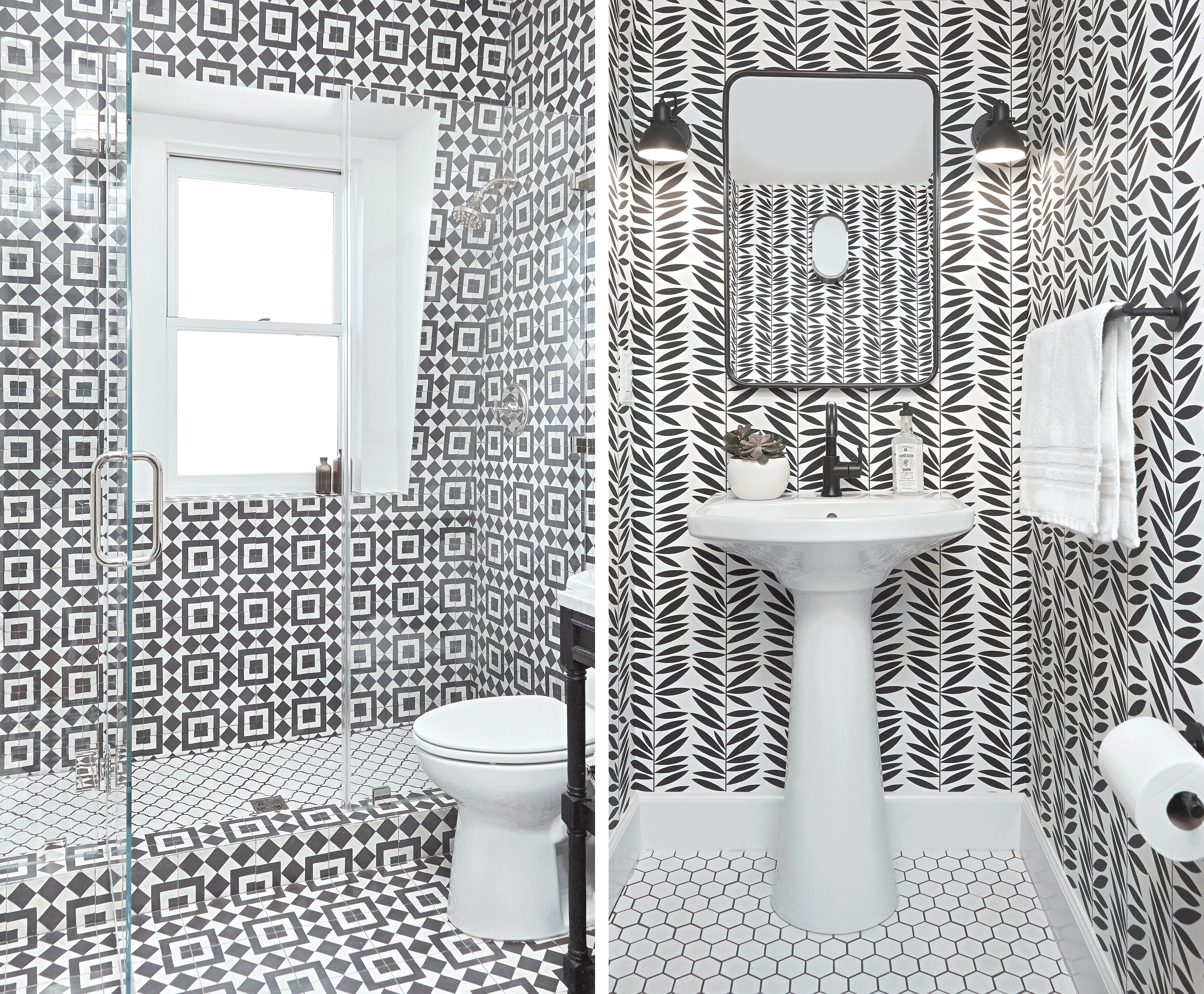
What to do with a bathroom that’s mainly for the kids but serves double duty when guests are in town? “I wanted to do something a little more experimental,” Sapna Mehta says of the third-floor bath in her and husband Andy Grimmig’s Kalorama rowhouse. “I wanted it to be fun but without looking like a kids’ bathroom.” Mehta searched for the right kind of graphic tile while DC architect and designer Carmel Greer was working on their whole-house renovation. Mehta knew she’d found “the one” when she hit upon the Moroccan-inspired “Fez” pattern by Granada, a company that manufactures concrete tile: “Given that the pattern was so busy, I wanted to stick to black and white.”
Greer continued it all the way up the sloping shower wall for added effect. “I always take tile up to the ceiling—I never stop it short,” she says. “I like anything bold in a small space. It’s never going to be large, so it might as well be exciting.” Greer finished the design with a simple open-shelf vanity and a mirror in a black finish. Says the architect: “There’s something about black in a bathroom that always feels crisp, because it can’t yellow or fade.”
It Has Universal Appeal
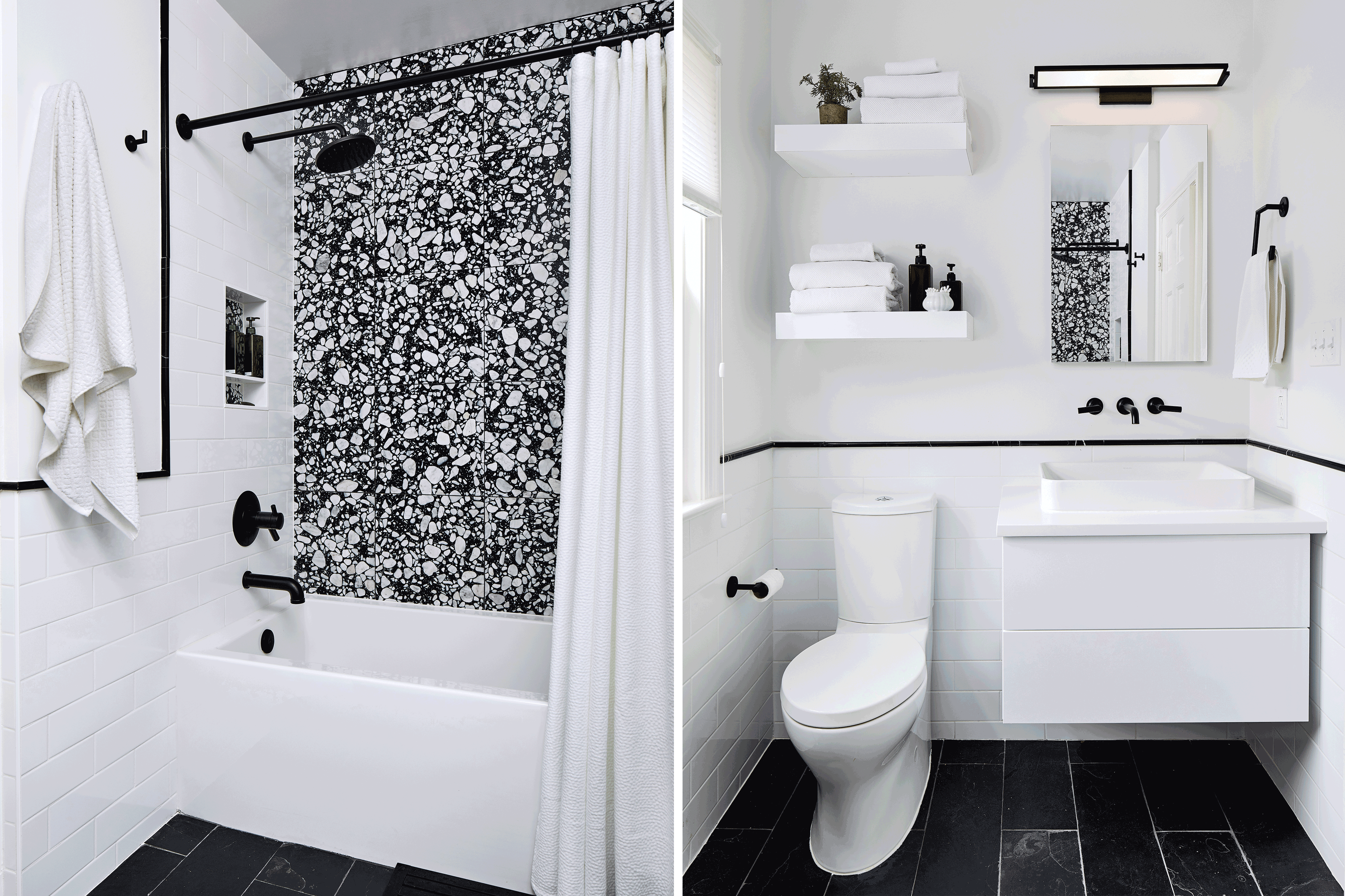
When lawyers Taylor Kiessig and Rosie Zaklad expanded the basement of their Capitol Hill home, they included an office for themselves and a playroom for their two young sons. That meant the powder room down there had to strike a happy medium between cheerful and sophisticated. For a solution, they relied on Kelly Emerson of Aidan Design. “Black and white is universal—young or old,” says the designer. “We love black and white because it allows punches of color in the accessories, like hand towels, and the owners appreciate the ability to add artwork over the years.”
Kiessig enjoys the energy that comes from the contrasting hues, especially because the underground location is “inherently dreary,” he says. “It works really well because the light’s always the same there—it doesn’t change.” The look is particularly successful because the fixtures and hardware, including the vanity’s visible plumbing, were all available in a black finish, which Emerson says is getting easier to find: “More [suppliers] are stocking black plumbing fixtures—they’re more affordable and readily available. It’s a way to elevate a thought-out, designed look.”
It’s Ideal for a Small Space
“When you say ‘terrazzo,’ people think of courthouse floors,” says Carolyn Elleman of Case Design. But there’s nothing drab or institutional about the upstairs hall bath of these clients’ Crestwood home. Elleman and designer Erin Elizabeth Hoopes created the bold space (Hoopes has since left Case). The bathroom was previously decked out in midcentury-era green and pink. The designers flipped through a tile catalog with their clients for inspiration. When the couple (who didn’t want to be named) turned the page to Ann Sacks’s “Terrazzo Renata,” with its huge, marble-like pattern, the husband said he was done looking. “It’s the statement piece for the whole bathroom,” Elleman says of the accent wall that now serves as a backdrop to the bathtub.
The designers couldn’t expand the tight layout, so the simple, stark palette served them well. Black slate “makes the floor drop out a little bit and makes the space feel larger,” says Elleman. White, by contrast, pulls the space inward, “so it feels cozy but not claustrophobic,” due in part to floating elements such as the vanity and shelving, which disappear into the walls. Black fixtures and trim tile complete the package, but it’s all in support of that powerful terrazzo tile, Elleman says. “When you pull back the shower curtain and you see that Dalmatian look, it’s definitely a showstopper.”
This article appears in the May 2019 issue of Washingtonian. It has been updated to include that Erin Elizabeth Hoopes also designed the fourth bathroom, with the terrazzo shower wall.

