Five stunning kitchens that prove going bold is worth the risk.
Dark and Handsome
A homeowner tired of “soulless” white kitchens goes in the opposite direction
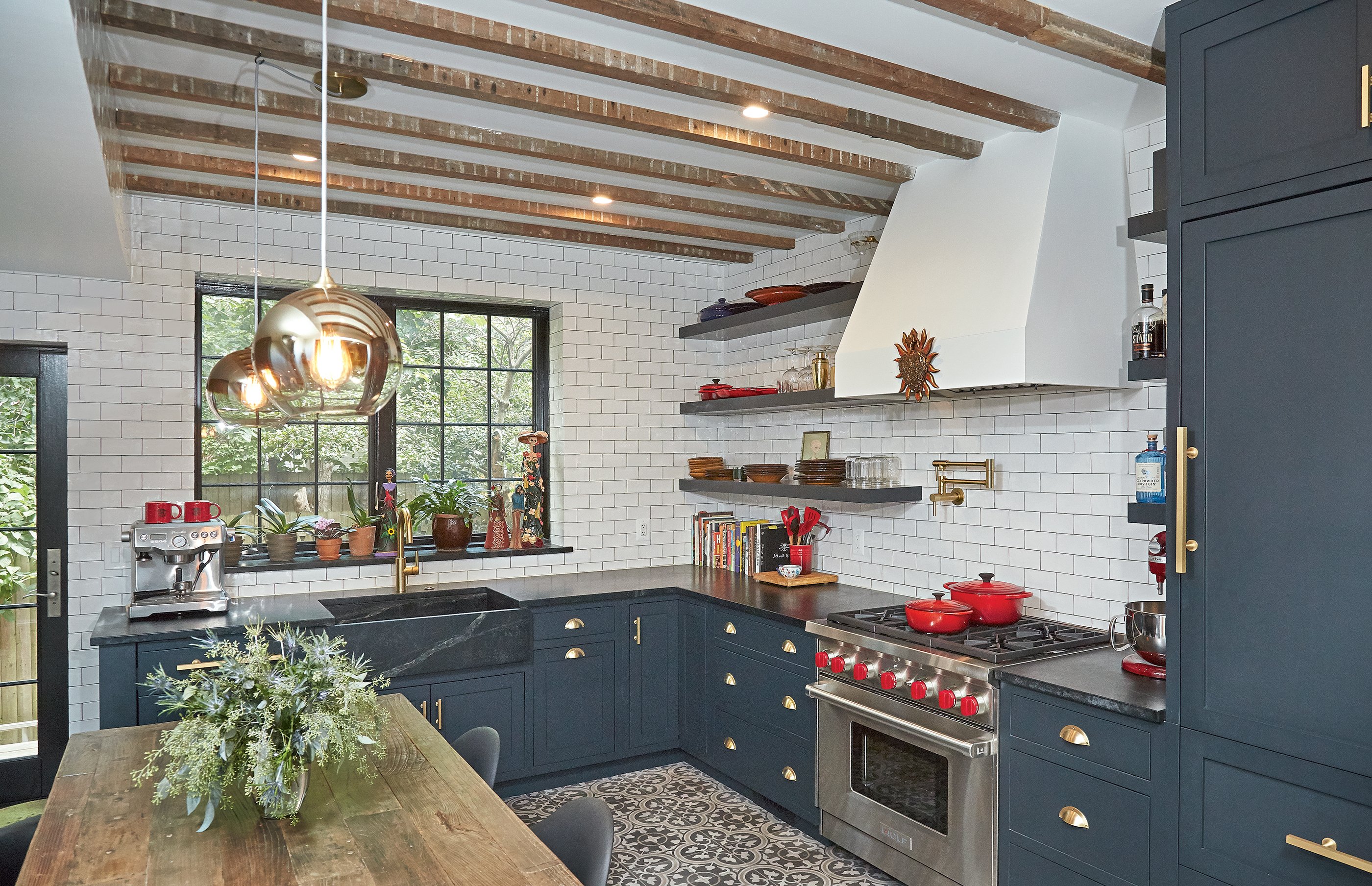
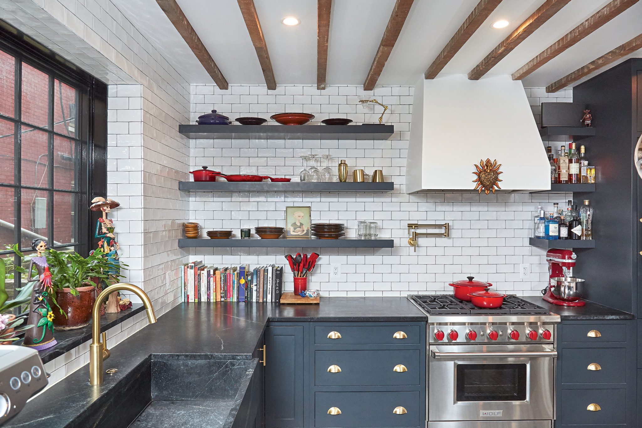
“When I moved to DC three years ago, I must have looked at 100 houses with white kitchens and light-gray walls,” says lawyer and amateur interior designer Nikia Gray. “I found them kind of soulless.” So when she bought a 19th-century rowhouse on Capitol Hill in 2015, she decided to put in a deep-blue, black, and ivory kitchen.
Working with architect Shawn Buehler of Bennett Frank McCarthy Architects and contractors Ali Naim and Dominik Piwowarski of Evcon, Gray planned what she calls a “curiosity cabinet” look at the rear of the Victorian house. A powder room and a wall were removed from the cramped space to open things up. Then the team installed custom cabinets painted with Farrow & Ball’s blue-black “Railing”—including panels concealing all the appliances, except the Wolf range. Extra-deep, matte soapstone countertops and a matching farm sink accommodate Gray’s food prep. (She’s a vegan fond of cooking Asian, Mexican, and Italian for friends and family.)
Other wow moments: folksy patterned encaustic floor tiles from Vietnam, which extend into the adjoining living room, and dark-wood ceiling beams, which Naim and Piwowarski saved from the original demo work. Brass hardware, including a handy hot-water spout above the stove, up the drama. “When you’re doing dark colors, which I have a lot of in this house, I think silver or chrome looks pretty cold,” says Gray. “This brushed-brass hardware gives everything an old-fashioned, glamorous feel.”
Blue Wave
Teal, white, and beachy wood combine in a peaceful space for an empty-nester
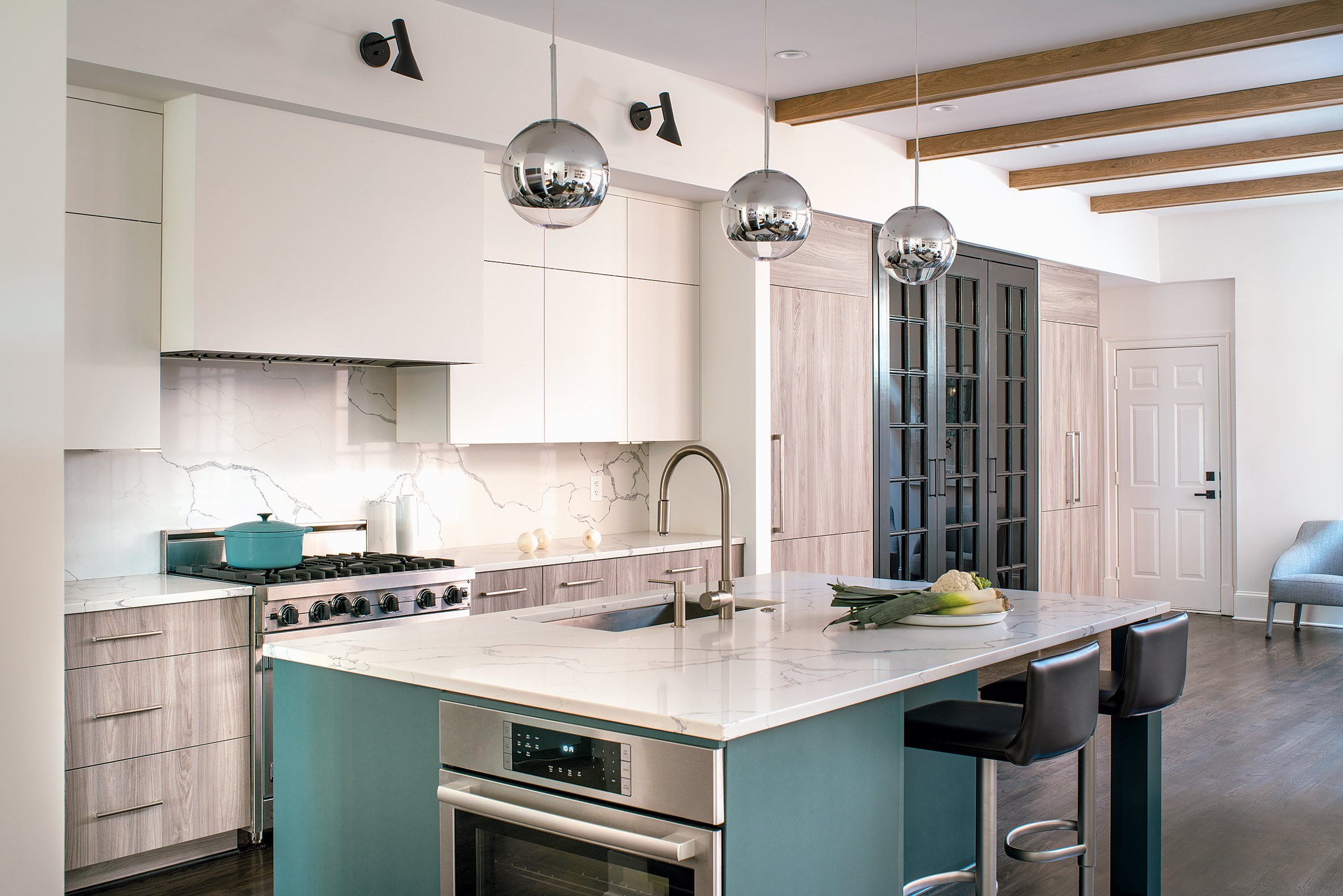
“I’m so tired of gray, I can’t see straight. I’m now a pushy color dealer,” says Sarah Kahn Turner, a designer with Jennifer Gilmer Kitchen & Bath. So when she found an open-minded client in food-marketing pro Mary Ann Sack, Turner cooked up an aqua-accented room that’s one part calm and two parts creative.
Sack moved into the Bethesda townhouse after her kids left the nest. She says she wanted “a space that was both quiet and inviting, but I couldn’t quite visualize it.” Turner suggested a Zen-like blend of pale teal, white, and beachy, wood-grain cabinets. “I’m not a fan of all the cabinets matching,” says the designer. “So long as the finishes speak to each other, pile it on.” The quartz countertops and backsplash unify the project.
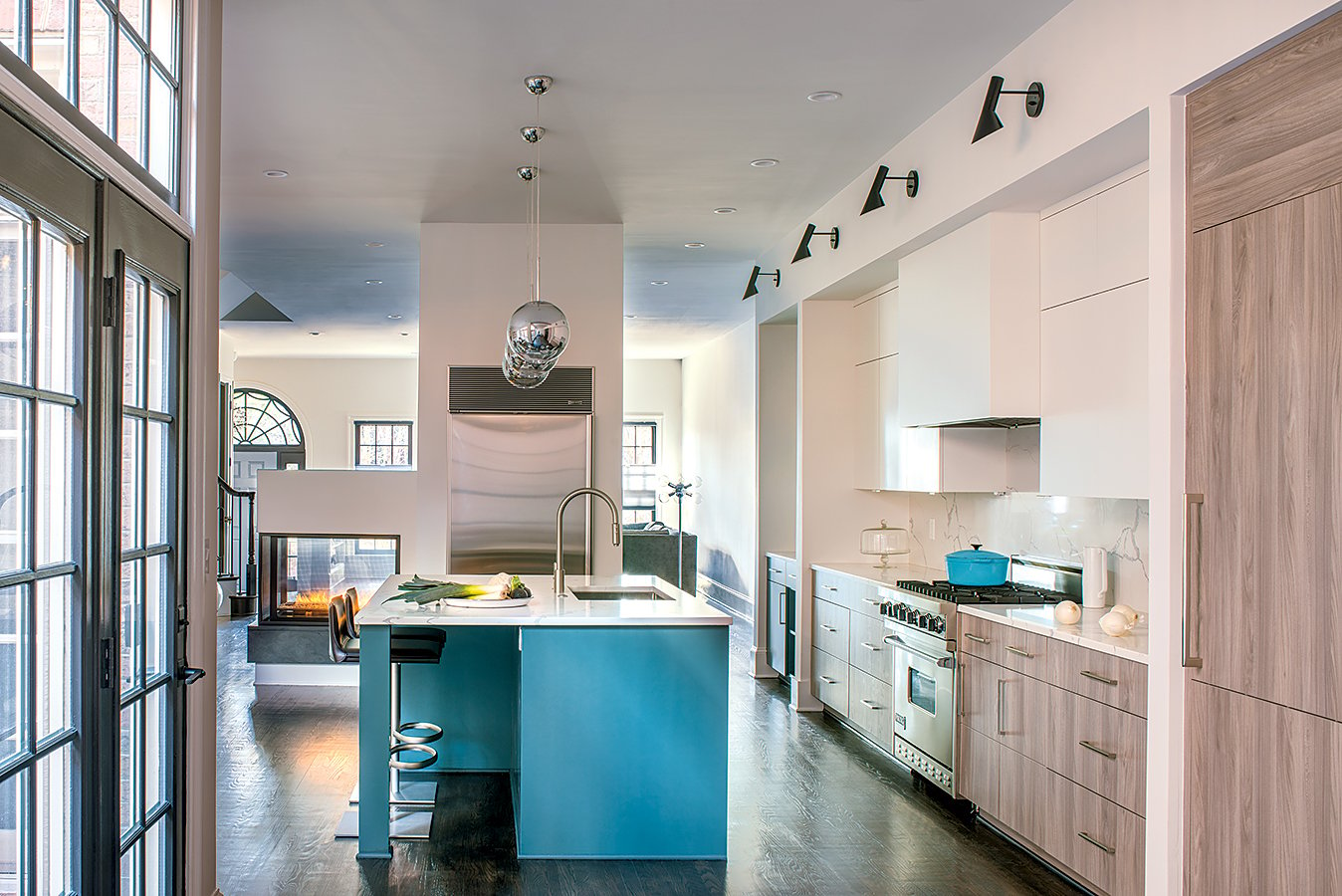
Sack got to keep her existing Sub-Zero stainless-steel fridge, but it was moved to a floating wall that also holds a glass-enclosed fireplace. “It makes the kitchen flow to the living room and dining room beyond seamlessly,” says Turner. Gleaming orb-pendant fixtures illuminate the island, while black sconces mounted on a dramatic soffit provide task lighting. The adjacent area got a black-framed, built-in pantry with black-painted French doors for storing Sack’s extensive collection of appliances, serving pieces, and sundries. “I’m a hoarder of canned goods, and it’s a great place to hide them,” she says. “I love that the pantry lights up when you open the doors.”
Traffic Stopper
A burst of safety-orange jolts awake an otherwise minimalist room
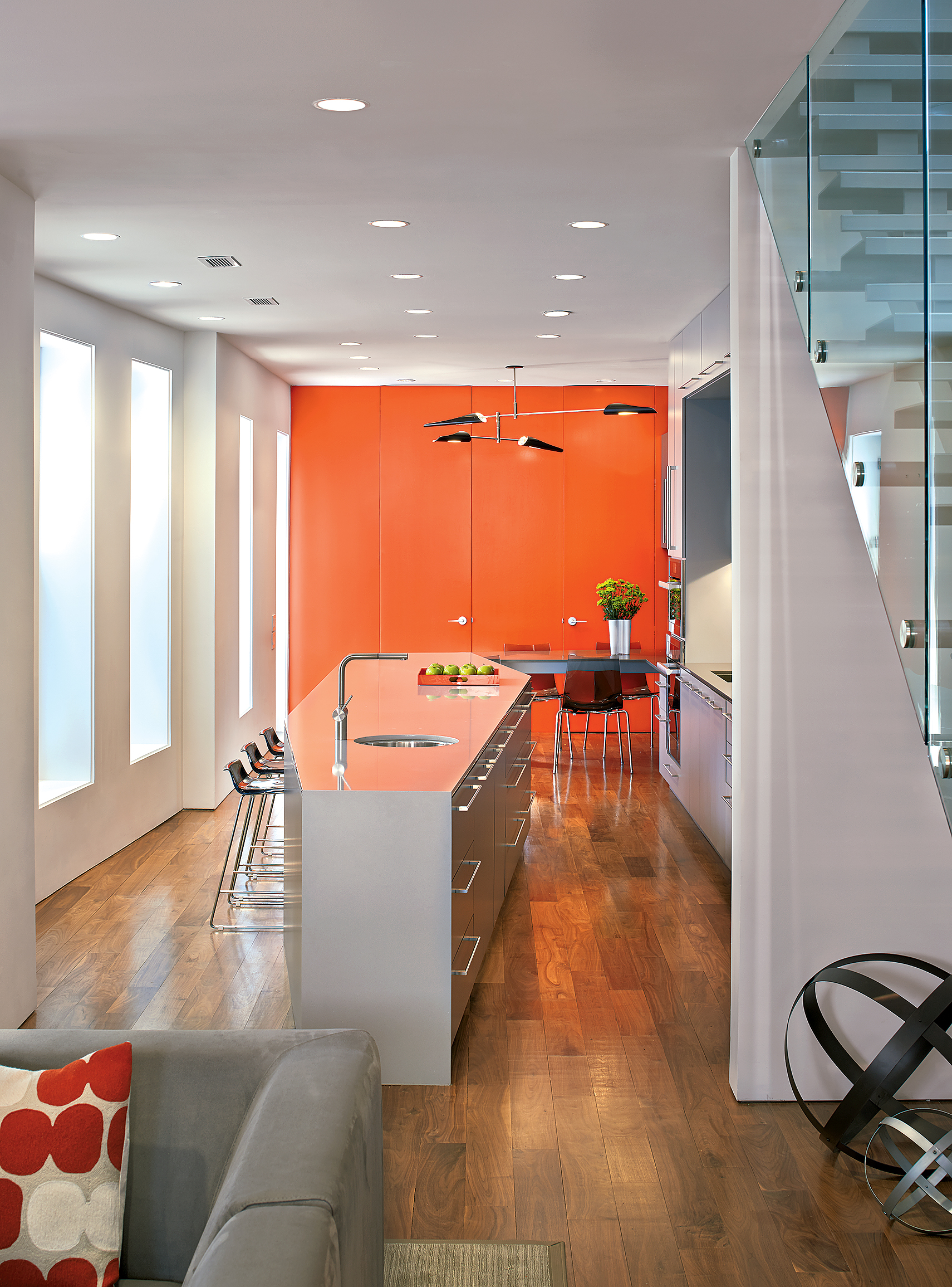
Sometimes just a flash of color can keep a space from getting stuck in neutral. That’s what architect Robert Gurney achieved with the kitchen in this West End rowhouse that he renovated for clients from top to bottom. Taking the narrow 19th-century interior down to the studs, he carved out a cooking zone and eat-in dining area at the back of the first floor. The area is minimalist, save for the head-turning orange wall. “I use color as a single one-off punch in projects,” he says. “I think it’s more impactful than distributing it throughout a space.”
In this case, that traffic-cone orange coats both a storage-jammed pantry and the doors to a tucked-away powder room. And because the first floor is now wide open, “it’s the first thing you notice when you walk in the house,” says Gurney. Cabinets in two tones of lacquered greige and a marble backsplash subtly contrast with the brightness.
Gurney designed the island, a 20-foot-long, irregularly shaped polygon, to maximize both seating and cooking space in the slender house. Its circular prep sink eases traffic at the main sink, especially when the owners—a couple with young children—entertain. At the rear of the kitchen, a built-in dining table echoes the materials and mood of the cabinetry. It’s lit by a mobile-like David Weeks chandelier in black. “I wanted something like a sculpture against the orange,” says Gurney. “Before, the kitchen was cut off from the rest of the house. Now it’s bright and, literally and figuratively, the heart of the home.”
The Great Indoors
An earthy—but sophisticated—kitchen takes its cues from the American West
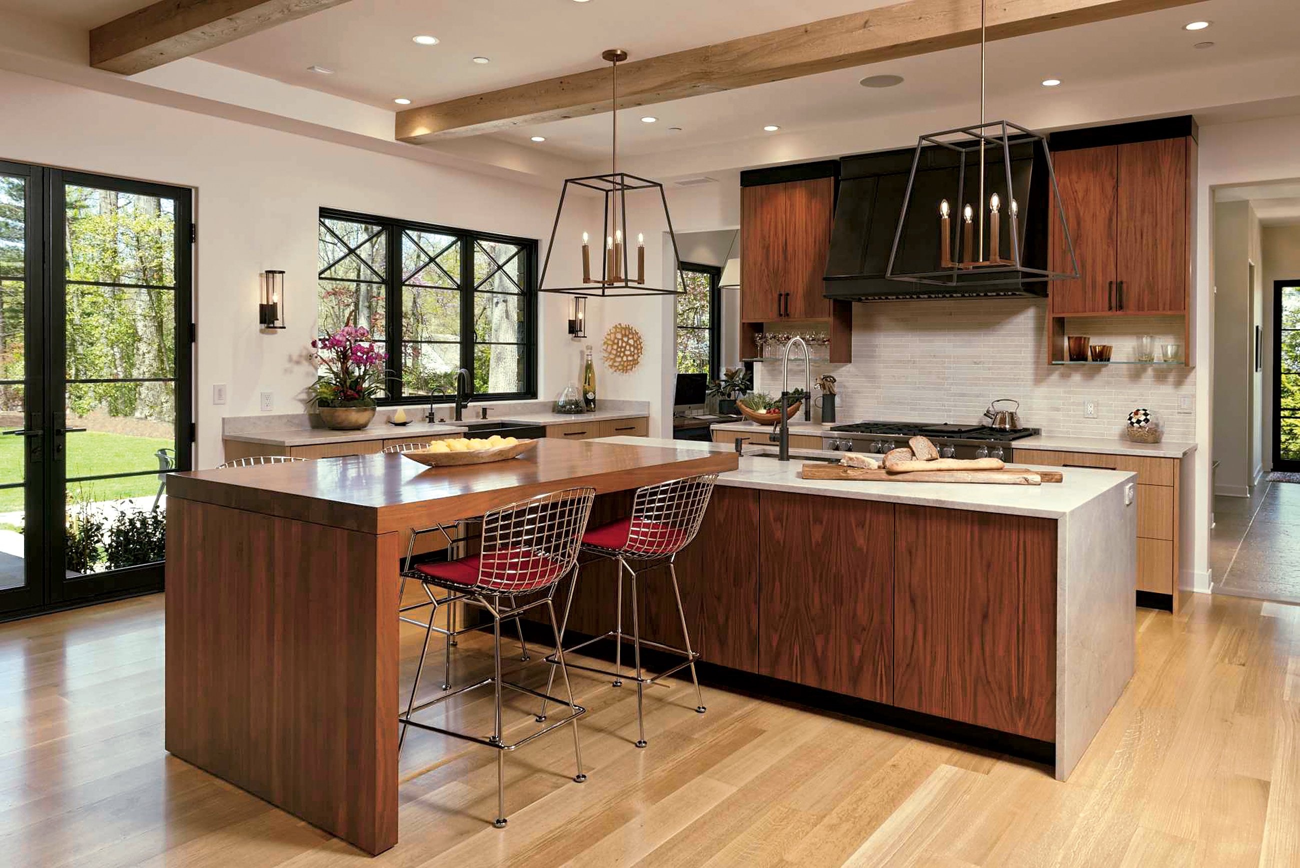
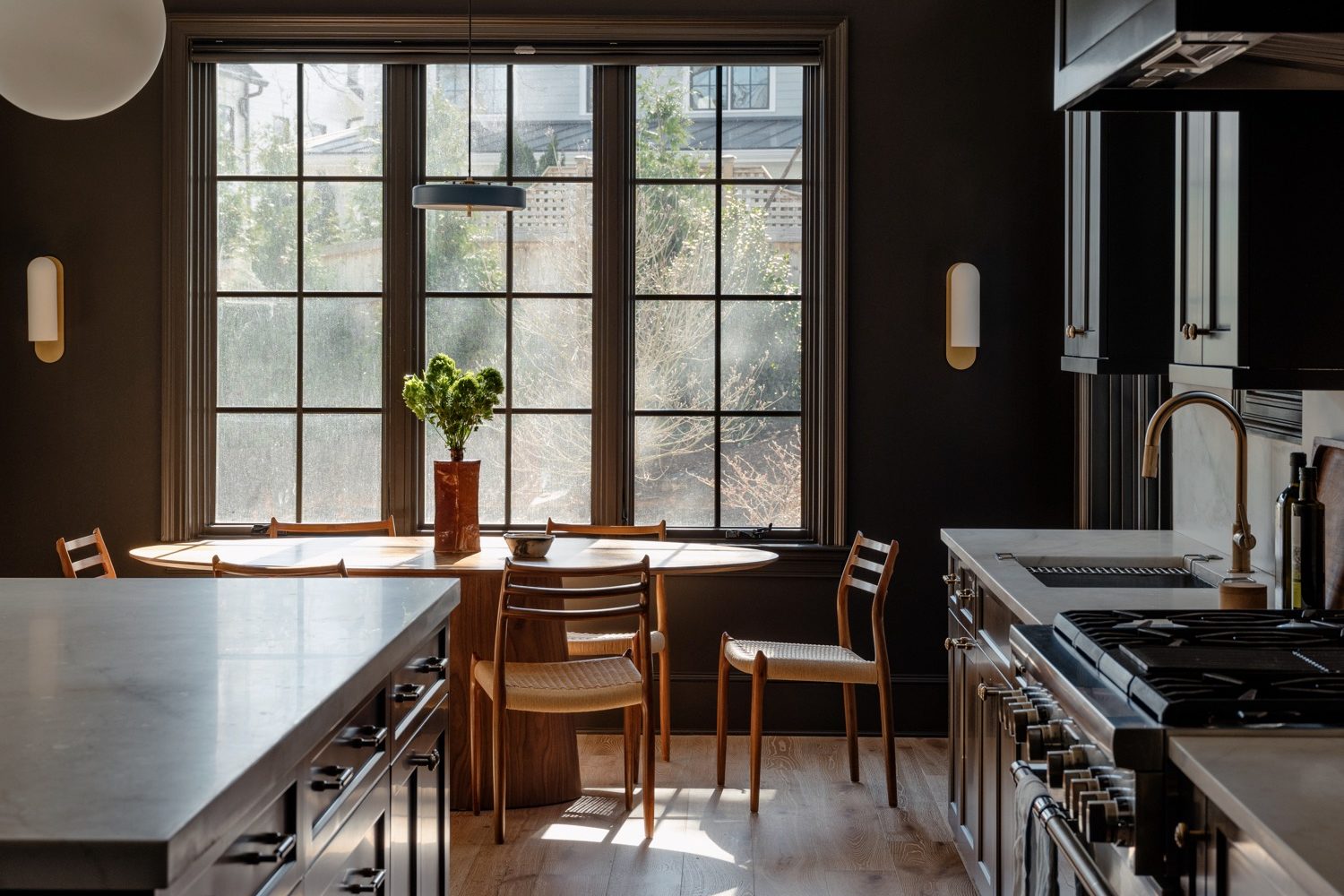
Though there are no Rocky Mountain views from this Bethesda kitchen, the space evokes how much its owners love that part of the country. “Their families live out west, and they wanted the sort of feel you’d get in Park City or Colorado,” says George Myers of GTM Architects. He completed the space for the young family last year, working with Rolando Valdez of GTM and interior designer Christiane Connor. The materials skew natural and organic: quartzite countertops in a leather finish, textured-stone wall tiles, and walnut and rift-cut-oak cabinets from Heartwood Design in Afton, Virginia.
“They definitely didn’t want a white kitchen,” says Connor, who had worked with the family on several previous projects. “We coined the term ‘mountain modern’ for them.” Iron sconces from Urban Electric and lantern-like island pendants from Hinkley boost the outdoorsy mood.
Most appliances are concealed behind wood panels on one large wall bank. Glass-fronted, iron-framed built-ins break up that wall, neatly holding dishes and serving pieces. “Even though there are different finishes in the space, I think it all works together,” Myers says. “It’s a nice series of contrasts.”
Crayola Kitchen
Why use one neon hue when you can use three?
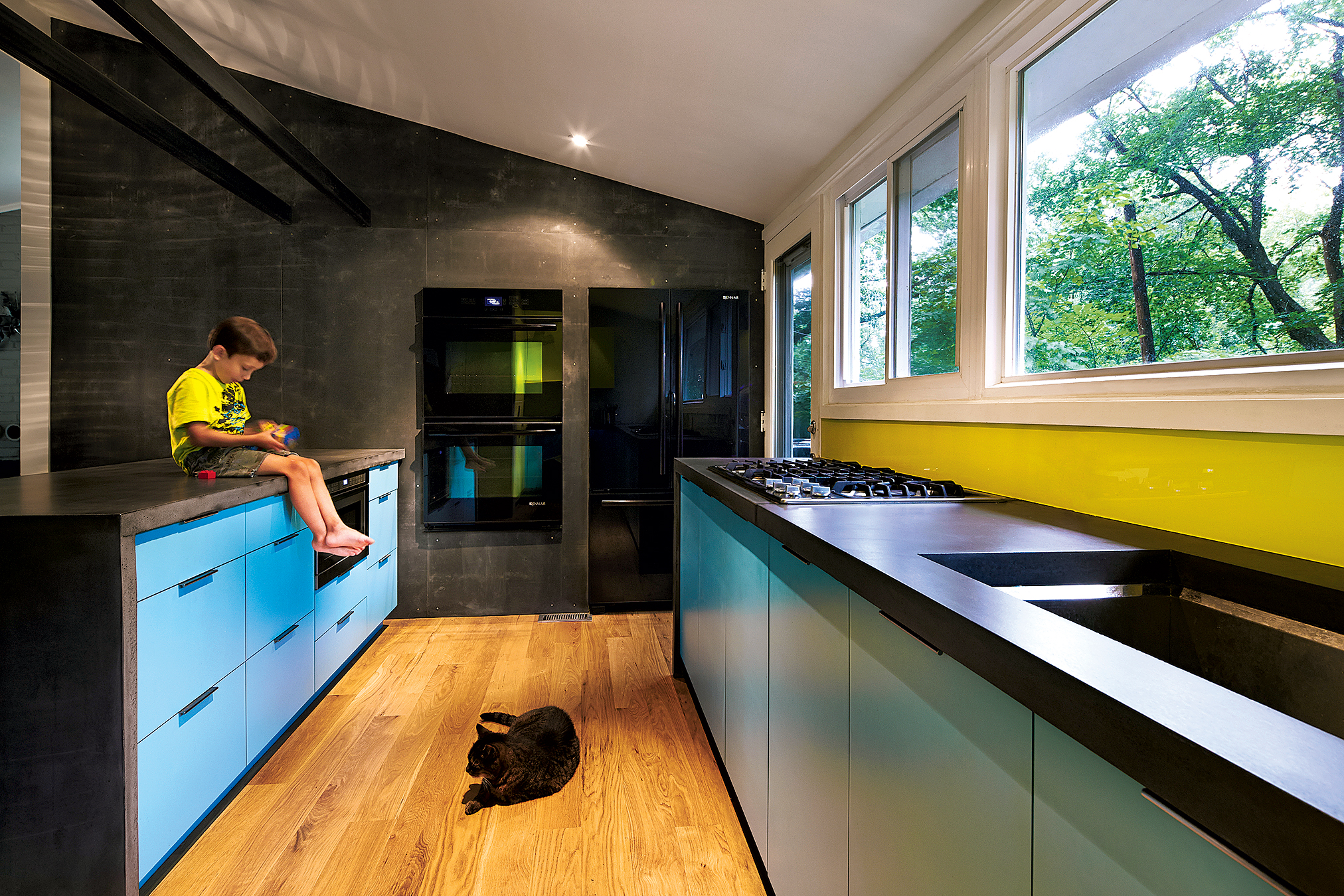
When architect Janet Bloomberg was redoing her own Kensington kitchen three years ago, “my cabinetmakers kept calling it the Crayola kitchen, since they’d rarely seen so much color in a cooking space,” she says. But Bloomberg, a principal at Kube Architecture, knew she wanted to inject the midcentury ranch house—originally designed by Charles Goodman—with a happy vibe. “I wanted something different, a place where I could hang out with my son, cook, and play,” she says.
Though she stayed true to much of the space’s 1950s floor plan, she took down a wall between the kitchen and living room and traded the dark, outdated cabinetry for clean-lined cabinets in lime green and robin’s-egg blue. Upper cabinets made it only into a corner you can’t see from the living room. “I didn’t want tall, imposing elements or anything that would block our view of the trees out back,” she says. A glass door replaced a solid one, bringing in more light and, in warmer months, leafy vistas.
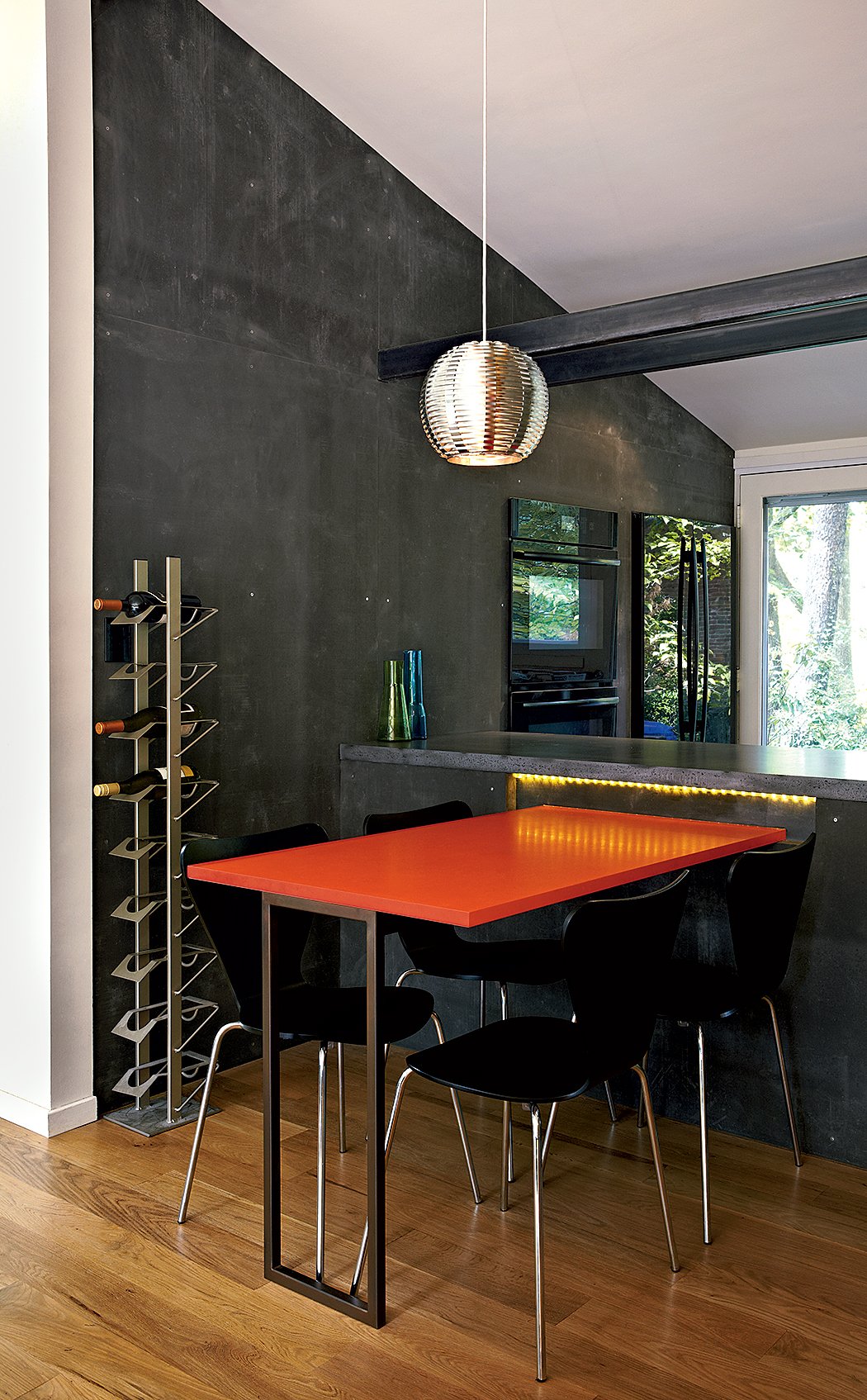
Black concrete countertops add an edgy contrast to the slick cabinets. Larger appliances, in glossy black glass, were installed on a wall covered in Viroc—a matte cement-board paneling that mimics concrete. “In smaller houses like this, appliances can feel like these big boxes,” says Bloomberg, “But when inset into the Viroc, they now look cool.”
This article appears in the October 2018 issue of Washingtonian.

