While blue and gray kitchens have been trending for a few years, white cook spaces remain a perennial favorite for their universal appeal and resale value. But sometimes all-white can feel clinical—or worse, unimaginative. Here’s how to create the look without sacrificing warmth or personality.
Bring in the Outdoors
Like a lot of rowhouse kitchens, this one in Bloomingdale was short on square-footage. Instead of tearing down walls to make it open-concept, architect Evelyn Pierce and Greenwich, Connecticut, interior designer Patrick Mele kept its compact footprint and deployed a little sleight of hand. Glass-fronted cabinetry creates a sense of depth, and running square ceramic tile to the ceiling makes the space appear taller. An oversize vintage glass lantern is a bold focal point that doesn’t add visual clutter, and the freestanding butcher block provides a warm wood element to soften the high-contrast space.
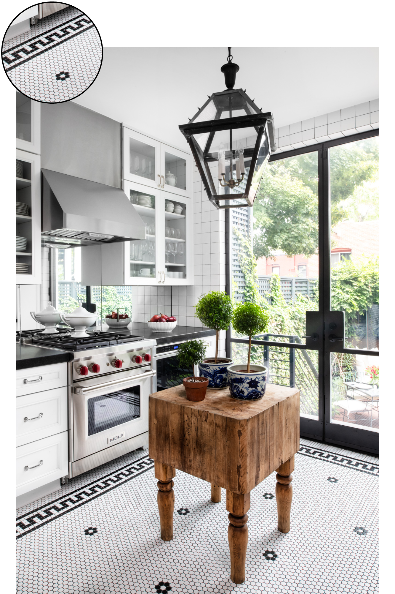
Pierce opened up the kitchen to the backyard with a large glass-and-steel door, which allows easy access for outdoor entertaining and bathes the room in sunshine. To take advantage of that natural light, she added a mirrored backsplash. “I think the door and the backsplash are what make the space work,” she says. “Now your eye wanders outside or catches the light reflecting in the glass. It’s still small, but it feels wide-open.”
Introduce Natural Textures
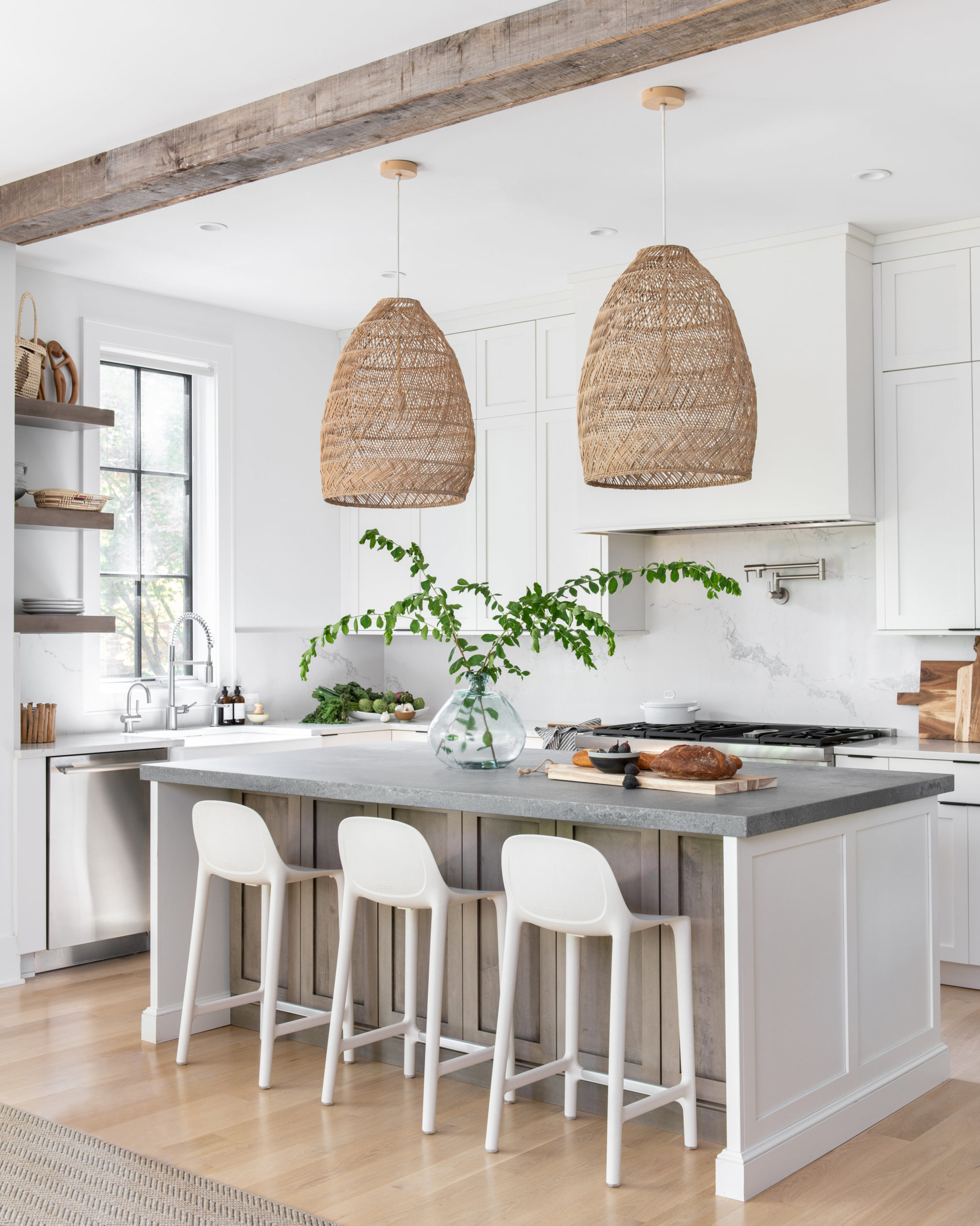
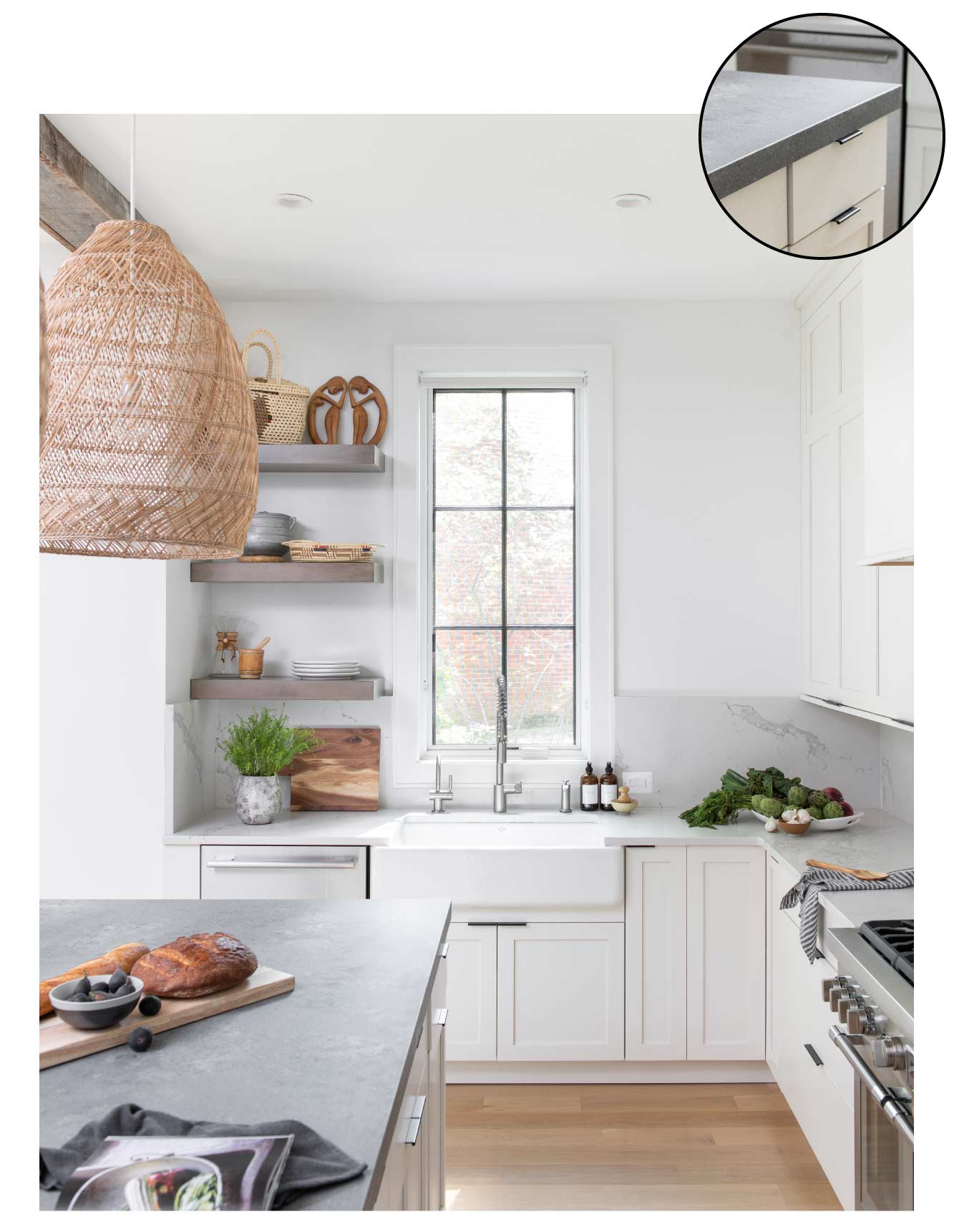
To marry this Forest Hills kitchen to its woodsy setting overlooking Rock Creek Park, architect Michelle Vassallo brought in organic elements. “When you have an open-concept room with white walls and cabinetry, it can feel so large that you want to provide definition,” she says. “The reclaimed beams tie into the view of the forest and help to define the space between the kitchen and family room.”
Oak shelving echoes the overhead beams, while the rattan basket pendants from Serena & Lily convey a relaxed, bohemian vibe. The light fixtures also subtly nod to the homeowners’ West Indian heritage and their collection of Afro-Cuban art and furnishings throughout the house.
Adding character via such personal touches reminds Vassallo of something her architect husband once said—that white kitchens are a little like wedding dresses. “They’re all white, but you can have one with lace, one with buttons, one that’s short, one that’s long; you’ll rarely see the same dress,” she says. “Similarly, white kitchens can be surprisingly unique.”
Create Bespoke Details
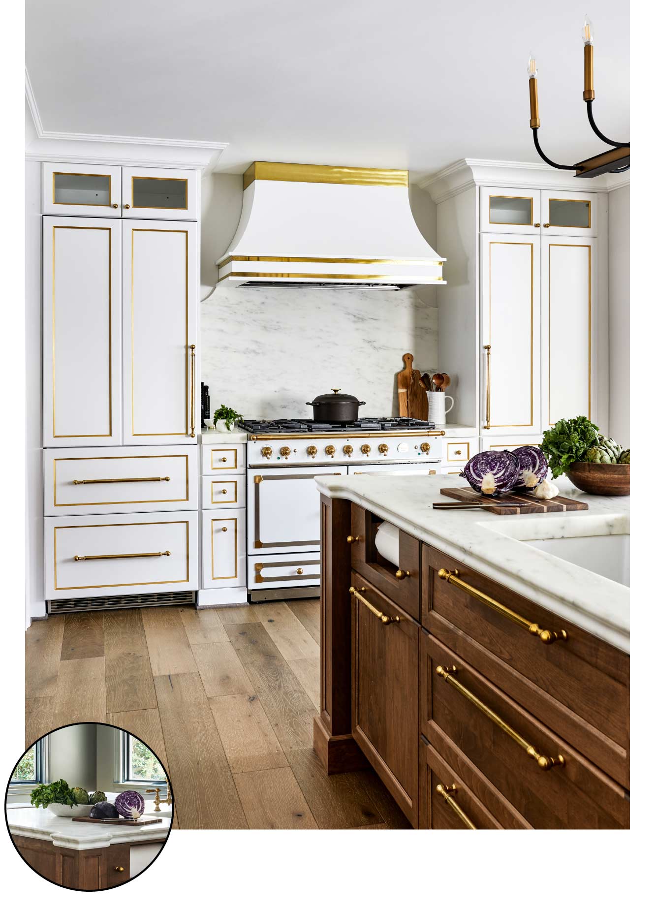
Interior designer Gretchen Simon knew she wanted to play up the French-country aesthetic of her Alexandria home, so she set her sights on a La Cornue range for the kitchen. That decision inspired the choices that followed in the renovation, carried out by Marks-Woods Construction: Simple white cabinets complement the stove, and a richly toned maple island telegraphs Old World elegance while warming up the space. Using the same Waterworks faucets and unlacquered brass pulls—which mimic the stove hardware—unifies the perimeter cabinets with the wood island. After installation, Simon looked around and still felt something was missing, so she had a gold-leaf pinstripe detail hand-painted on the cabinets to double down on the drama.
Perhaps the best feature of all is one that isn’t immediately visible: a hidden door to the basement that’s disguised as a pantry cabinet. “Having that door pivot the way it does hides a utilitarian access point and provides a nice symmetrical design,” says designer Danielle Steele of Marks-Woods. “It’s a great party trick!”
Play With Gray
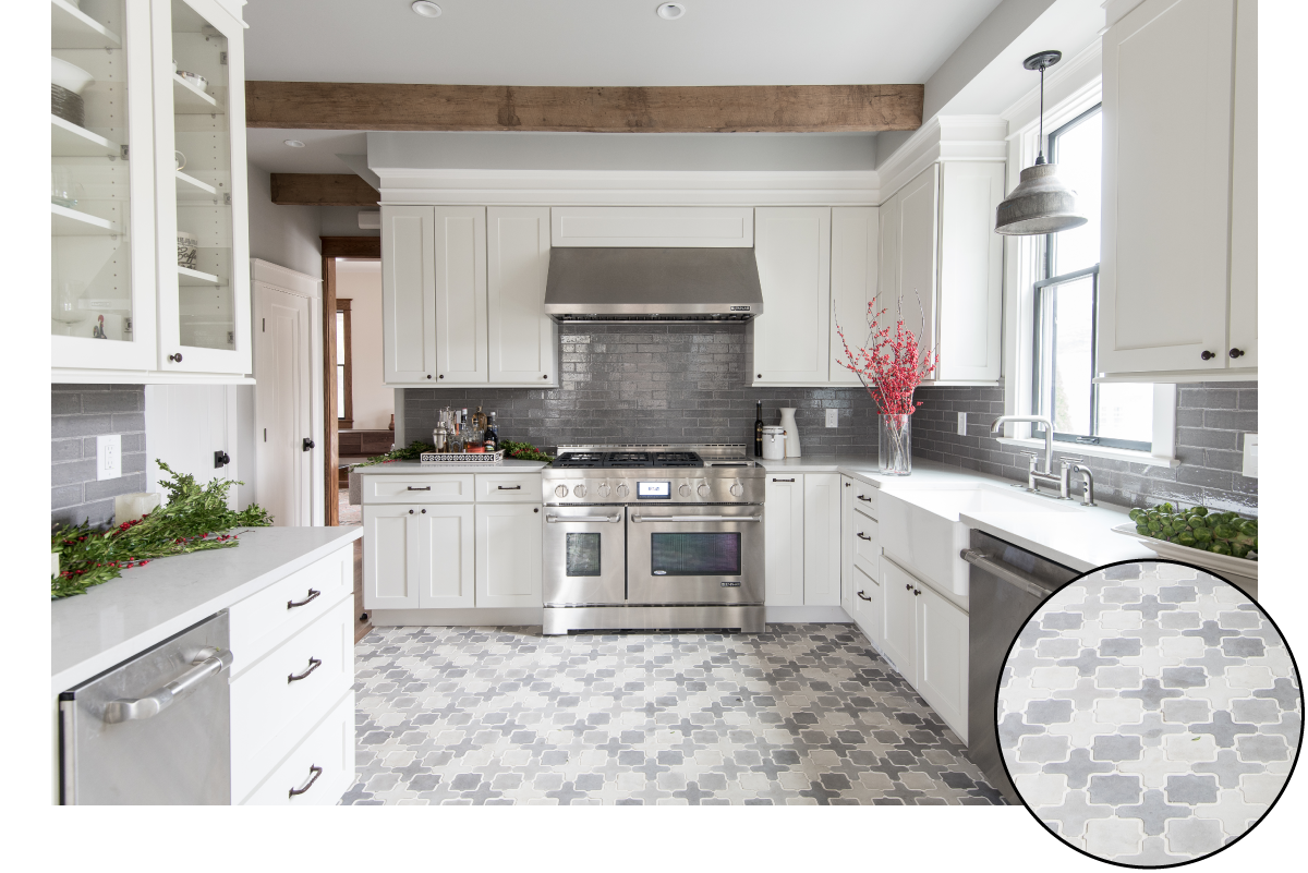
The design for this American University Park kitchen by architect Evelyn Pierce started with the arabesque floor tile. Wanting the graphic mosaic tile to be the space’s centerpiece, the homeowner opted for plain white cabinets with oil-rubbed bronze pulls. Pierce brought in salvaged-wood beams to visually connect the new kitchen to the rest of the house, which is in the Craftsman style and features a lot of its original millwork. Gray ceramic subway tile from Ann Sacks lines the backsplash, and the countertops are “London Fog” by Caesarstone. “We picked it because it’s a warm pale gray that blended nicely with the backsplash and floors,” says Pierce.
Because all grays are not created equal, she admits it was a challenge finding a wall color that didn’t skew too cool. In the end, she mixed a custom color that’s 25 percent Sherwin-Williams “Repose Gray” and 75 percent Sherwin-Williams “Passive.” Says Pierce: “We did a lot of test samples and ended up blending two colors to get it just right.”
Add a Touch of Blue
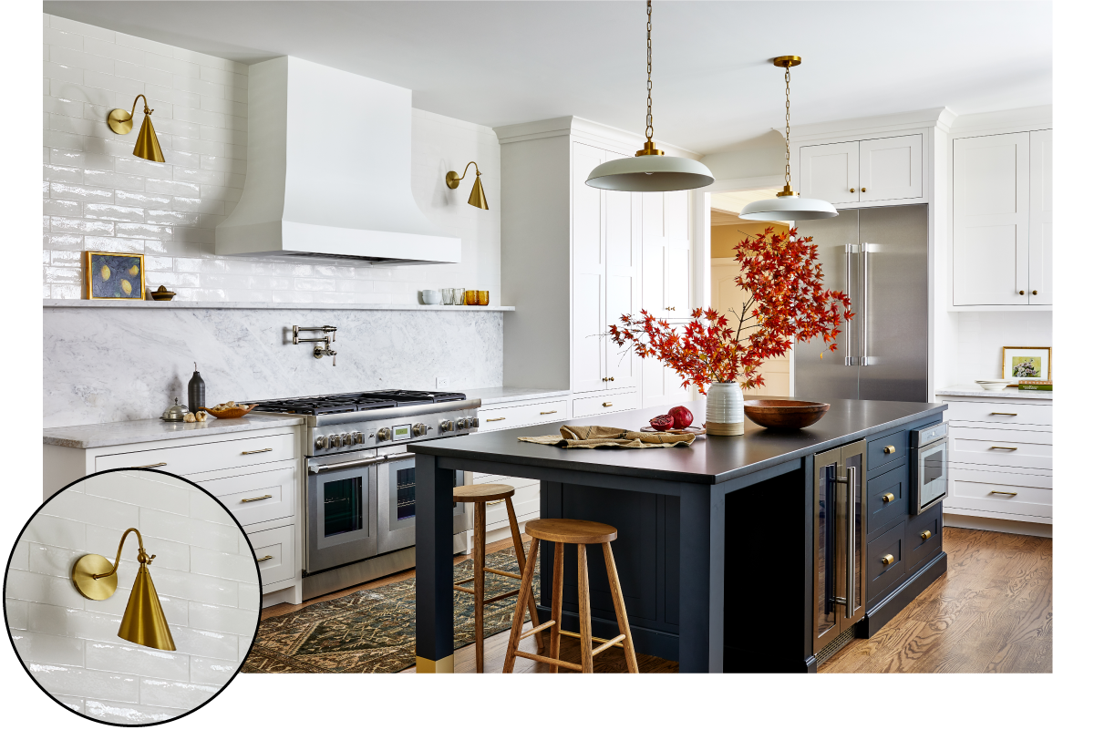
Designer Tanya Smith-Shiflett of Unique Kitchens & Baths originally pitched the idea of all-blue cabinetry for this Ashburn kitchen, but her client wanted a more timeless feel, so they reached a compromise: white cabinets along the walls and a rich navy for the new expanded island. To add vintage charm and introduce warm wood tones, Smith-Shiflett brought in a white-oak china tower, stained three shades darker than the floor for contrast. “All of our cabinets feature English-style inset doors and are meant to look like heirloom pieces of furniture,” she says.
Such storage solutions were key. The original kitchen had a lot of wall cabinets, most of which were eliminated in favor of a quartzite backsplash and display ledge, topped off with subway tile. “Usually, you would do subway tile only from the countertop to the wall cabinet, but now with kitchens being more open, there’s no stopping point,” the designer says. “It’s prettier and easier to do the whole wall.”
This article appears in the October 2022 issue of Washingtonian.

