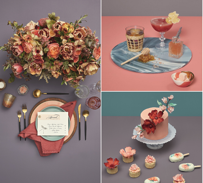
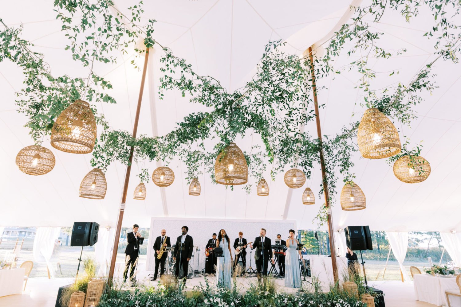
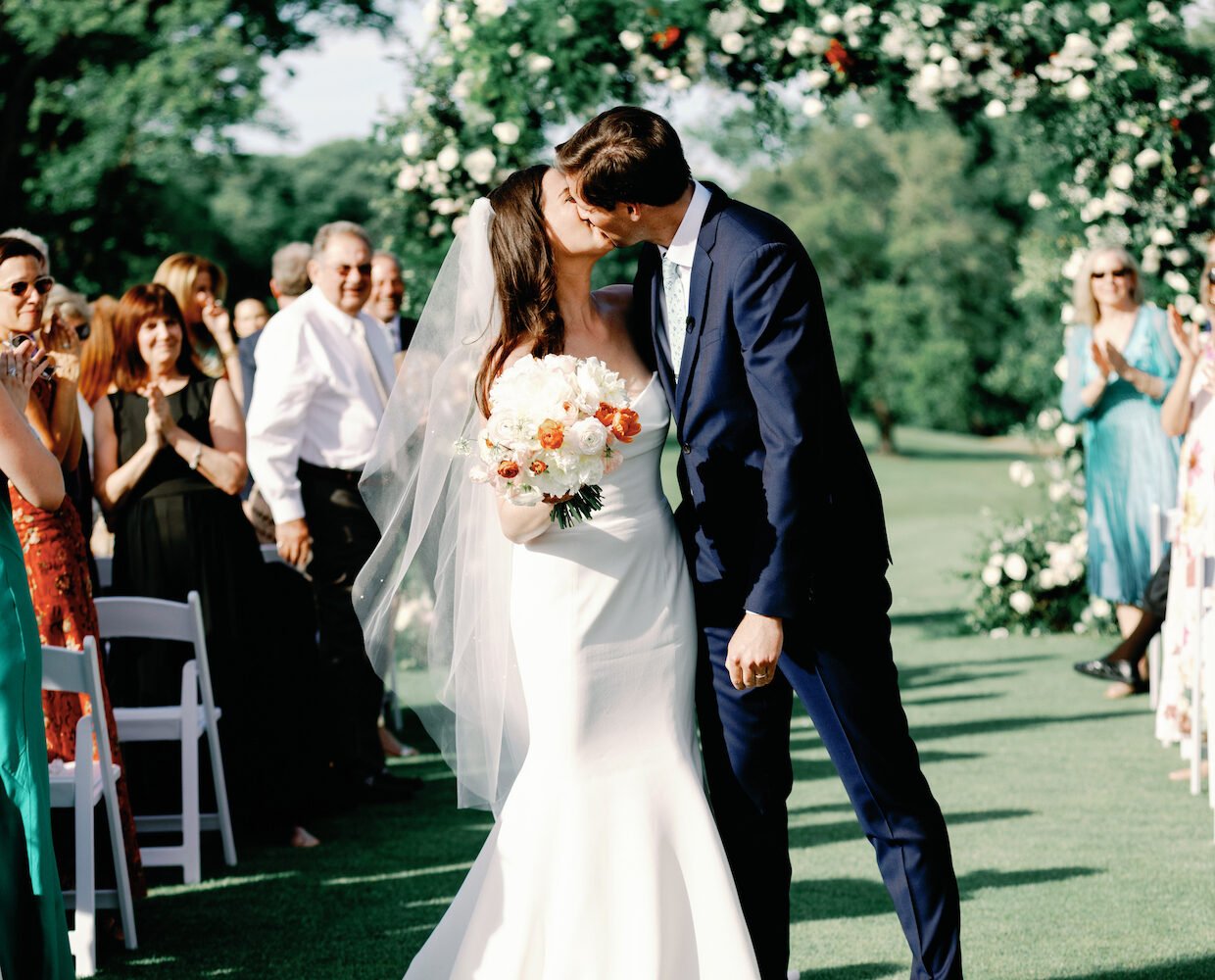
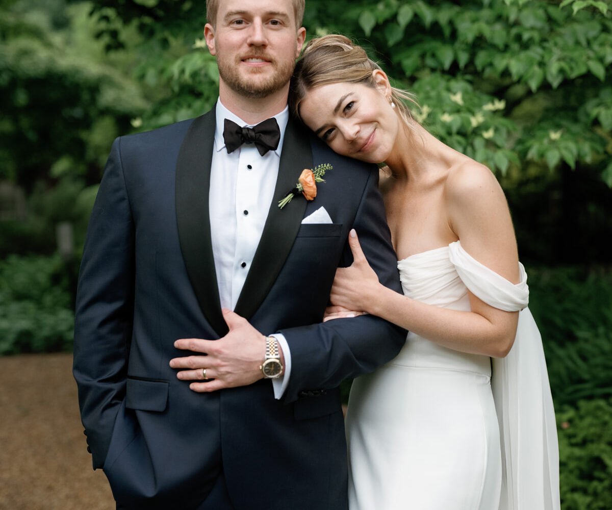
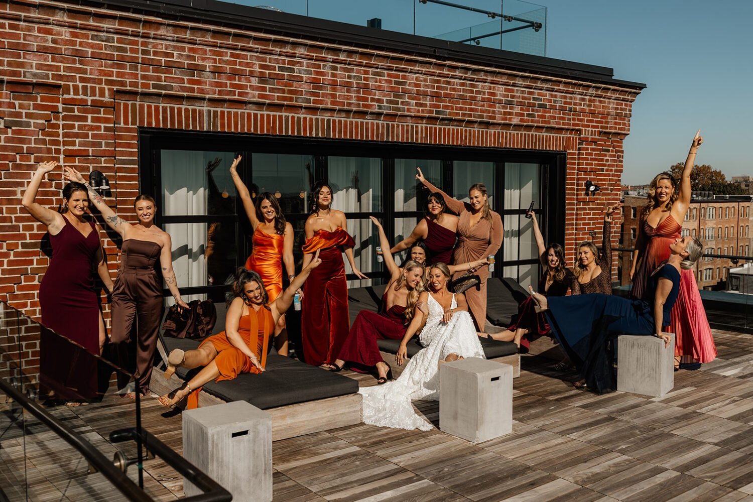
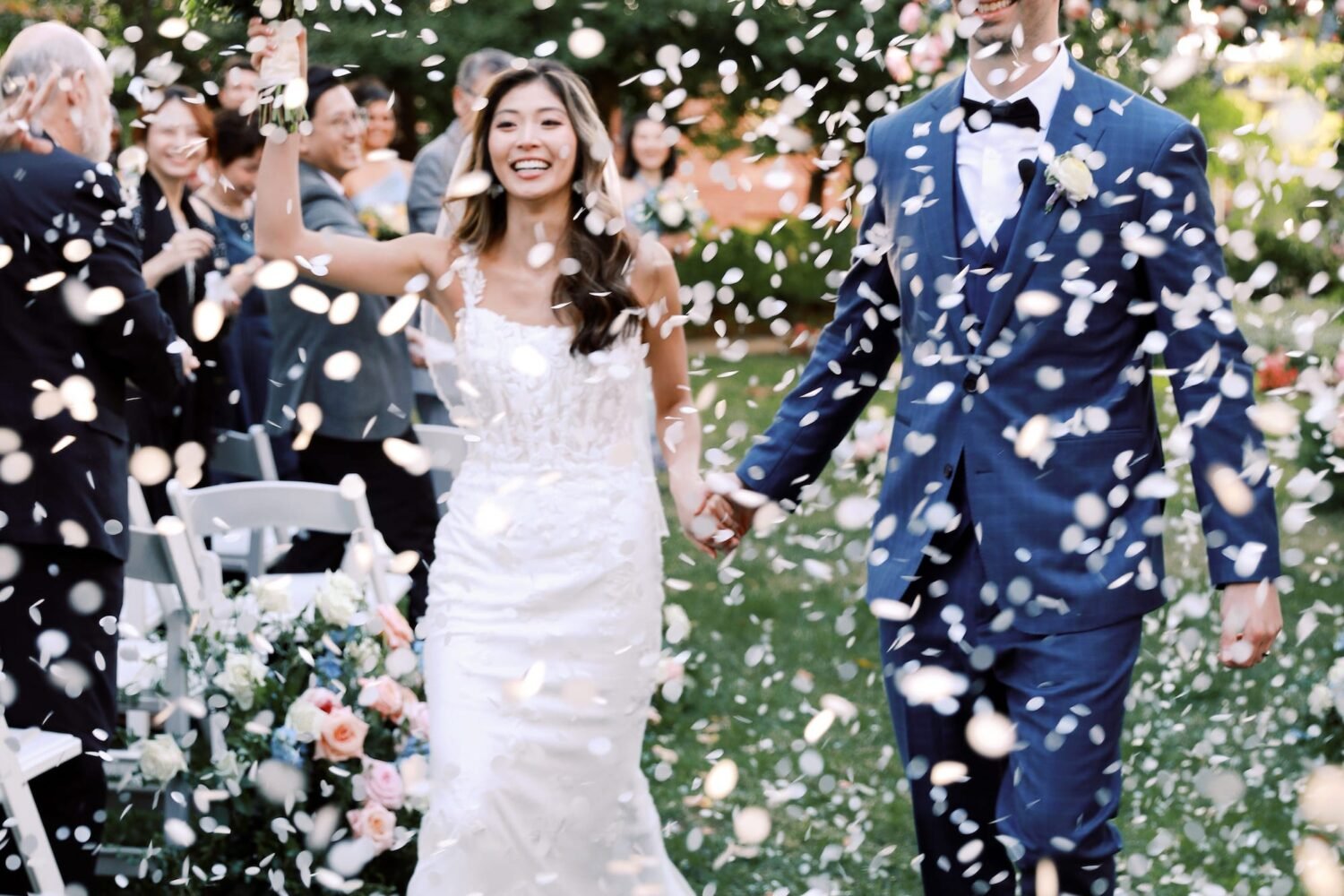
This earthy spin on Pantone’s color of the year, designed in collaboration with Cheers Darling Events’ Kaitlin Przezdziecki, reminds us of a sunset over the Chesapeake—but it’s a beautiful choice for landlocked celebrations, too.
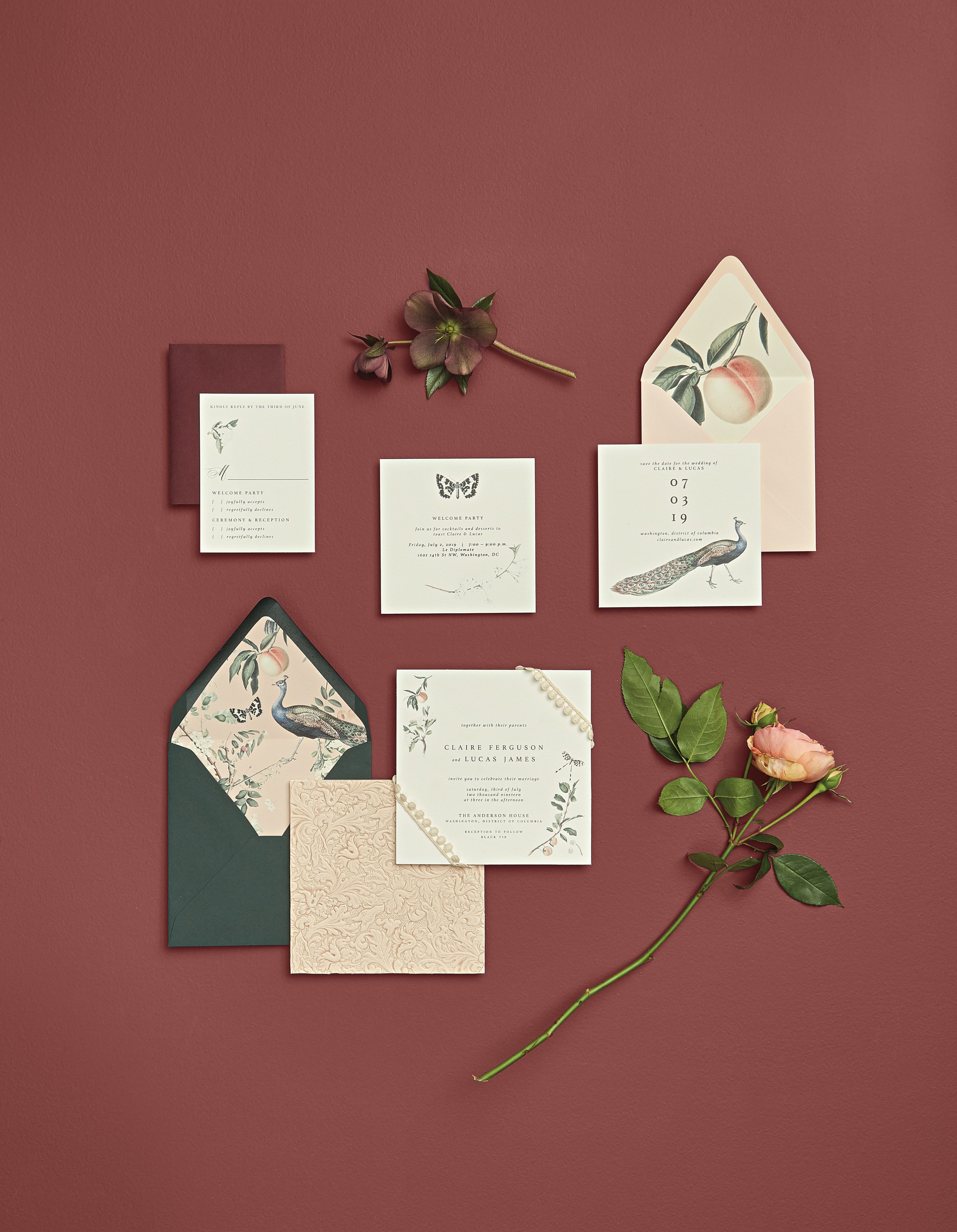
Get creative with your envelope liners.
The invitation suite sets the tone for your event, and should preview the day’s formality and style. Envelope liners are a fun place to introduce some of your big-day design elements, and various components of the invitation can be thoughtfully coordinated without having to match.
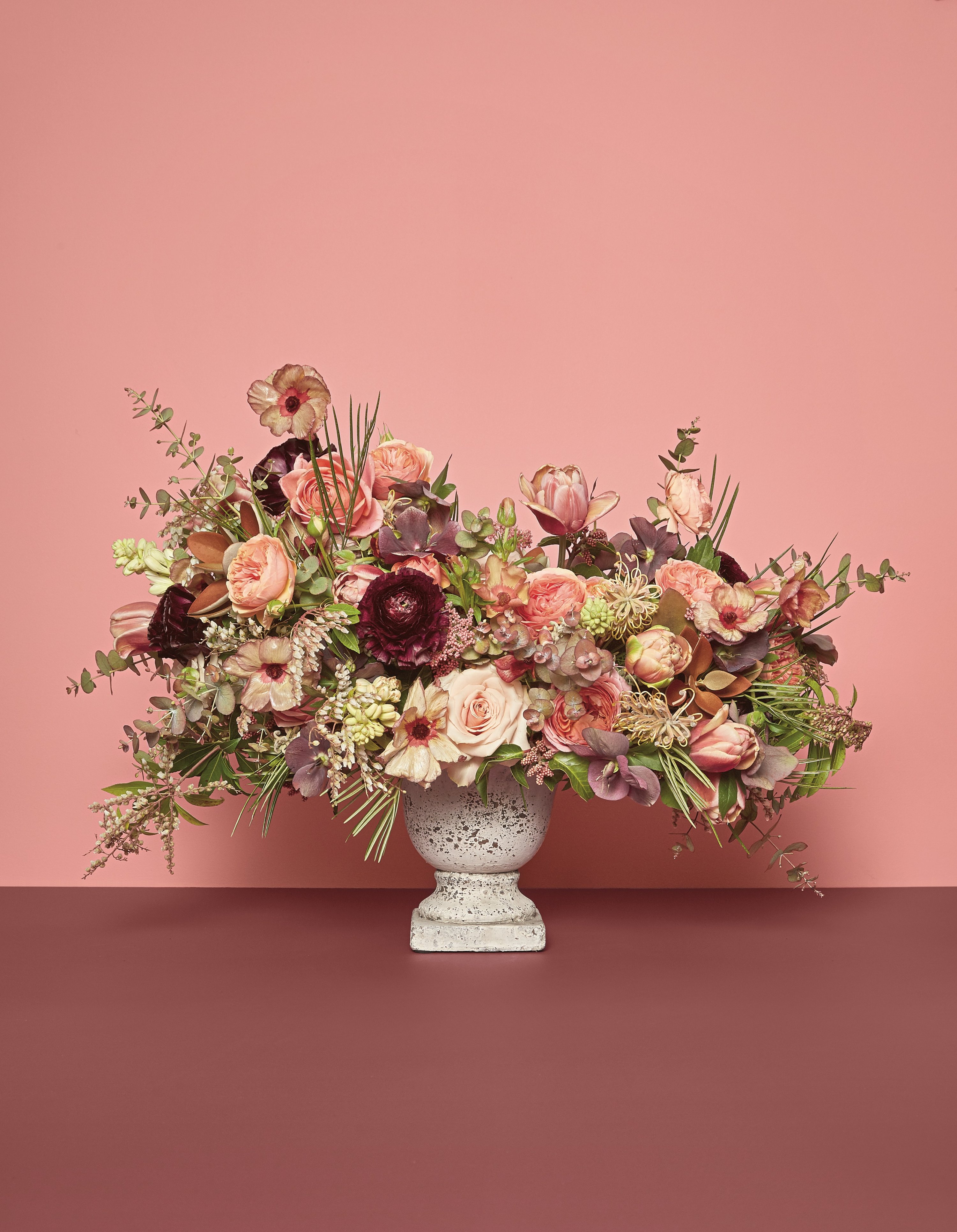
Add varying shades of color to your florals and centerpieces.
Flowers are the organic way to show off your palette. Incorporate varying shades of different colors to deepen the dimension, or select a variety of blooms mixed with greenery to add texture.
Tip: Choose vases and vessels that help set the aesthetic tone you’re trying to achieve.
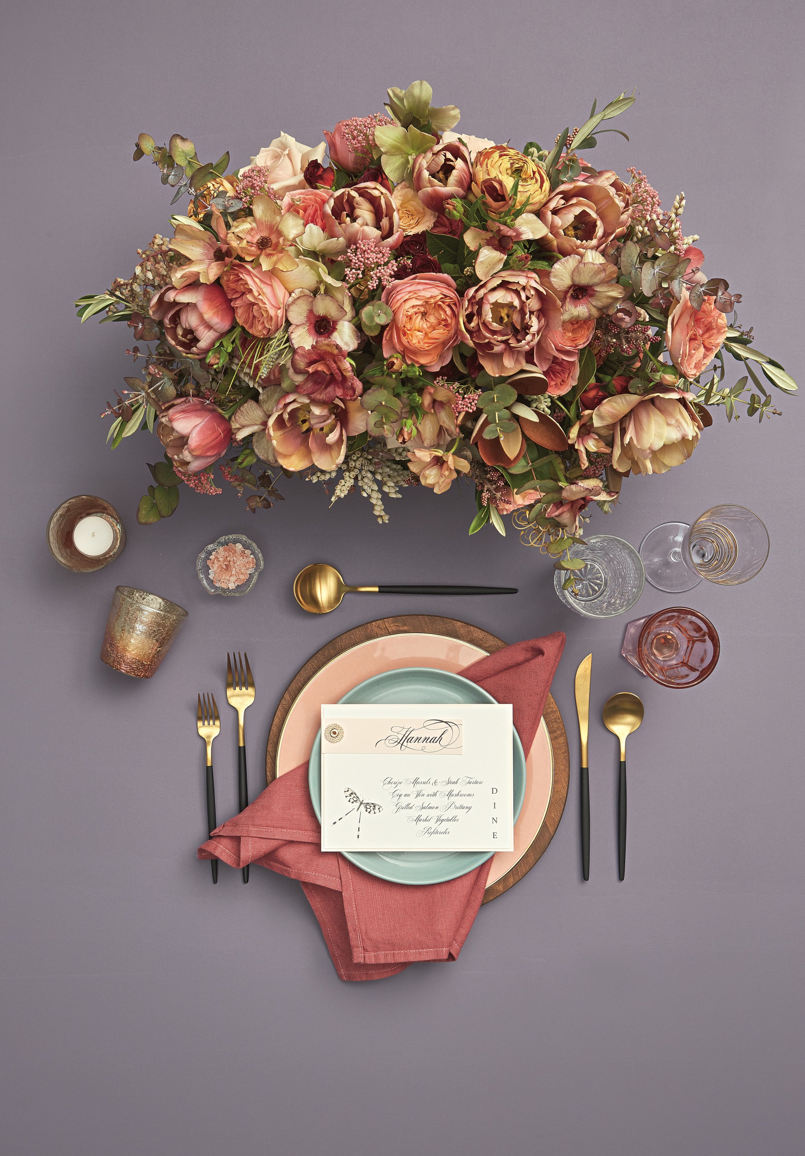
Layering is key—when it comes using this color in your place settings.
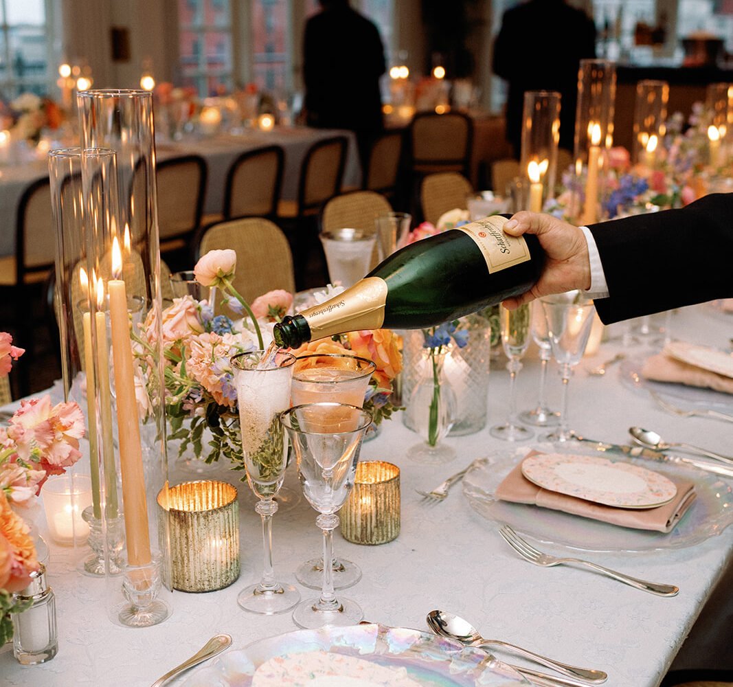
Where all your wedding-day hues come into play, don’t be afraid to layer solid—or patterned!—linens with chargers, flatware, and plates, then accent with iridescent glassware and votives. Pull it all together with eye-catching florals.
Hint: Himalayan salt in distinctive containers is a great color prop!
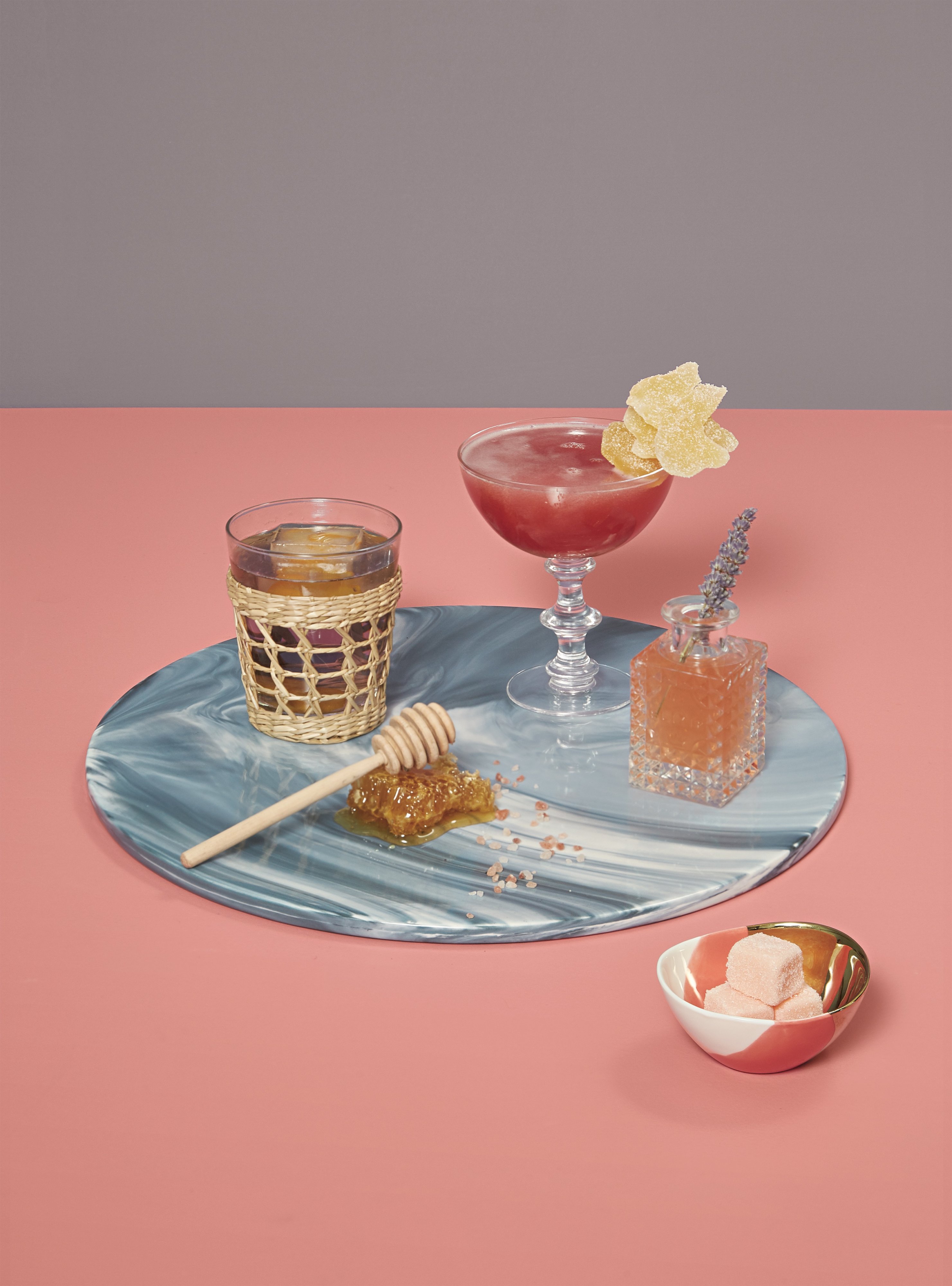
Signature drinks can easily showcase Pantone’s color of the year, too.
In addition to colorful stirrers, garnishes, sugar cubes, drink trays, and other bar props, choose a signature cocktail or two to showcase your palette at the bar.
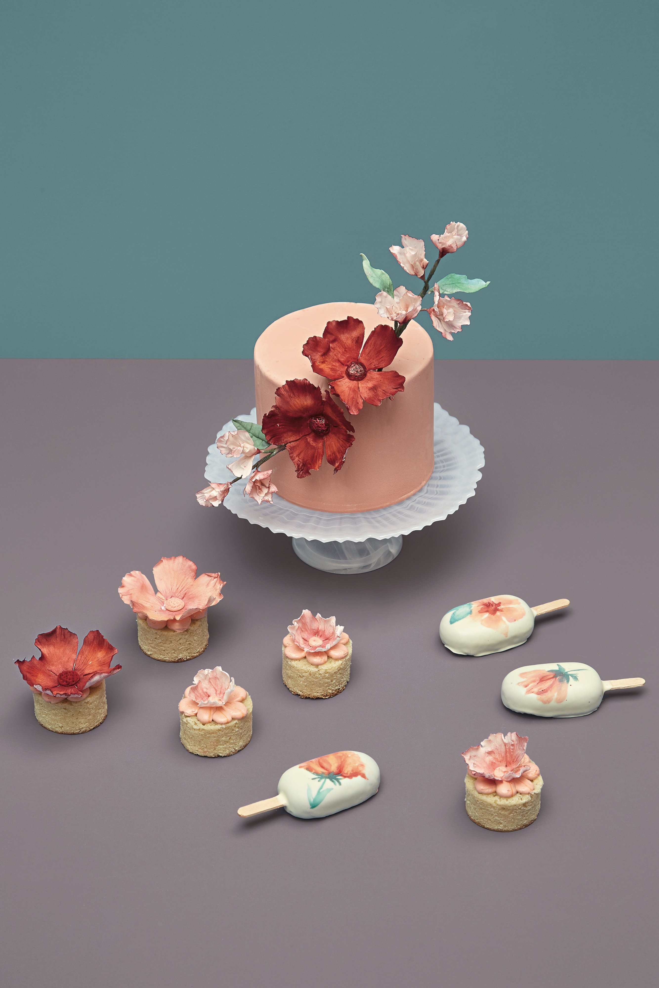
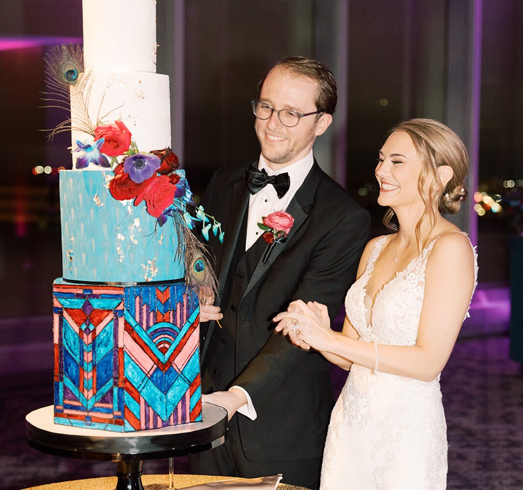
Don’t skimp on the cake and desserts!
Carry your motif to the dessert table with icing and sugar flowers, and even hand-painted treats, such as delicious (and trending!) cakesicles.
This article appeared in the Summer/Fall 2019 issue of Washingtonian Weddings.

